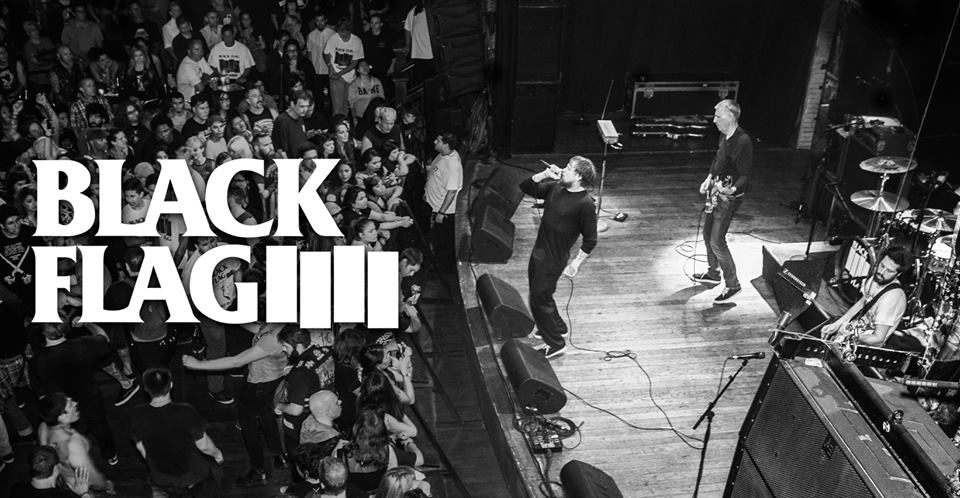
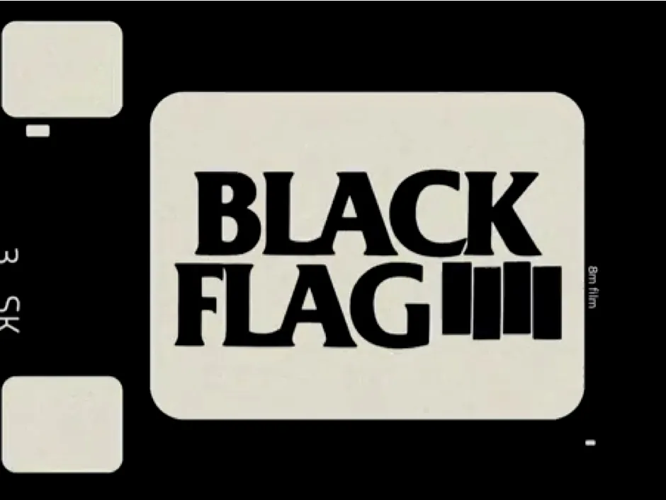
The Black Flag band logo is one of the most recognized symbols in the punk rock world, encapsulating not only the ethos of the band itself but also the entire genre it represents. A stark, minimalistic design consisting of four black bars, the logo has become synonymous with rebellion, defiance, and the DIY ethos that has always been at the heart of punk rock. For anyone who has delved into the world of punk music, the Black Flag band logo is more than just a design; it’s an emblem of a cultural movement.
Origins of the Black Flag Band Logo
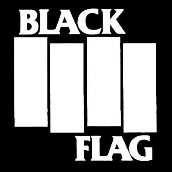
The Black Flag band logo was designed by Raymond Pettibon, an artist and the brother of Greg Ginn, the founding member of the band. Pettibon’s minimalist design has remained iconic for decades and plays a huge role in the visual identity of both the band and the punk movement at large. The four black bars are intended to represent a waving flag, a symbol of anarchy and rebellion that aligns perfectly with Black Flag’s ethos. It’s a logo that’s simple yet powerful, capturing the raw energy and defiance of the music itself.
The choice of four bars was deliberate, with each bar representing a building block of the band: simplicity, aggression, unity, and rebellion. Unlike the intricate and often flashy logos of other bands, the Black Flag band logo stands out for its sheer simplicity, making it more than just an aesthetic choice—it’s a statement.
Why the Black Flag Band Logo Stands Out
The Black Flag band logo isn’t just famous because it’s associated with an iconic band—it’s famous because it symbolizes a certain kind of spirit that many fans relate to on a personal level. In a genre that prides itself on standing outside the mainstream, the logo, much like Black Flag’s music, is an exercise in minimalism that resonates deeply with the punk community. The stark, bold lines convey a sense of order amid chaos, which could be seen as a metaphor for the band’s music—a disciplined approach to what is often thought of as a chaotic genre.
The Four Bars: A Simple but Powerful Statement
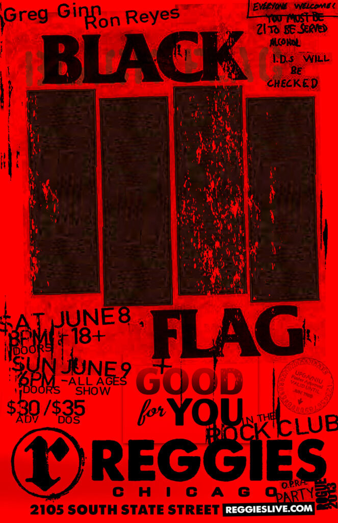
The four black bars that comprise the Black Flag band logo are simple, but they are charged with meaning. They symbolize a flag in motion, signifying defiance and resistance. The waving black flag evokes imagery of anarchy, rebellion, and opposition to the mainstream, ideals that Black Flag has stood for throughout their career.
In many ways, the Black Flag band logo is a perfect visual representation of the band’s sound: loud, unapologetic, and confrontational, yet disciplined and stripped down to its bare essentials. It’s a design that communicates a lot without saying much at all, much like the raw, abrasive style of punk rock that Black Flag helped pioneer.

The Logo and Punk Rock Culture
To understand the true impact of the Black Flag band logo, it’s essential to place it within the context of the punk rock movement. Punk rock, by its very nature, is about stripping things down to the core, rejecting excessive decoration and flamboyance in favor of raw emotion and authenticity. The Black Flag band logo perfectly embodies these ideals.
Unlike the ornate logos of some of the bigger rock bands of the 1970s, such as Led Zeppelin or Pink Floyd, the Black Flag band logo was as gritty and unadorned as the music itself. It wasn’t designed to sell records or merchandise—it was designed to be a symbol, one that fans could quickly recognize and embrace as their own. The fact that so many punk rock fans have tattooed the Black Flag band logo onto their skin is a testament to its lasting impact.
DIY Aesthetic
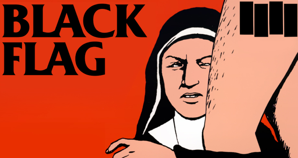
Another reason why the Black Flag band logo stands out is because it perfectly aligns with the DIY (Do It Yourself) aesthetic of punk rock. The logo wasn’t created by a big-time graphic designer or branding agency—it was created by someone within the band’s inner circle. This hands-on approach to art and branding is something that resonates deeply within punk culture, where bands often self-produce their records, design their own flyers, and book their own tours.
The Black Flag band logo quickly became a visual representation of this DIY ethos. It was easy to reproduce by fans, who could spray paint it on walls, draw it on notebooks, and print it on T-shirts with minimal effort. The simplicity of the design made it an ideal choice for a movement that prided itself on being accessible and unpolished.
The Band Members and Their Influence on the Logo
While the Black Flag band logo was designed by Raymond Pettibon, the band members themselves had a strong influence on the overall direction of the band’s branding. Greg Ginn, the band’s guitarist and primary songwriter, was a staunch advocate for the band’s minimalist and no-nonsense approach to both music and visual presentation. For Ginn, the logo wasn’t just a way to sell merchandise—it was a way to visually express the band’s philosophy.
Similarly, frontman Henry Rollins, who joined the band in 1981, has also spoken about how the logo represents the raw, confrontational attitude that Black Flag embodies. Rollins brought a new level of intensity and aggression to the band, and the logo—simple, bold, and unyielding—was a perfect match for the band’s evolving sound and message.
Rollins has often discussed the importance of maintaining authenticity in both the band’s music and its visual representation. The Black Flag band logo, in its stark minimalism, does just that—it represents the essence of what the band is about: rebellion, defiance, and a refusal to compromise.
Thoughts Behind the Logo from a Band Member’s Perspective
If we were to imagine what the Black Flag band members might think of their iconic logo, it would likely revolve around the idea of its enduring power. For the band, the logo probably represents much more than just a visual brand—it’s a symbol of everything they’ve stood for over the years. It’s a flag that their fans can rally around, a visual marker that signifies their commitment to punk rock’s anti-authoritarian values.
The Black Flag band logo is more than just an image; it’s a flag of rebellion, a symbol that gives the band members a sense of identity and purpose. Over the years, it has become an intrinsic part of their legacy, one that continues to resonate with new generations of fans.
The Enduring Legacy of the Black Flag Band Logo
More than 40 years after its creation, the Black Flag band logo remains one of the most enduring symbols in the world of music. It has been appropriated, imitated, and parodied countless times, but its original meaning remains intact. For fans of the band—and punk rock in general—the logo represents a shared set of values, a commitment to staying true to oneself, and a refusal to conform to the expectations of the mainstream.
In a world where logos are often seen as tools for commercialization, the Black Flag band logo stands out as a symbol of independence and authenticity. It’s a reminder that sometimes the most powerful statements are the simplest ones. The four black bars may be minimal in design, but their impact has been anything but small.
Conclusion: A Symbol of Punk Rock’s Rebellious Spirit
In conclusion, the Black Flag band logo is much more than a simple graphic design—it is a visual representation of everything that the band and the punk rock movement stand for. Created by Raymond Pettibon, the logo’s four black bars symbolize the band’s commitment to rebellion, simplicity, and authenticity. It’s a design that has endured for decades, resonating with fans and newcomers alike.
Whether it’s on a T-shirt, a wall, or a fan’s skin, the Black Flag band logo continues to serve as a powerful symbol of punk rock’s enduring spirit. Its minimalist design and powerful message ensure that it will remain one of the most iconic logos in music history for years to come.
