When you think of Pierce the Veil, the beloved post-hardcore band from San Diego, a few things immediately come to mind: high-energy live performances, emotionally charged lyrics, and a fiercely loyal fanbase. But for many fans, their logo also plays a big role in the band’s identity. It’s more than just a design—it’s a symbol of the band’s journey, sound, and connection to their audience.
In this article, we’ll explore the Pierce the Veil band logo, the story behind it, how it evolved over time, and why it resonates so deeply with fans. From its stylistic choices to its role in the broader post-hardcore genre, let’s take a closer look at this iconic visual identity.
The Rise of Pierce the Veil
Before diving into their logo, it’s important to understand who Pierce the Veil is and why their visual branding matters. Formed in 2006 by brothers Vic Fuentes and Mike Fuentes, Pierce the Veil quickly gained recognition with their debut album A Flair for the Dramatic. Over the years, they’ve carved out a space in the post-hardcore and emo scenes, blending heavy instrumentals with melodic vocals and deeply personal lyrics.
The band’s fanbase grew exponentially with albums like Selfish Machines and Collide with the Sky, where songs such as King for a Day and Caraphernelia became anthems. As their popularity soared, so did the importance of their logo, which became a recognizable symbol of their music and message.
The Pierce the Veil Band Logo: A Unique Identity
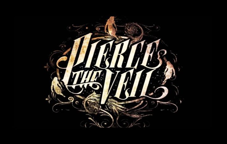
The Pierce the Veil band logo is distinctive for its intricate and stylized lettering. Unlike many bands that opt for sharp, aggressive designs, Pierce the Veil takes a more elegant and artistic approach.
The logo prominently features the band’s name in an elaborate, flowing script. The letters often appear hand-drawn, with delicate curves, swirls, and flourishes. This ornate design reflects the band’s ability to balance beauty and intensity in their music. The Pierce the Veil band logo isn’t just another cookie-cutter emblem—it’s a work of art that mirrors their melodic yet chaotic sound.
Key Features of the Logo:
- Ornate Lettering: The flowing, calligraphic style gives the logo an artistic and slightly vintage feel.
- Custom Design: Unlike many logos that use generic fonts, the Pierce the Veil band logo feels personal and unique—much like their music.
- Dark Yet Elegant Aesthetic: While the logo doesn’t scream aggression like many metal or hardcore logos, its intricate details give it a moody, atmospheric vibe.

Why the Logo Resonates with Fans
The Pierce the Veil band logo stands out because it perfectly matches the band’s identity. Post-hardcore music often thrives on emotion, storytelling, and a mix of rawness and melody. This logo captures all of that:
- A Symbol of Emotional Connection
Pierce the Veil’s music speaks to fans on a personal level, tackling themes of heartbreak, self-reflection, and resilience. The logo, with its artistic curves and hand-drawn feel, represents this emotional connection—it feels intimate and crafted with care. - Recognizable Branding
Over the years, the Pierce the Veil band logo has appeared on album covers, t-shirts, posters, and more. Its consistent use has made it instantly recognizable to fans worldwide. Whether it’s on a vinyl record or a concert hoodie, the logo serves as a badge of belonging for the Pierce the Veil community. - A Balance of Aggression and Artistry
Just like the band’s music, the logo finds a balance between beauty and intensity. This duality is central to the post-hardcore genre, where heavy breakdowns coexist with melodic choruses and introspective lyrics.
Evolution of the Logo
While the Pierce the Veil band logo has remained fairly consistent over the years, there have been subtle variations.
- On earlier albums like A Flair for the Dramatic, the logo was slightly simpler, with fewer flourishes and a cleaner overall look.
- By the time Collide with the Sky and Misadventures were released, the logo had evolved into its full, ornate form. The increased detail reflected the band’s growth and their expanding creative vision.
The consistency of the logo, despite these minor tweaks, has helped solidify it as a key part of the band’s identity.
Band Members and Their Influence
The Pierce the Veil band logo feels so authentic because it reflects the personalities and artistry of the band members themselves.
- Vic Fuentes (vocals, guitar) is known for his poetic lyricism and emotional depth. His influence can be felt in the delicate, almost lyrical design of the logo’s lettering.
- Mike Fuentes (drums) brings intensity and energy to the band’s sound, which is subtly mirrored in the logo’s intricate, dynamic flow.
- Other members, like Tony Perry (lead guitar) and Jaime Preciado (bass), contribute to the band’s overall identity as musicians who bridge the gap between technical skill and heartfelt expression.
For the band, the logo is more than just a name—it’s a reflection of their artistry, growth, and the connection they share with fans.
Why a Logo Matters in Post-Hardcore Music
The Pierce the Veil band logo also highlights the importance of visual branding in the post-hardcore genre. In a music scene that thrives on emotion and individuality, a logo is more than just a design—it’s an extension of a band’s story.
For bands like Pierce the Veil, a strong logo:
- Helps establish their identity in a crowded music scene.
- Creates a deeper connection with fans who proudly wear the logo on merch.
- Acts as a visual signature that complements the music’s message and aesthetic.
The ornate and unique nature of the Pierce the Veil band logo sets it apart, making it a perfect representation of the band’s sound and vision.

Final Thoughts: A Visual Legacy
The Pierce the Veil band logo isn’t just a design—it’s a symbol of the band’s journey, their music, and the community they’ve built. Its intricate, flowing lettering reflects the balance of beauty and chaos that defines Pierce the Veil’s sound.
For fans, the logo is a mark of identity, a reminder of the songs and lyrics that have shaped their lives. And for the band, it’s a timeless emblem of their artistry and the emotional connection they share with listeners worldwide.
In the world of post-hardcore music, where authenticity and emotion reign supreme, the Pierce the Veil band logo stands as a shining example of how a visual identity can capture the heart and soul of a band.
