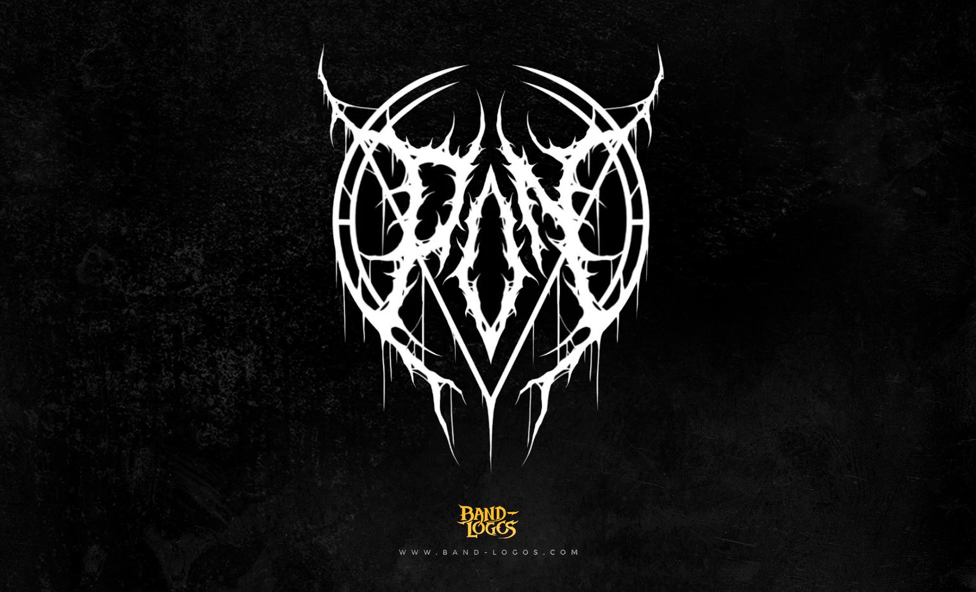
The a perfect circle band logo stands as one of the most distinctive and philosophically charged visual identities in alternative rock. Formed in 1999 by Tool vocalist Maynard James Keenan and guitarist Billy Howerdel, A Perfect Circle emerged with a sonic palette that balanced aggression with atmospheric beauty, and their logo perfectly captured this duality. The circular emblem with its interconnected geometric elements has become instantly recognizable among fans of progressive and alternative metal, representing far more than just a band name.
The Origins of A Perfect Circle
A Perfect Circle was born from a collection of demo recordings that guitarist Billy Howerdel had been developing since the early 1990s. Howerdel, who worked as a guitar technician for bands like Nine Inch Nails, Tool, and The Smashing Pumpkins, had spent years refining his musical vision. When Maynard James Keenan heard these recordings, he was immediately drawn to their emotional depth and sonic architecture. The partnership between Howerdel and Keenan became the foundation for what would become one of the most critically acclaimed acts in alternative rock.
The band’s original lineup also included paz Lenchantin on bass, Troy Van Leeuwen on guitar, and Tim Alexander on drums, though the rhythm section would see changes before their debut album. By the time they recorded Mer de Noms in 2000, the lineup had solidified with Josh Freese on drums and Lenchantin on bass, alongside founding members Howerdel and Keenan, plus guitarist Troy Van Leeuwen.
The Design Philosophy Behind the A Perfect Circle Band Logo
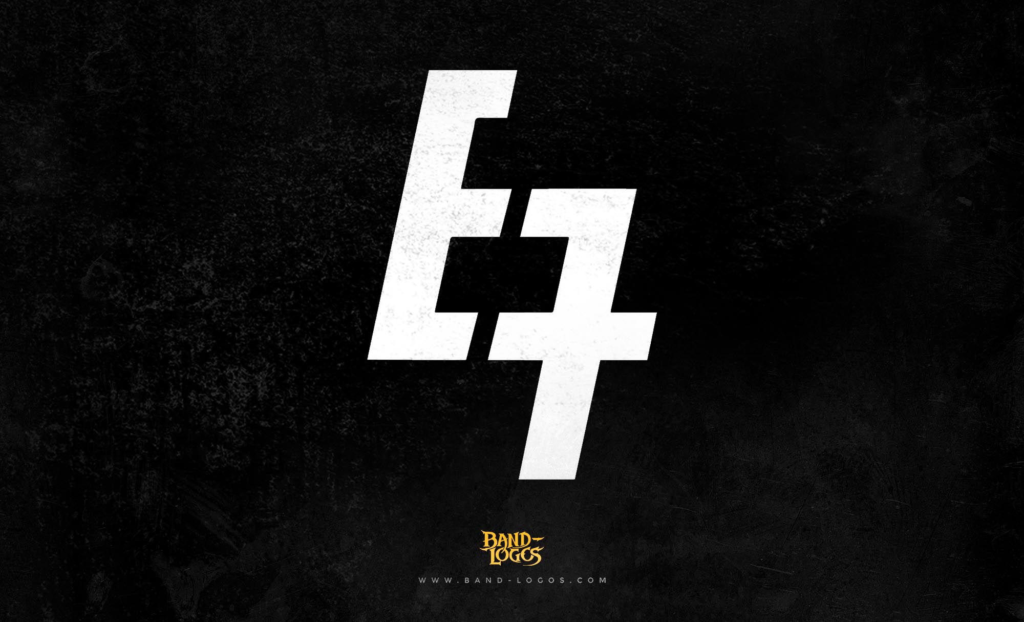
The a perfect circle band logo features a minimalist circular design with internal geometric patterns that create a sense of movement and balance. While the exact designer of the logo has not been widely publicized in mainstream sources, the visual direction for A Perfect Circle’s branding was closely tied to the band’s overall artistic vision, which Billy Howerdel played a significant role in shaping. The logo reflects the mathematical precision and philosophical underpinnings that characterize much of the band’s work.
The circular form itself carries deep symbolic weight. In geometry and philosophy, the circle represents wholeness, infinity, and the cyclical nature of existence. For A Perfect Circle, this imagery aligns perfectly with the themes explored in their lyrics, which often grapple with existential questions, human connection, and the search for meaning. The logo’s clean lines and symmetrical construction mirror the band’s meticulous approach to songwriting and production.
Evolution and Variations
Throughout their career, the a perfect circle band logo has remained remarkably consistent, though subtle variations have appeared across different album releases and tour merchandise. The core circular design has been rendered in different colors and textures to match the aesthetic of each album cycle. For Mer de Noms, the logo appeared in stark black and white, emphasizing the raw emotional landscape of the debut. Later releases saw the logo integrated with more complex artwork, but the fundamental geometry remained unchanged.
This consistency has helped establish the logo as an enduring symbol within the broader landscape of band logos. Unlike many acts that reinvent their visual identity with each album, A Perfect Circle has maintained a singular vision that reinforces brand recognition while allowing the music to evolve independently.
Symbolic Language and Visual Identity
The visual language of the a perfect circle band logo extends beyond mere aesthetics into the realm of meaningful symbolism. The interconnected elements within the circle can be interpreted as representing the relationships between band members, the connection between artist and audience, or the interplay between different aspects of consciousness. This multilayered symbolism invites interpretation, much like the band’s lyrics themselves.
In the context of metal band logos, A Perfect Circle’s design stands apart from the aggressive typography and gothic imagery often associated with heavier genres. While bands in the extreme metal spectrum, particularly within black metal band logos, favor illegible, corpse-paint-inspired lettering, A Perfect Circle opted for philosophical minimalism. This choice reflects their position as a band that incorporates metal elements without fully embracing genre conventions.
Band Members and Their Contributions
The creative core of A Perfect Circle has always been the partnership between Maynard James Keenan and Billy Howerdel. Keenan, already established as the enigmatic frontman of Tool, brought his distinctive vocal style and lyrical depth to the project. His ability to convey vulnerability and intensity in equal measure gave A Perfect Circle a unique emotional resonance.
Billy Howerdel serves as the band’s primary songwriter, guitarist, and creative architect. His background in guitar tech work for major touring acts gave him an insider’s perspective on production and live performance. Howerdel’s compositions form the foundation upon which Keenan’s vocals are built, creating a collaborative dynamic that has defined the band’s sound across four studio albums.
Throughout their history, A Perfect Circle has featured numerous accomplished musicians in supporting roles. James Iha of The Smashing Pumpkins contributed guitar work on their second album, Thirteenth Step. Matt McJunkins has served as the band’s bassist since 2006, while Jeff Friedl took over drumming duties around the same time. These personnel changes have allowed the band to explore new sonic territories while maintaining their core identity.
Recent Activity and Discography
After a lengthy hiatus, A Perfect Circle returned with their fourth studio album, Eat the Elephant, in April 2018. The album debuted at number three on the Billboard 200 and marked their first new material in fourteen years. Eat the Elephant showcased a more restrained, atmospheric approach compared to earlier works, with electronic elements and subtle arrangements taking precedence over heavy guitar riffs. The album’s themes addressed political disillusionment, technological anxiety, and personal transformation, reflecting the changed landscape of both the music industry and the world at large.
The band supported the album with extensive touring throughout 2018 and 2019, performing at major festivals and headlining venues across North America and Europe. Their live performances have always been notable for their visual presentation, with elaborate stage designs and lighting that complement the music’s emotional intensity. According to Billboard, the album received generally positive reviews for its mature songwriting and willingness to experiment with quieter dynamics.
The band’s complete discography includes Mer de Noms (2000), which remains their highest-selling release, Thirteenth Step (2003), eMOTIVe (2004), a collection of politically charged cover songs, and Eat the Elephant (2018). Each album has explored different facets of the band’s musical personality while maintaining the philosophical and emotional depth that defines their work.
The Logo’s Place in Music Culture
The a perfect circle band logo has transcended its original purpose to become a cultural touchstone for fans who identify with the band’s introspective and questioning approach to rock music. The logo appears on countless t-shirts, posters, and tattoos, serving as a badge of belonging for those who connect with the band’s artistic vision. Its geometric simplicity makes it versatile and easily reproducible, while its symbolic depth ensures it carries weight beyond mere decoration.
In an era where visual branding plays an increasingly important role in music marketing, the a perfect circle band logo demonstrates the power of thoughtful design. Rather than following trends or conforming to genre expectations, the logo establishes its own visual language that perfectly complements the music it represents. This alignment between sound and symbol has contributed significantly to the band’s enduring appeal and cultural relevance.
Conclusion
The a perfect circle band logo exemplifies how visual identity can enhance and reflect a band’s musical philosophy. Through its geometric precision, symbolic richness, and consistent application across two decades, the logo has become inseparable from the band’s legacy. As A Perfect Circle continues to evolve musically, their iconic circular emblem remains a constant, reminding fans of the timeless themes and meticulous craftsmanship that have always defined their work. Whether encountered on an album cover, a concert poster, or a fan’s clothing, the logo instantly evokes the band’s unique position at the intersection of alternative rock, progressive metal, and philosophical inquiry.


