In the world of metal music, few logos are as iconic and influential as the Death band logo. Known for its brutal simplicity and menacing aesthetic, this logo has become synonymous with the birth of death metal and the pioneering work of the band Death. As the band that essentially created the genre, Death, led by the late Chuck Schuldiner, not only influenced countless musicians but also crafted a visual identity that is immediately recognizable in the heavy metal world.
In this article, we will take a closer look at the Death band logo, examining who designed it, the reasons behind its creation, its importance in the specific genre of death metal, and how it reflects the personalities of the band members. By the end, we’ll have a deeper appreciation for how this simple yet powerful logo has come to symbolize an entire movement in extreme metal.
Who Designed the Death Band Logo?
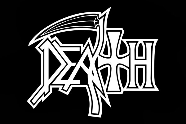
The Death band logo was designed by Ed Repka, a well-known graphic artist who has worked extensively in the metal scene, particularly with thrash and death metal bands. Repka’s distinctive style, which often features apocalyptic and dystopian themes, made him a natural fit for creating the visual identity for Death. His work with other prominent bands like Megadeth and Toxic Holocaust is well-known in metal circles, but his association with Death is particularly significant because of how it helped shape the identity of a new genre of music.
The Death logo is one of his most enduring works. Designed in the early 1980s, it was first introduced with the band’s debut album, “Scream Bloody Gore”. This logo has since become an emblem of the death metal genre and has been consistently used by the band throughout their career.
The Concept Behind the Death Band Logo
The Death band logo is a simple yet impactful design. At first glance, it may seem like a straightforward band name written in a brutal, angular font, but a closer look reveals the deeper meaning and design elements hidden within it.
The most noticeable feature is the grim reaper’s scythe integrated into the letter “T.” This scythe is a classic symbol of death, and its inclusion in the logo helps immediately convey the band’s association with morbid, dark, and violent themes. The “D” in the logo is adorned with an upside-down cross, another symbol often associated with death, Satanism, or anti-religion, all themes frequently explored in death metal. The blood dripping from the letters adds a sense of horror and violence, echoing the brutal and intense nature of the band’s music.
The purpose of the design was clear: to reflect the sound and vision of Death as a band. Chuck Schuldiner and the band wanted a logo that represented the aggression, darkness, and raw energy of their music. The grim reaper imagery and blood effects create a sense of foreboding and horror, perfectly aligned with the death metal aesthetic.
Importance of the Logo in Death Metal
The Death band logo played a pivotal role in shaping the visual identity of the death metal genre as a whole. In the 1980s, death metal was a fledgling genre, still finding its voice. Bands like Possessed, Morbid Angel, and, of course, Death, were leading the charge in developing this new sound. However, it wasn’t just the music that set these bands apart; it was their entire aesthetic, including their logos.
In death metal, the logo is just as important as the music itself. It serves as a badge of honor, a symbol of allegiance for fans. The Death logo, with its dark, gothic imagery and brutal design, encapsulated the essence of death metal and became one of the most recognizable symbols in the genre.
The band’s debut album, “Scream Bloody Gore” (1987), is widely regarded as one of the first death metal albums, and the logo was front and center on the album cover. This established Death’s identity and helped differentiate them from other heavy metal and thrash bands of the time. The use of grotesque, horror-inspired visuals, combined with the brutal sound of the music, made Death a trailblazer, and their logo became a symbol for the entire death metal movement.
As Death continued to release albums like “Leprosy” (1988) and “Spiritual Healing” (1990), their logo became synonymous with the genre. Its simplicity and boldness made it easy to reproduce on t-shirts, posters, and other merchandise, further spreading the band’s influence and reinforcing their status as genre pioneers.
Band Members and Their Influence on the Logo
While Ed Repka designed the logo, Chuck Schuldiner, the band’s founder and creative force, played a significant role in shaping the band’s visual identity. Schuldiner, often referred to as the “father of death metal,” was deeply involved in every aspect of Death, from the music to the imagery.
Schuldiner’s fascination with horror, death, and philosophical themes is reflected in the band’s lyrics, album artwork, and logo. The grim reaper motif, the blood, and the dark, gothic lettering all stem from his vision for the band. His desire to push the boundaries of extreme metal influenced not only the sound of Death but also their visual presentation.
Schuldiner once said that the band name, Death, was not just a literal representation of death but a metaphor for life’s hardships and struggles. This deeper meaning is reflected in the Death band logo, which, while brutal and aggressive, also hints at something more profound—perhaps the inevitability of death and the fragility of life. This duality between brutality and philosophy is what set Death apart from other bands in the genre, and it is mirrored in their logo.
Other band members also contributed to the band’s identity, but Schuldiner’s vision remained central. As Death evolved musically, moving from the raw brutality of their early albums to more progressive and technical sounds in albums like “Symbolic” (1995) and “The Sound of Perseverance” (1998), the logo remained a constant—an anchor that reminded fans of the band’s roots, even as they pushed the genre forward.
The Symbolism of the Death Logo: A Band Member’s Perspective
If Chuck Schuldiner could describe the significance of the Death band logo, he might say that it’s a representation of the band’s evolution. From the early days of thrash-influenced death metal to the later progressive and melodic influences, the Death logo stayed the same, representing the unwavering dedication to pushing boundaries in heavy metal.
For Schuldiner, the scythe in the logo was more than just a symbol of death—it was a reminder of the struggles the band had faced, from line-up changes to financial hardships. In many ways, the Death logo could be seen as a reflection of the band’s perseverance. The logo, like the band, endured through thick and thin, always maintaining its integrity, no matter how much the music evolved.
The Enduring Legacy of the Death Band Logo
Today, the Death band logo is not just a symbol of the band itself but a representation of death metal as a whole. It is one of the most iconic logos in metal history and is instantly recognizable to fans of the genre. For many, the logo represents the birth of a new sound—a genre that would go on to influence countless bands and reshape the landscape of extreme music.
Even after Chuck Schuldiner’s untimely death in 2001, the Death logo continues to live on. It is worn by fans worldwide, printed on album reissues, and remains a lasting tribute to a band that changed the course of heavy metal history.
Conclusion
The Death band logo is more than just a piece of graphic design—it is a symbol of the band’s lasting influence on the death metal genre. Designed by Ed Repka, the logo’s dark imagery, gothic lettering, and brutal simplicity perfectly capture the essence of Death’s music. It represents the aggressive, philosophical, and boundary-pushing nature of Chuck Schuldiner’s vision and remains a powerful symbol in the world of metal.
For fans of death metal, the Death logo is a badge of honor. It represents the raw, unapologetic spirit of a genre that refuses to conform to the mainstream. And for the band itself, it’s a reminder of their journey—from the early days of “Scream Bloody Gore” to their final album, “The Sound of Perseverance”. The Death band logo is, and always will be, a timeless emblem of death metal’s dark legacy.

