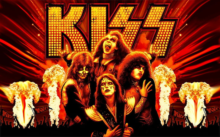
Few band logos are as iconic, enduring, and universally recognized as the Kiss band logo. Since their formation in the early 1970s, the American rock band Kiss has been known for their high-energy performances, theatrical makeup, and larger-than-life stage presence. But just as important to their visual identity is the striking, electrifying logo that has adorned their albums, merchandise, and stage sets for decades.

In this article, we’ll dive into the origins of the Kiss band logo, the designers behind its creation, and the reasons why this bold, simple design has become one of the most powerful symbols in rock music history. We’ll also explore the band’s members and their influence on the logo, as well as its cultural significance and lasting impact on both fans and the music industry at large.
The Origins of the Kiss Band Logo
The Kiss band logo first appeared on the band’s self-titled debut album, Kiss, which was released in 1974. It was designed by Ace Frehley, the band’s original lead guitarist, who came up with the now-famous look by sketching the band’s name on paper. Frehley gave the “K” and the “I” letters their signature sharp edges and lightning bolt-like appearance, which would come to define the bold, electrifying persona of Kiss.
The reason behind the design was simple but effective: the band wanted a logo that was eye-catching, powerful, and matched the intensity of their music and performances. With Kiss on the rise as one of the most theatrical and bombastic acts in rock ‘n’ roll, the logo had to reflect the larger-than-life image they were creating. The lightning bolt-style “S” characters convey the raw energy, excitement, and edge that the band brought to their live shows and their records.
This distinctive logo soon became a core part of Kiss’s brand, appearing on every album cover, stage backdrop, and countless pieces of merchandise throughout their career. From t-shirts to posters, the Kiss band logo is a symbol that screams rock ‘n’ roll rebellion, excess, and an unapologetic attitude.
The Lightning Bolt Controversy: A Unique Challenge
While the Kiss band logo has enjoyed massive success, it has also faced its share of controversies. In Germany, Austria, and Israel, the logo has had to be altered due to the lightning bolt-like appearance of the “S” characters. The original logo’s design was seen as too similar to the Nazi SS insignia, which is banned in those countries.
To avoid any association with Nazi symbols, Kiss changed their logo for these markets. In the revised version, the “S” characters are softened, giving them a more rounded, less angular shape. Despite these changes, the Kiss band logo has retained its core identity and remains just as recognizable around the world.
The Importance of the Kiss Band Logo in Rock Music
The Kiss band logo isn’t just a visual representation of the band—it’s a statement. From the moment you see it, you know that Kiss isn’t a band that plays by the rules. They are loud, bold, and proud to embrace the flamboyance and theatrics that define their sound and stage persona.
In the realm of rock music, image is just as important as sound. Kiss understood this better than most, and the Kiss band logo played a crucial role in shaping their image as larger-than-life rock icons. The logo’s simplicity and boldness make it instantly recognizable, even from a distance, which is exactly what you want when you’re headlining arenas and performing in front of tens of thousands of fans.

The lightning bolt “S” characters give the logo an aggressive, electric feel, capturing the raw energy and intensity of Kiss’s music. Whether it’s emblazoned on a drum kit, an album cover, or a leather jacket, the Kiss band logo sends a message: this is a band that is loud, unapologetic, and ready to rock.
The Band Members’ Influence on the Kiss Band Logo
Each member of Kiss has left their mark on the band’s visual identity, and their influence is felt in the Kiss band logo as well. Gene Simmons, the band’s iconic bassist and co-lead vocalist, is known for his Demon persona, complete with blood-spitting and fire-breathing on stage. Simmons has always been about pushing boundaries, and the bold, aggressive design of the logo fits perfectly with his larger-than-life stage presence.
Paul Stanley, the band’s rhythm guitarist and co-lead vocalist, has been the band’s heart and soul. Known for his Starchild persona and his powerful voice, Stanley has always emphasized the importance of the band’s image. The Kiss band logo reflects his desire for the band to stand out and be instantly recognizable, not just for their music but for their visuals as well.
As the designer of the logo, Ace Frehley‘s influence is perhaps the most direct. His original sketch became the blueprint for one of the most famous logos in rock history. Even after his departure from the band, Frehley’s contribution to the band’s identity through the logo remains a lasting part of Kiss’s legacy.
Peter Criss, the band’s original drummer and Catman persona, also brought a sense of theatricality and showmanship to Kiss’s image. While his direct influence on the logo design might not be as apparent, his contributions to the band’s visual aesthetic were essential in establishing Kiss as a band that embraced the idea of rock as a spectacle.
The Logo’s Enduring Legacy and Cultural Impact
The Kiss band logo has transcended the world of rock music to become a cultural symbol in its own right. It’s a logo that represents not just a band, but a way of life for Kiss’s legion of fans, known as the Kiss Army. Over the years, the logo has appeared on everything from guitars to action figures to pinball machines. Kiss is a band that knows how to market themselves, and the Kiss band logo has been a key part of that strategy.
In the genre of hard rock and heavy metal, logos play a critical role in defining a band’s identity. The Kiss band logo stands out as one of the most effective examples of this. Its simplicity and boldness allow it to be instantly recognizable, while its lightning bolt elements give it the edge that aligns perfectly with Kiss’s music and image.
For fans, the Kiss band logo represents more than just a band. It’s a symbol of loyalty, excitement, and a love for rock music that pushes the boundaries of what’s possible. Whether you’re a fan of their classic hits like “Rock and Roll All Nite” or their later works, the logo is a constant reminder of Kiss’s status as one of the most iconic rock bands in history.
Conclusion: The Power of the Kiss Band Logo
The Kiss band logo is one of the most enduring and iconic symbols in rock music. Its bold design and electrifying elements perfectly encapsulate the energy and larger-than-life persona of the band. From Ace Frehley’s initial sketch to its appearance on millions of pieces of merchandise, the logo has become a symbol of Kiss’s legacy in both the music world and popular culture.
For fans, the logo is a source of pride and a connection to the band they love. It represents the excitement of a Kiss concert, the rebellious spirit of rock ‘n’ roll, and the enduring appeal of a band that has always played by their own rules. As Kiss continues to perform and leave their mark on rock history, the Kiss band logo will remain a powerful symbol of their place in the pantheon of rock legends.

