The Korn band logo stands as a jagged, raw testament to the birth of a musical revolution. When looking back at the 1990s, few images summon the angsty, guttural energy of the era quite like that child-like scrawl. It is a paradox of graphic design: it is technically messy, amateurish by traditional standards, and created with a crayon. Yet, it became the defining symbol of a multi-platinum cultural shift.
While many corporate brands spend millions on focus groups to perfect their typography, the Korn band logo was birthed by the band’s frontman, Jonathan Davis. He wasn’t a professional graphic artist. He was a musician trying to capture a feeling. This masterclass breakdown explores how a simple, seemingly careless sketch bridged the gap between band trivia and high-level design strategy.
For designers and fans alike, the Korn band logo offers a strategic lesson in authenticity. It survives the digital age not because it is polished, but because it is human. By analyzing this piece of core authority page history, we uncover why “ugly” design often resonates deeper than perfection.
The Origin Story of the Iconic Korn Band Logo
Who designed the Korn band logo? The answer often surprises casual listeners. It wasn’t an agency; it was Jonathan Davis, the lead singer, sitting on the floor of a rehearsal space. The legend behind the design is a testament to the power of intuitive creation over technical precision.
Davis employed a unique “Crayon Method” to achieve the logo’s distinct look. Despite being right-handed, Davis reportedly picked up a crayon with his left hand. His goal was not to draw a logo, but to capture the shaky, unrefined essence of a child’s handwriting. He wanted the text to look as if a kid had scrawled it on a wall in a fit of emotion. This technique stripped away muscle memory and fine motor control, resulting in the authentic, distressed lines that vector filters struggle to replicate today.
The design debuted on their self-titled 1994 album, instantly setting the visual tone for the music inside. It was dark, disturbing, and unmistakably real. For a detailed timeline of the band’s rise alongside this visual identity, you can review the band’s history on Wikipedia: Korn (stylized as KoЯn) History.
Lesson 1: The Power of Anti-Design in the Korn Band Logo
One of the most frequent questions regarding the band’s imagery is: What is the meaning of the backwards ‘R’? Within the context of the Korn band logo, this wasn’t merely a stylistic gimmick. It was a calculated act of anti-design.
This aesthetic choice leaned heavily into the concept of “innocence lost,” a recurring theme in Korn’s lyrical content. The backwards ‘R’ famously mimics the branding of “Toys ‘R’ Us,” associating the band’s dark, heavy sound with childhood imagery. This juxtaposition created a psychological unease that became a hallmark of the genre.
- Intentional Subversion: By breaking the rules of typography, the logo signaled that the music would break the rules of rock.
- Genre Branding: This flip didn’t just define Korn; it established the visual language for the entire nu-metal logo design examples movement.
- Memorability: The human brain is wired to notice errors. The backwards letter acts as a “pattern interrupt,” making the Korn band logo impossible to ignore.
Lesson 2: Psychological Typography
Designers often ask: What font is the Korn band logo based on? The answer is the “No-Font” rule. There is no typeface. It is purely hand-drawn, which is exactly why it works.
The typography mimics a “scrawl” that suggests a lack of professional training, fitting the “Anti-Corporate” aesthetic of the 90s alternative scene. If you analyze the kerning (the space between letters) and the line weight, you see inconsistency. In traditional design, this is a failure. In the context of the Korn band logo, it is a triumph of psychological branding.
There is also a distinct visual synergy between the logo and the music. The jagged, sharp edges of the letters mirror the percussive, “slapping” bass sound of Fieldy and the guttural, erratic vocals of Davis. The logo looks exactly how the band sounds.
Replicating the Scratchy Aesthetic of the Korn Band Logo
For graphic designers looking to capture this energy, simply selecting a “grunge” font is rarely enough. To truly replicate the Korn band logo style, you must understand technical replication in modern vector software.
Step 1: The Analog Foundation
Do not start in Adobe Illustrator. Start with paper. Use a crayon, a charcoal stick, or a drying permanent marker. Draw your logotype with your non-dominant hand. This analog foundation provides the “happy accidents” that digital tools cannot synthesize.
Step 2: Vectorizing “Noise”
Once scanned, import your sketch into Illustrator. When using “Image Trace,” avoid the Black and White Logo preset, which smoothes out curves. Instead:
- Open the Image Trace panel.
- Select High Fidelity Photo or Sketched Art.
- Adjust the “Noise” threshold to low and the “Paths” to high.
This preserves the grit and the scratchy texture that defines the Korn band logo.
Step 3: Creating Custom Brushes
If you must work digitally, use the “Bristle Brush” tool in Illustrator/Photoshop. Configure the settings to respond to pen pressure and tilt, mimicking the wax buildup of a crayon.
For those who lack advanced software skills or need a quick mockup, you can utilize a primary band logo generator tool to find pre-made distressed textures that approximate this iconic style.
Comparative Analysis: Korn vs. The Extreme Metal Landscape
To understand the genius of the Korn band logo, we must compare it to its peers. The landscape of metal logos is vast, but Korn occupies a unique middle ground.
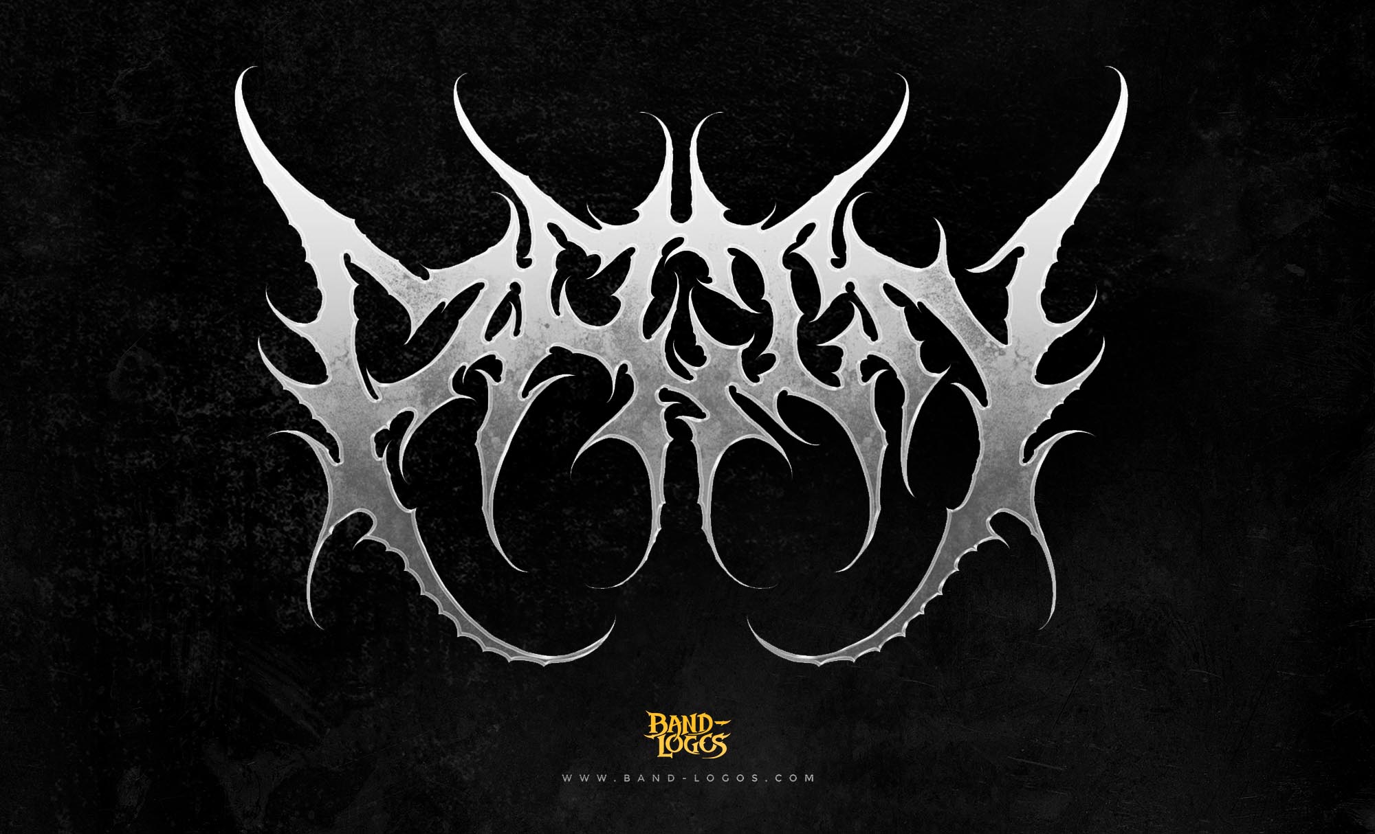
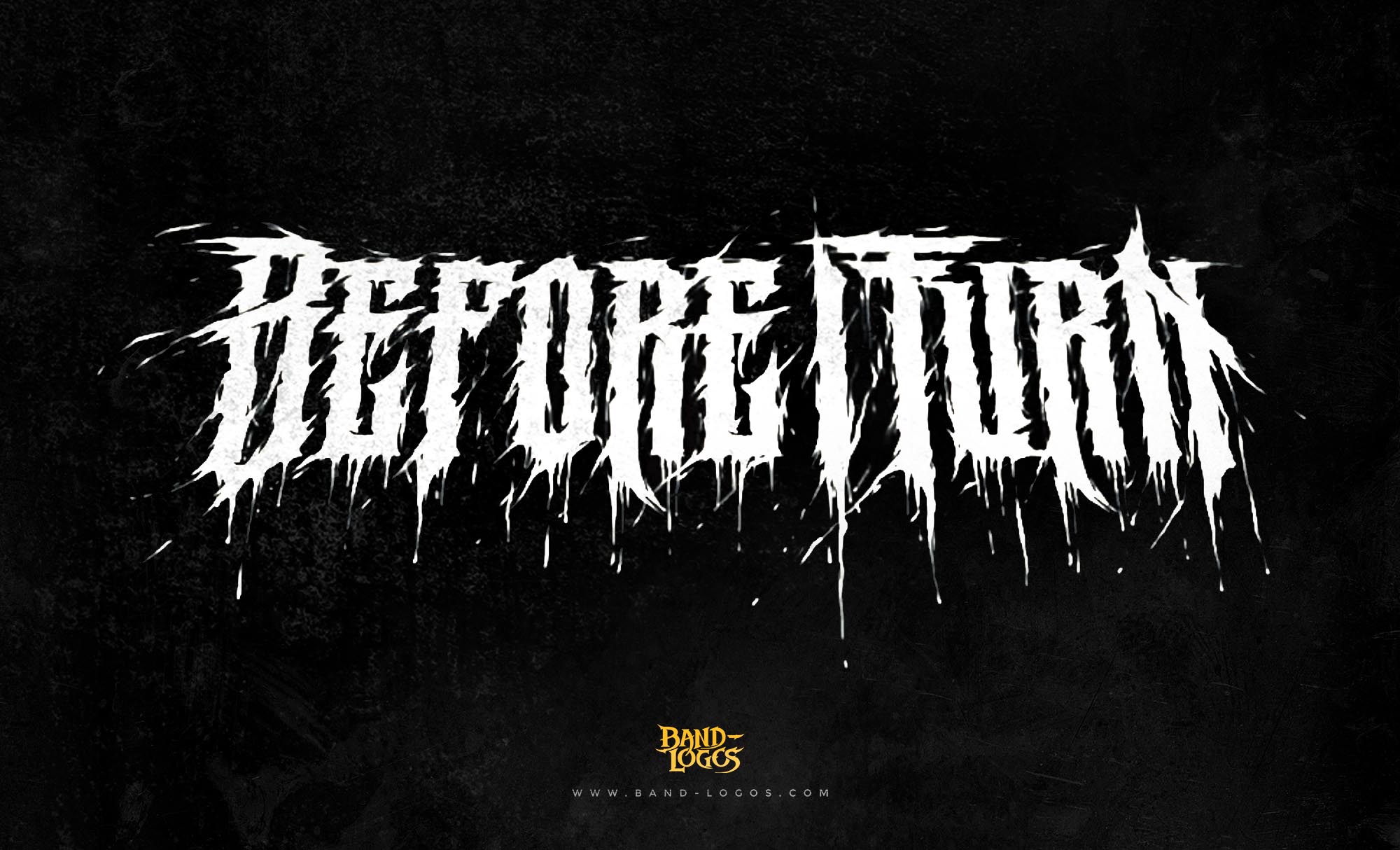
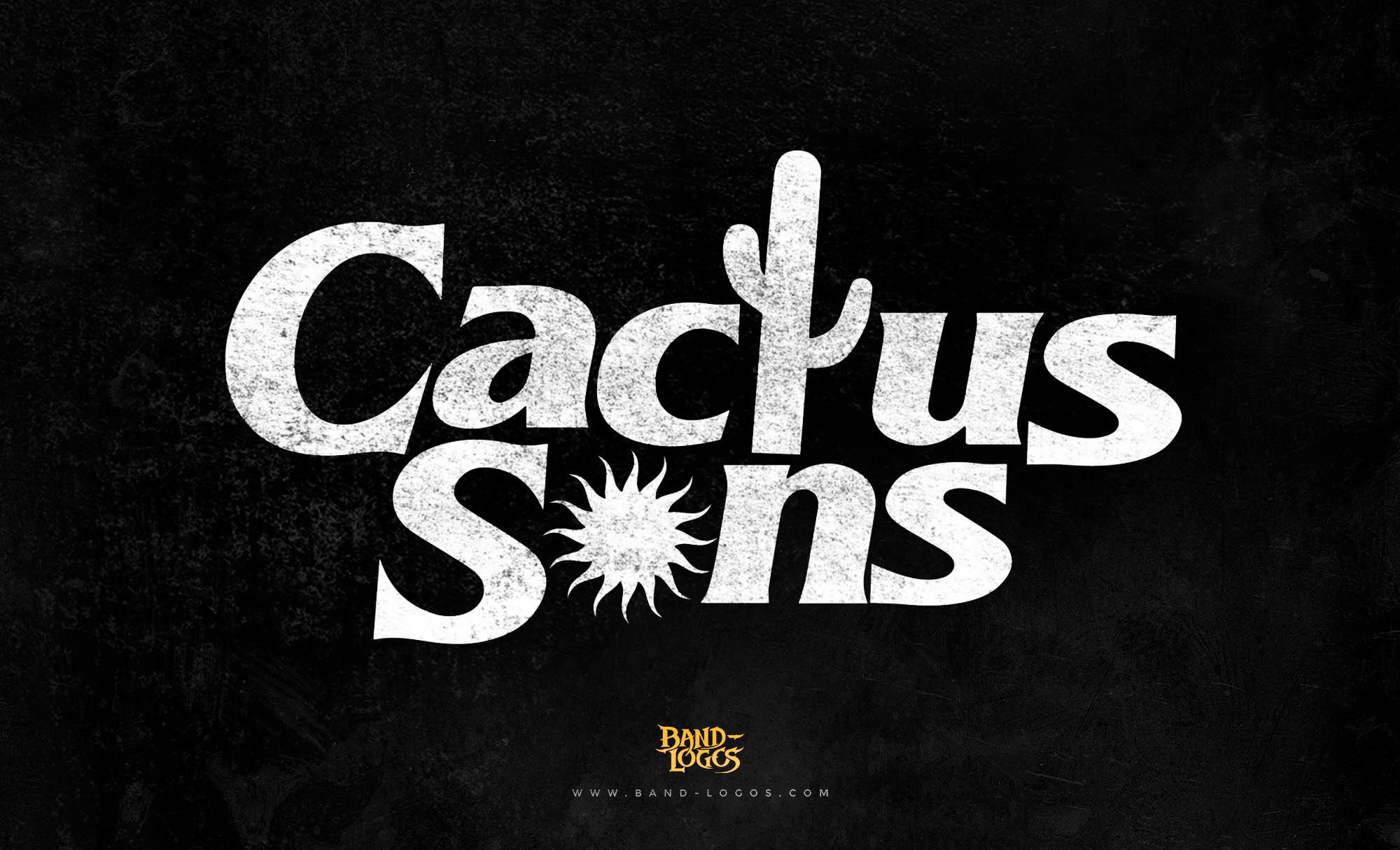
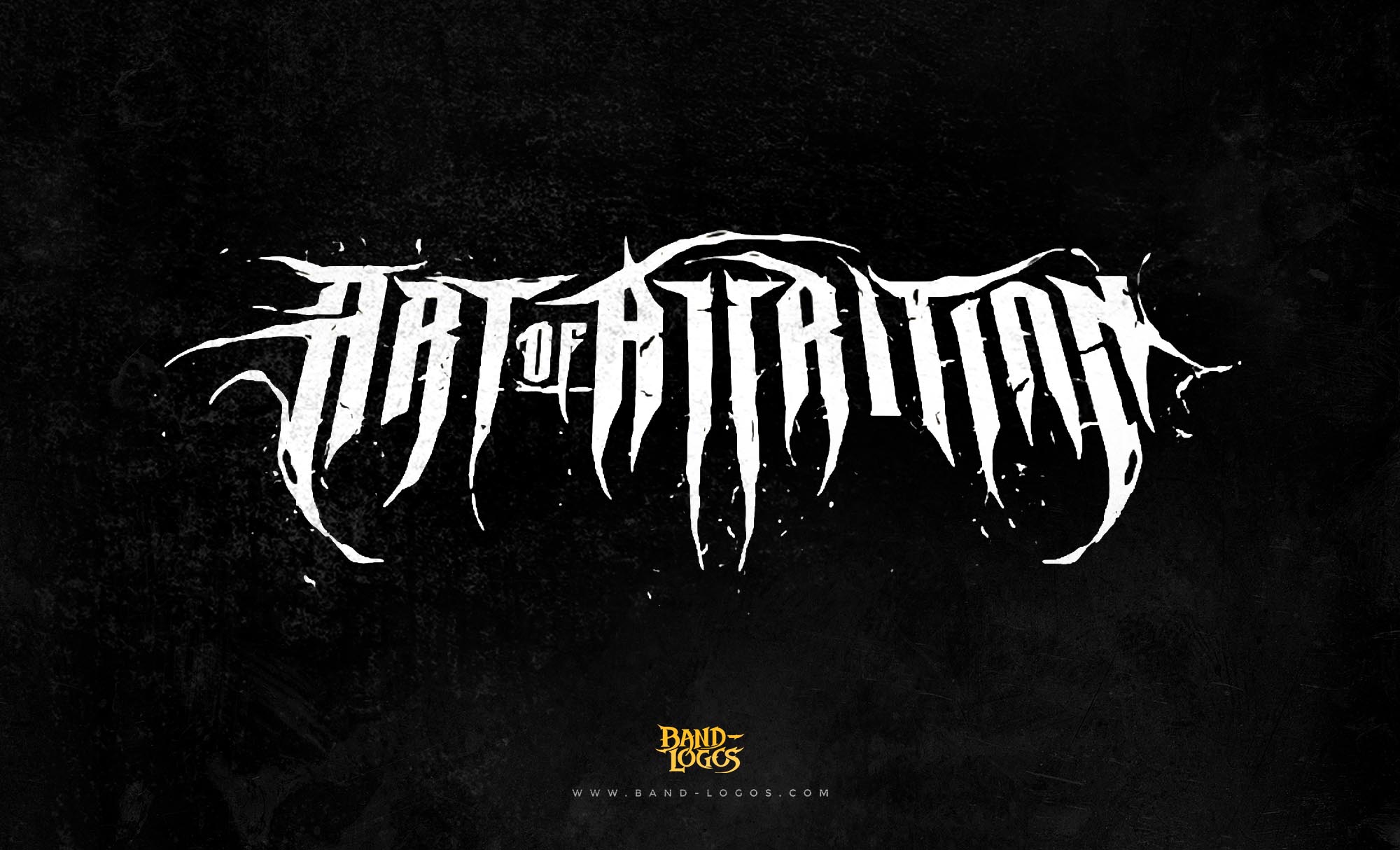
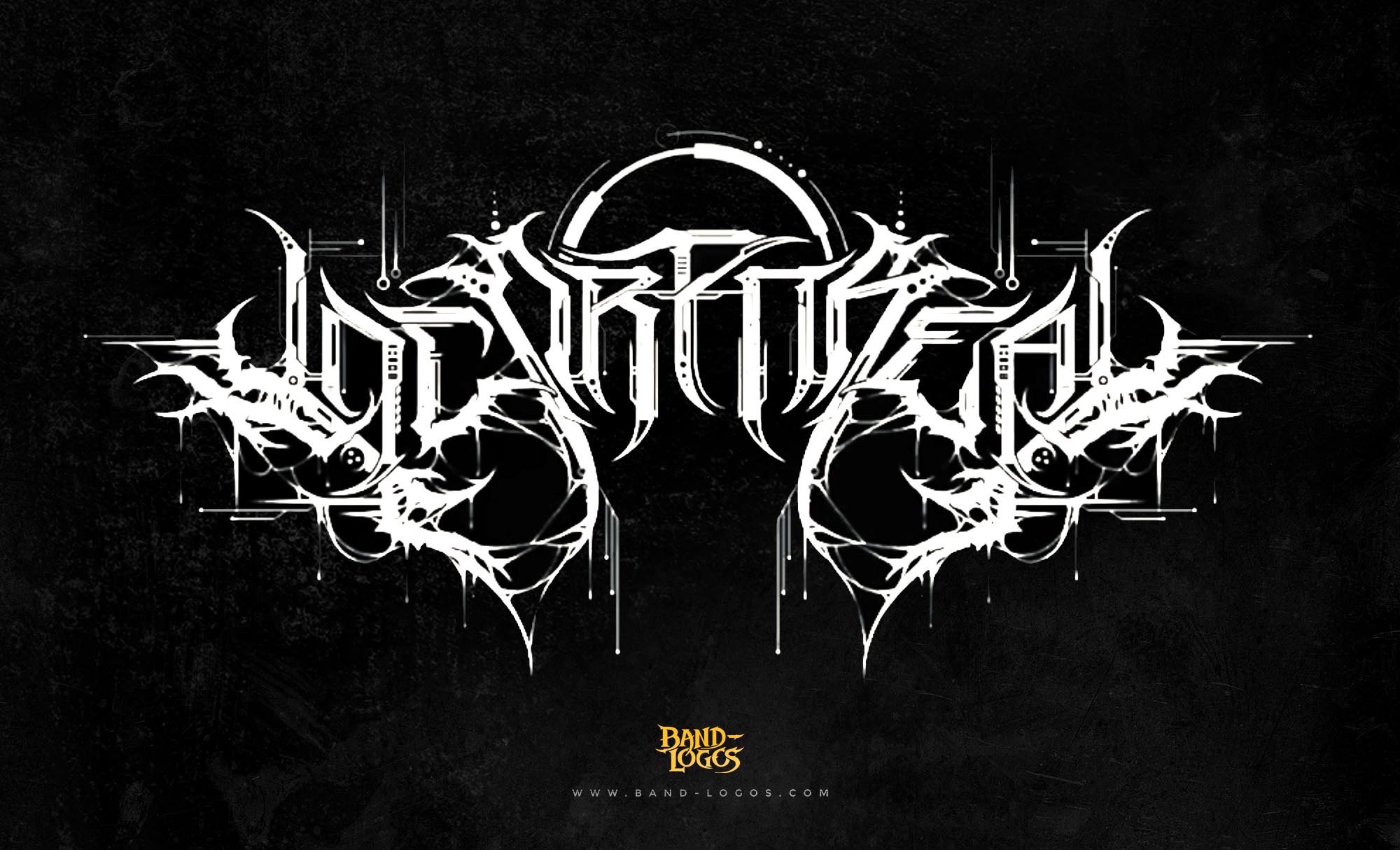
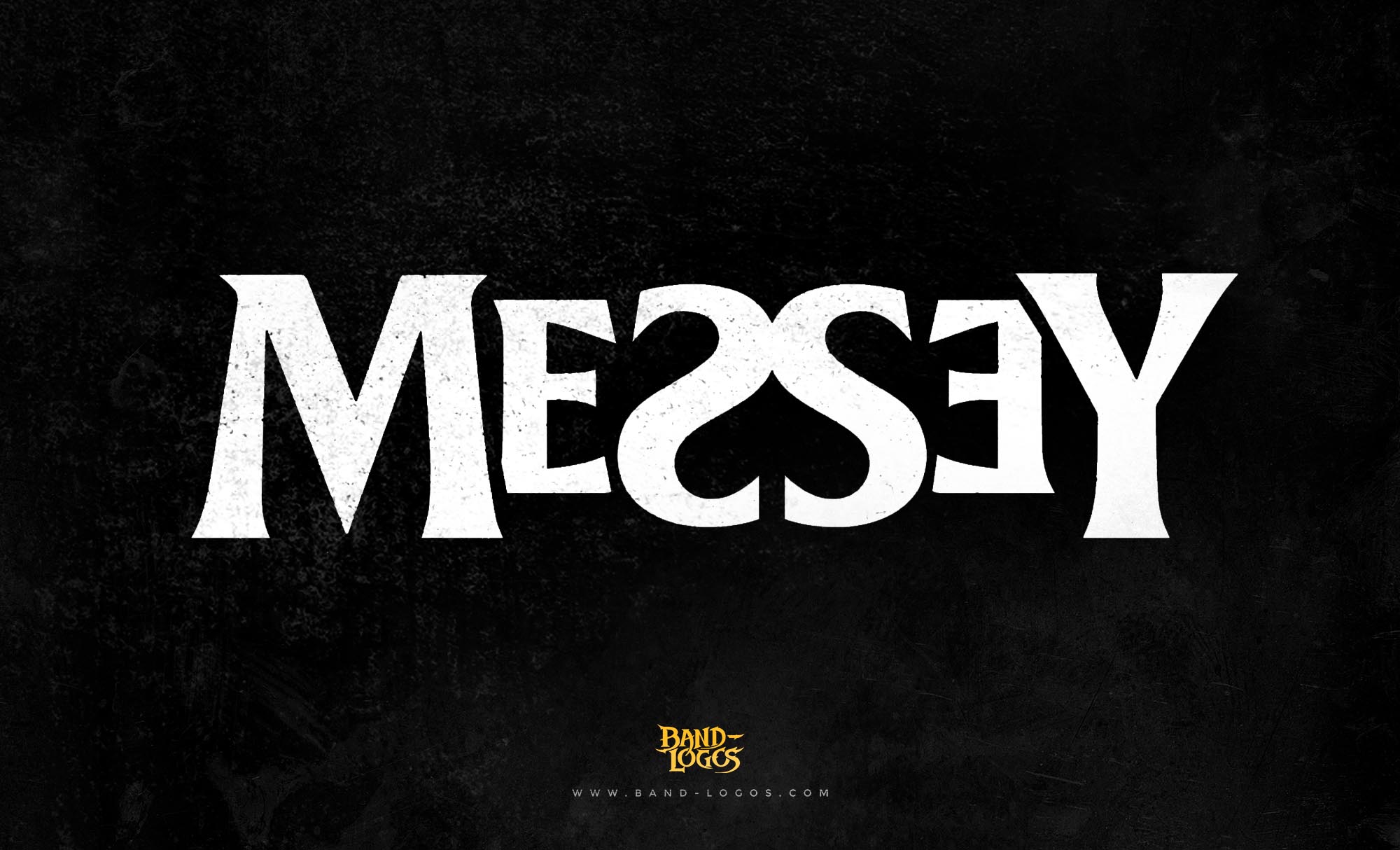
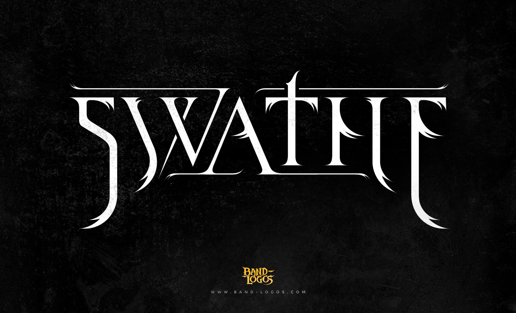
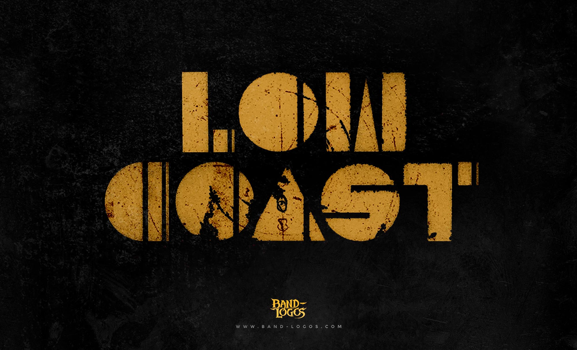
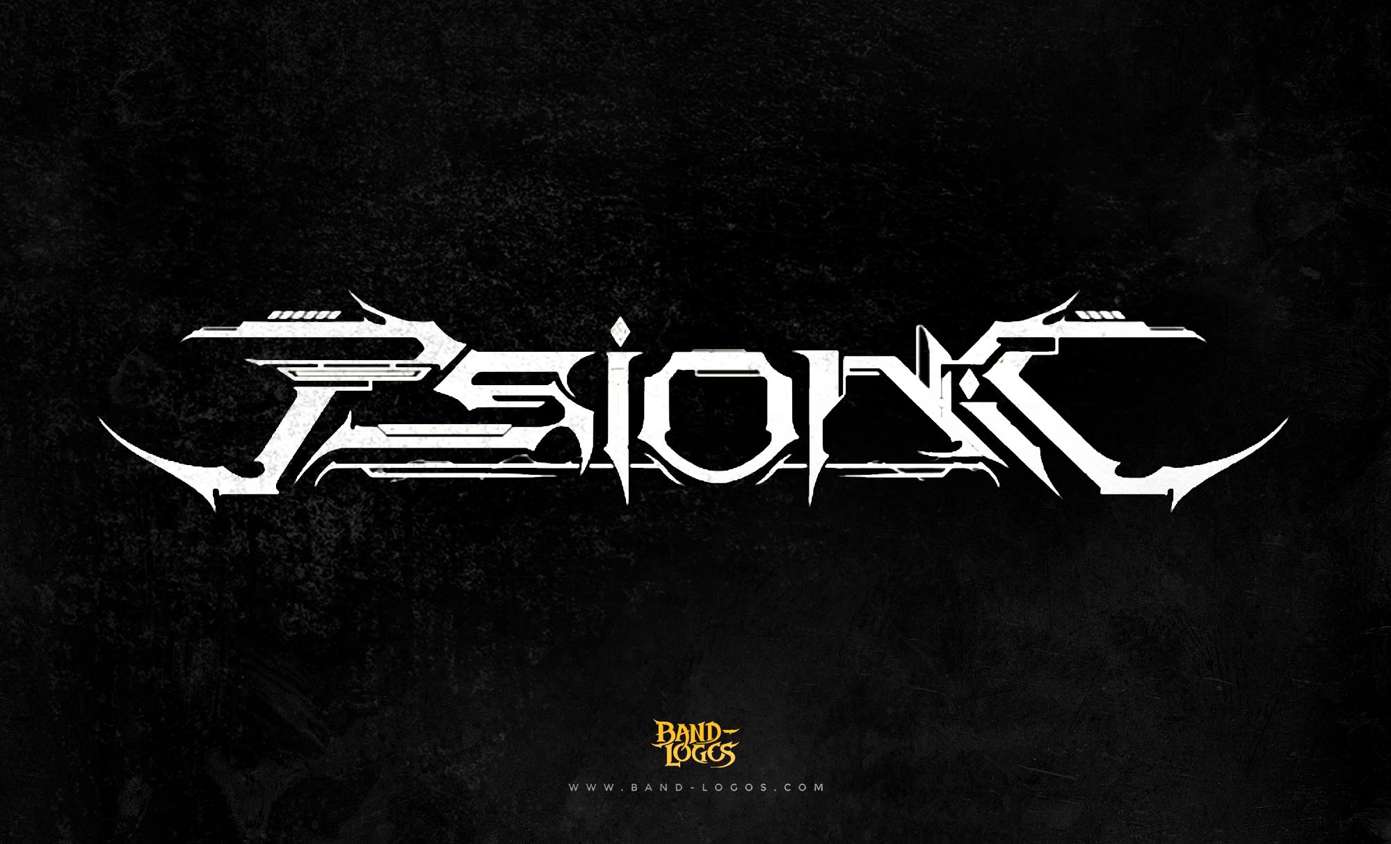
Korn vs. Metalcore: Modern metalcore leans heavily on symmetry and sharp, polished vectors. If you look at metalcore band logo design services, you see precision. Korn’s logo is the antithesis of this; it is loose and asymmetrical.
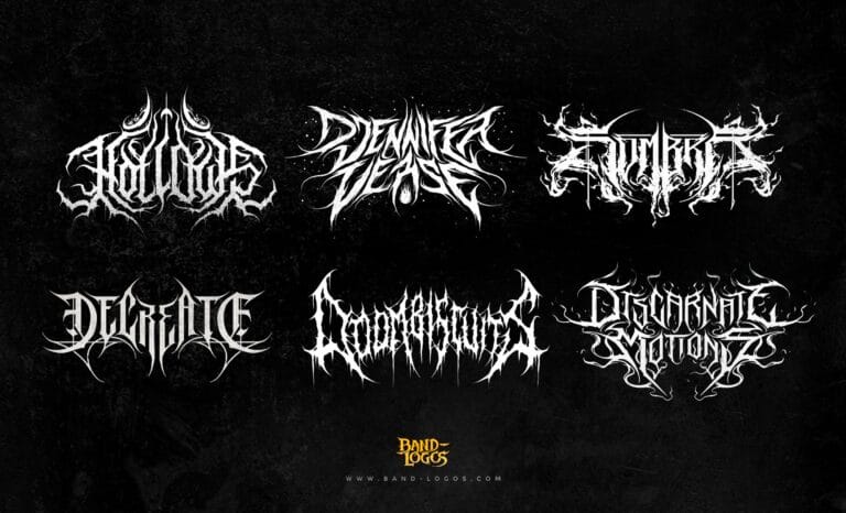
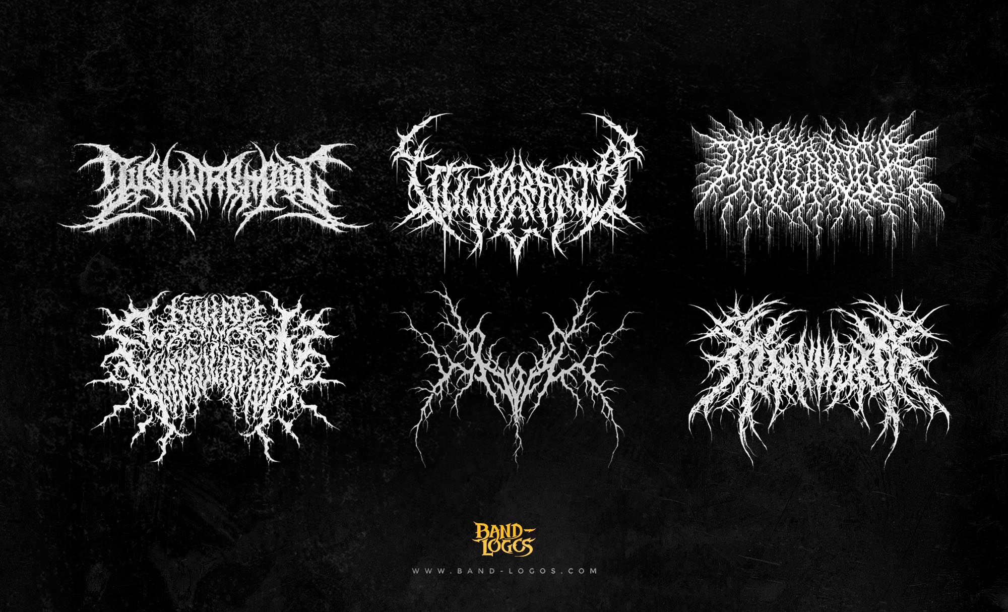
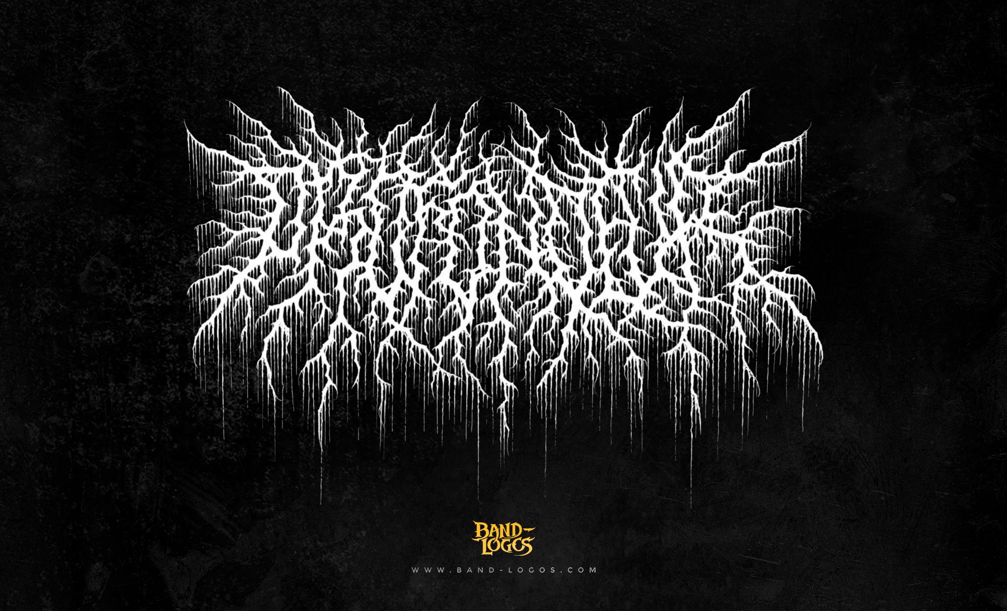
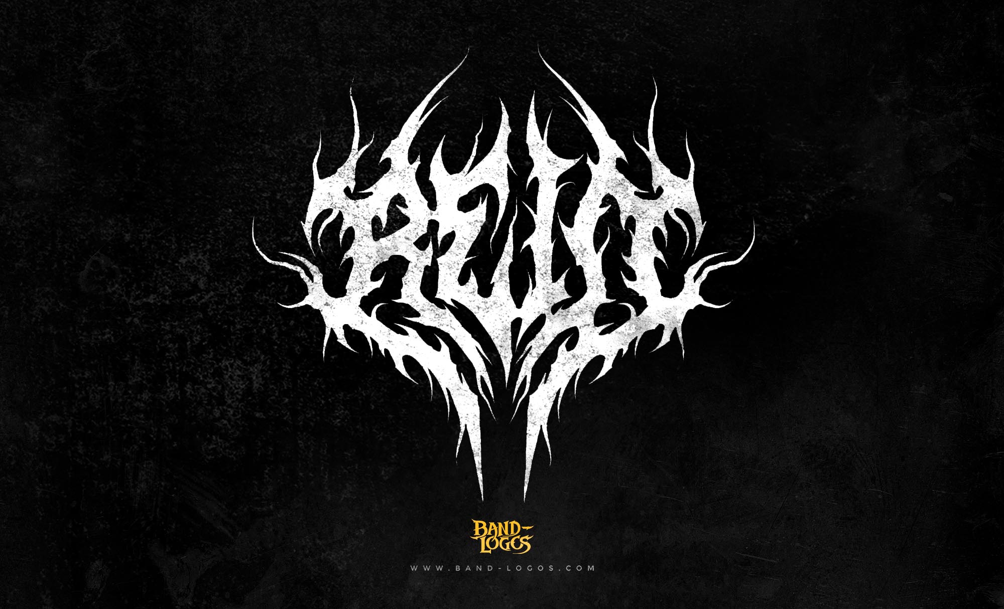
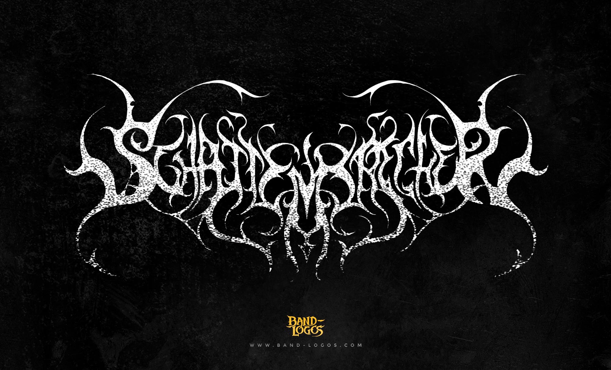
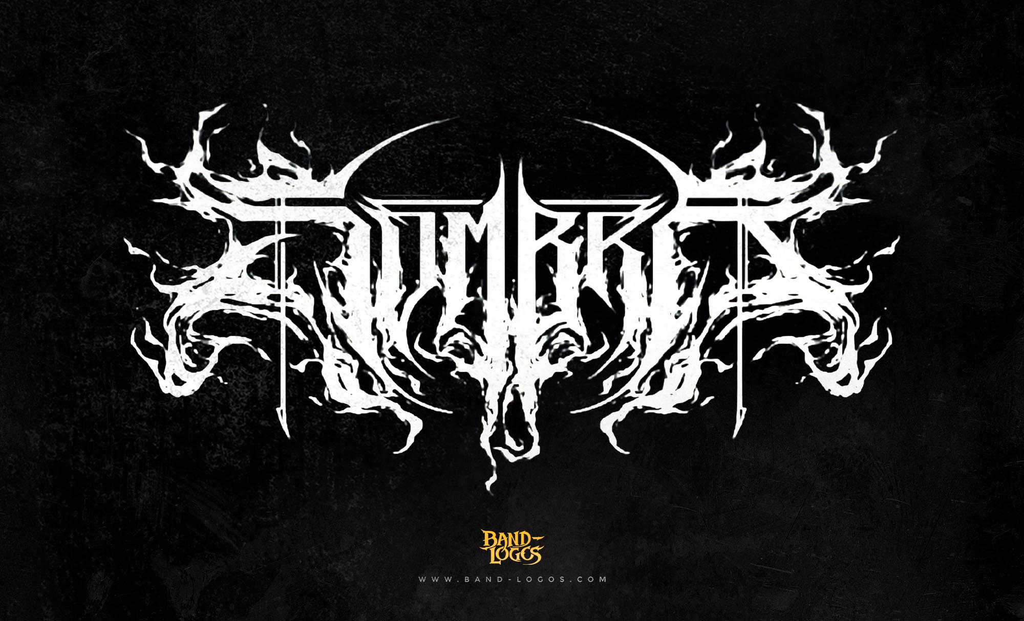
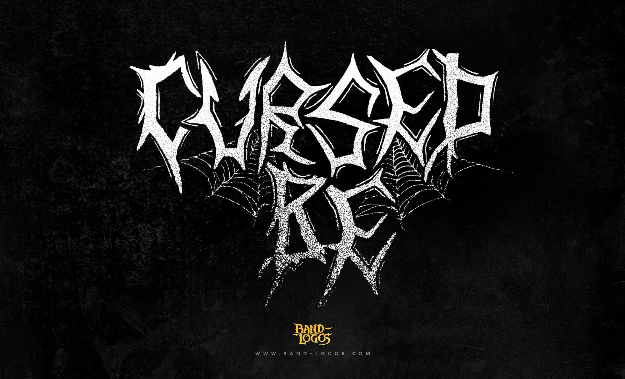
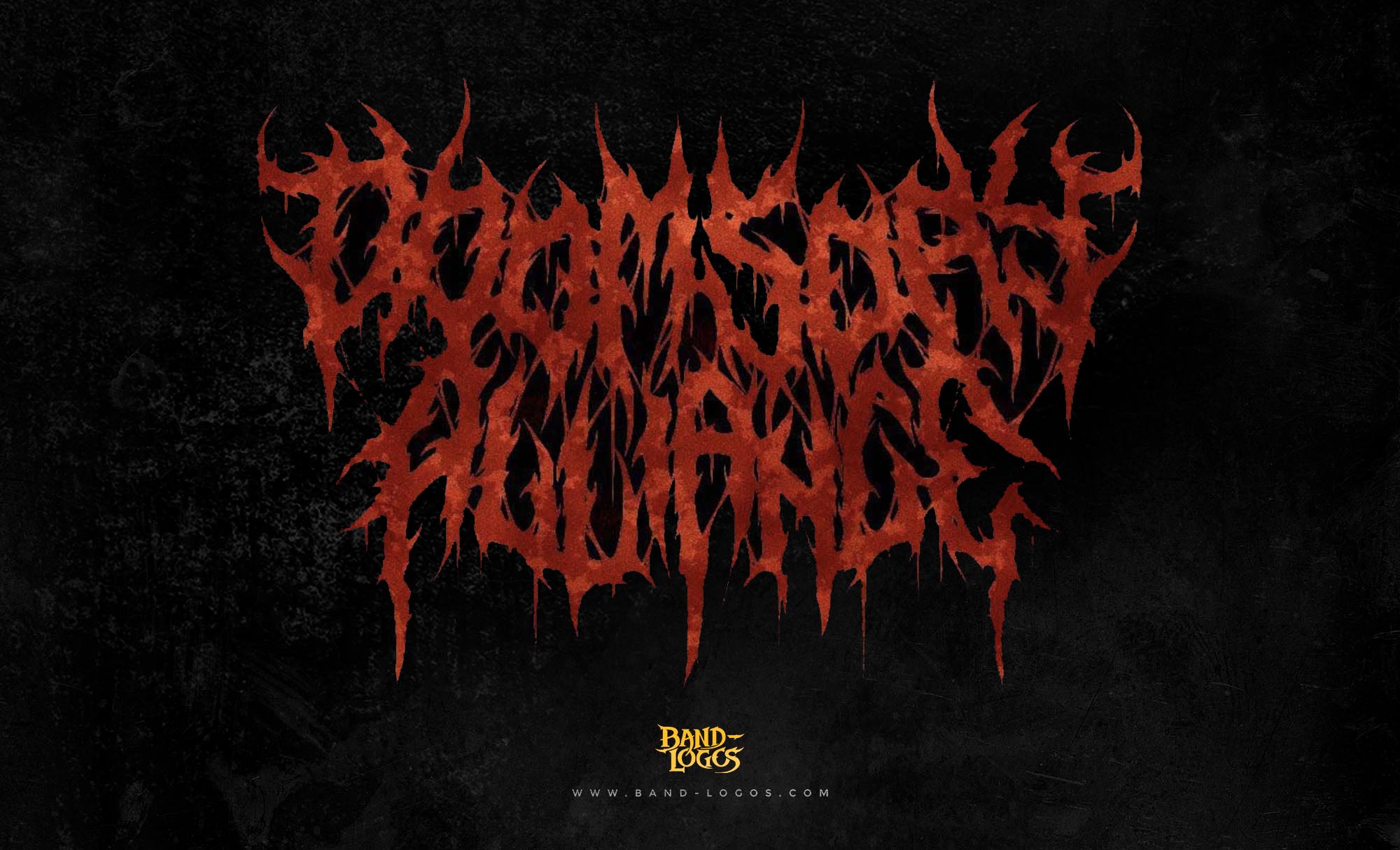
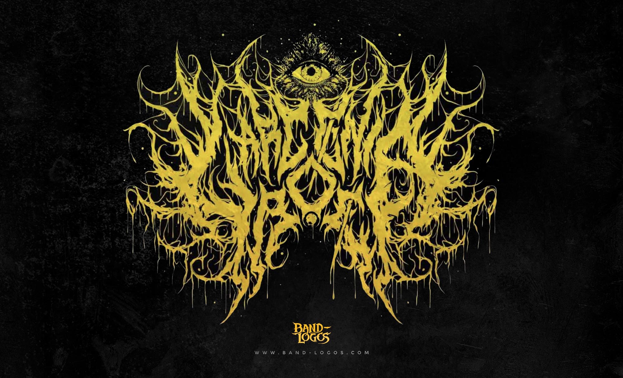
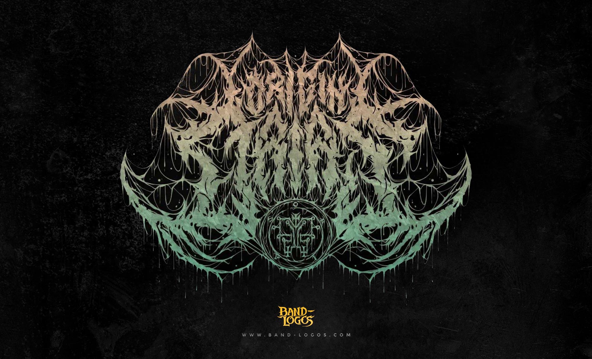
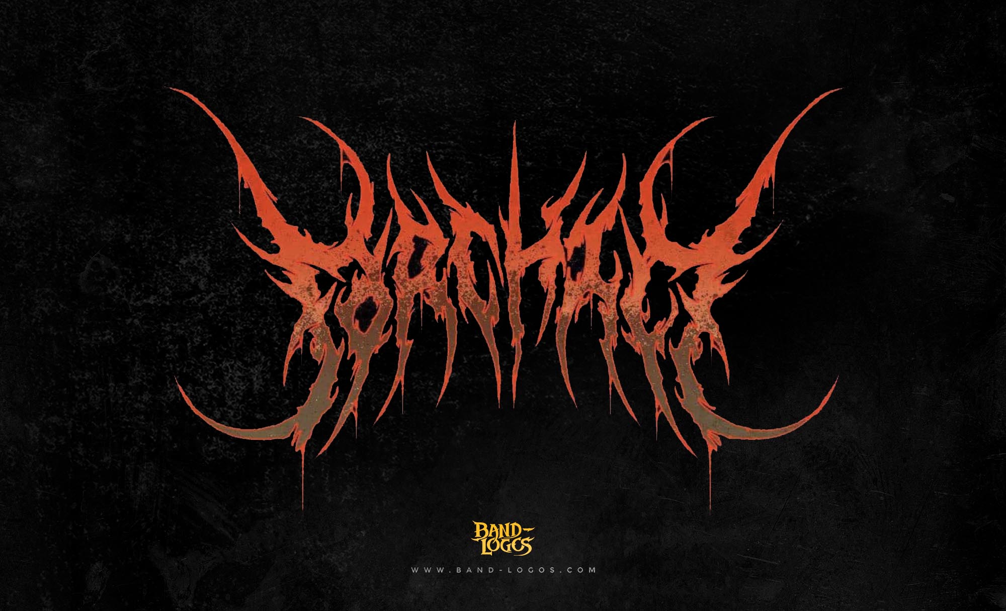
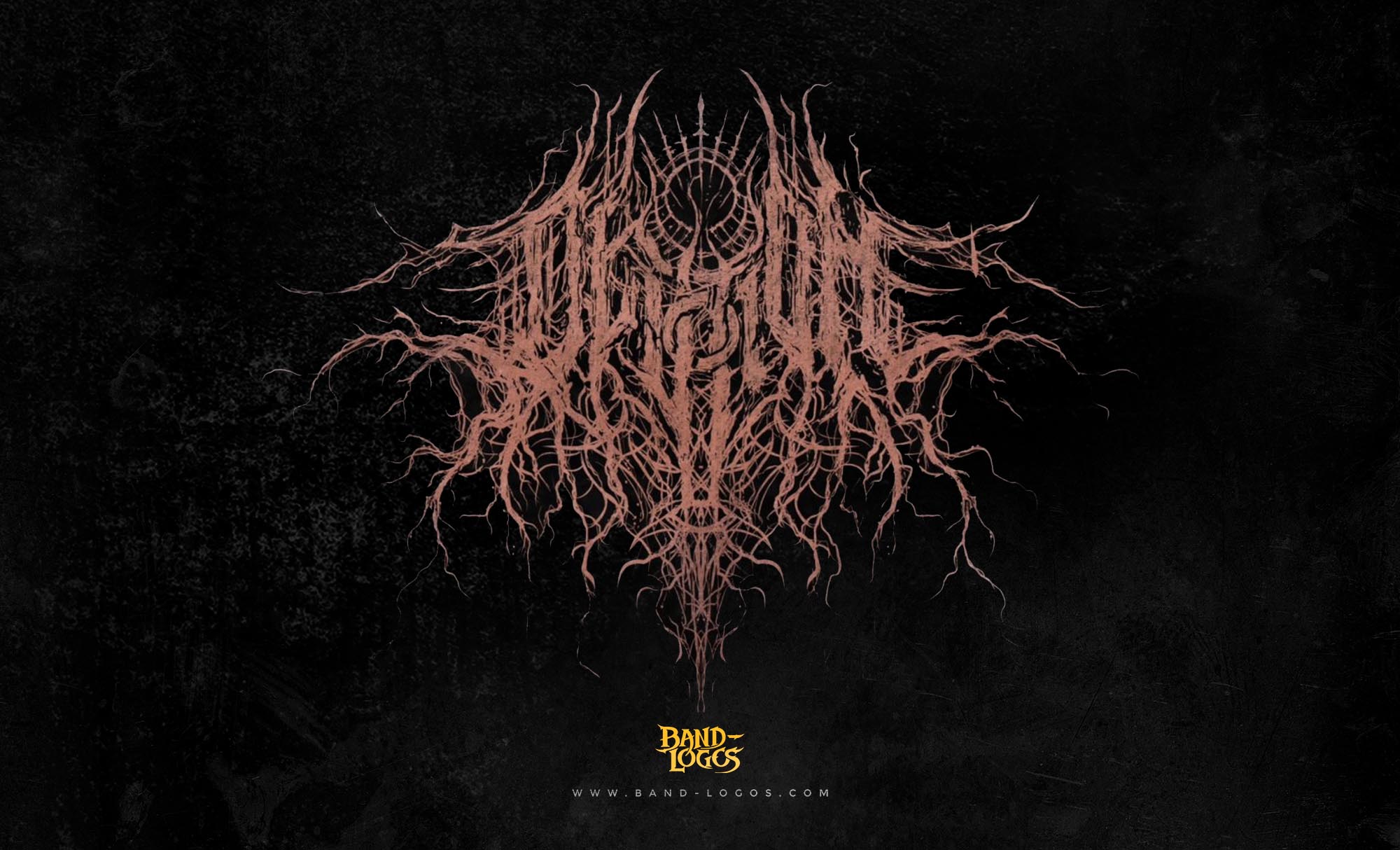
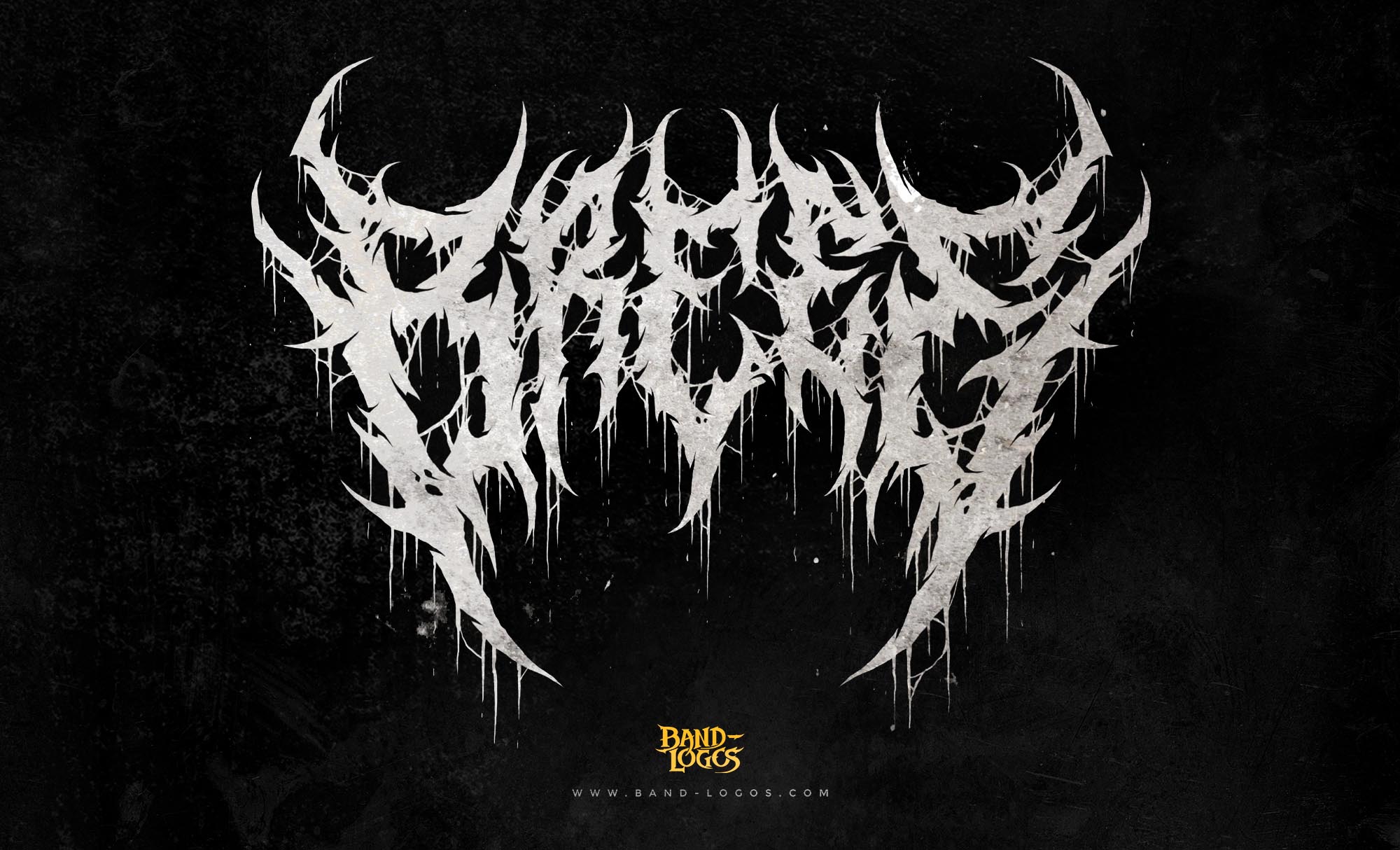
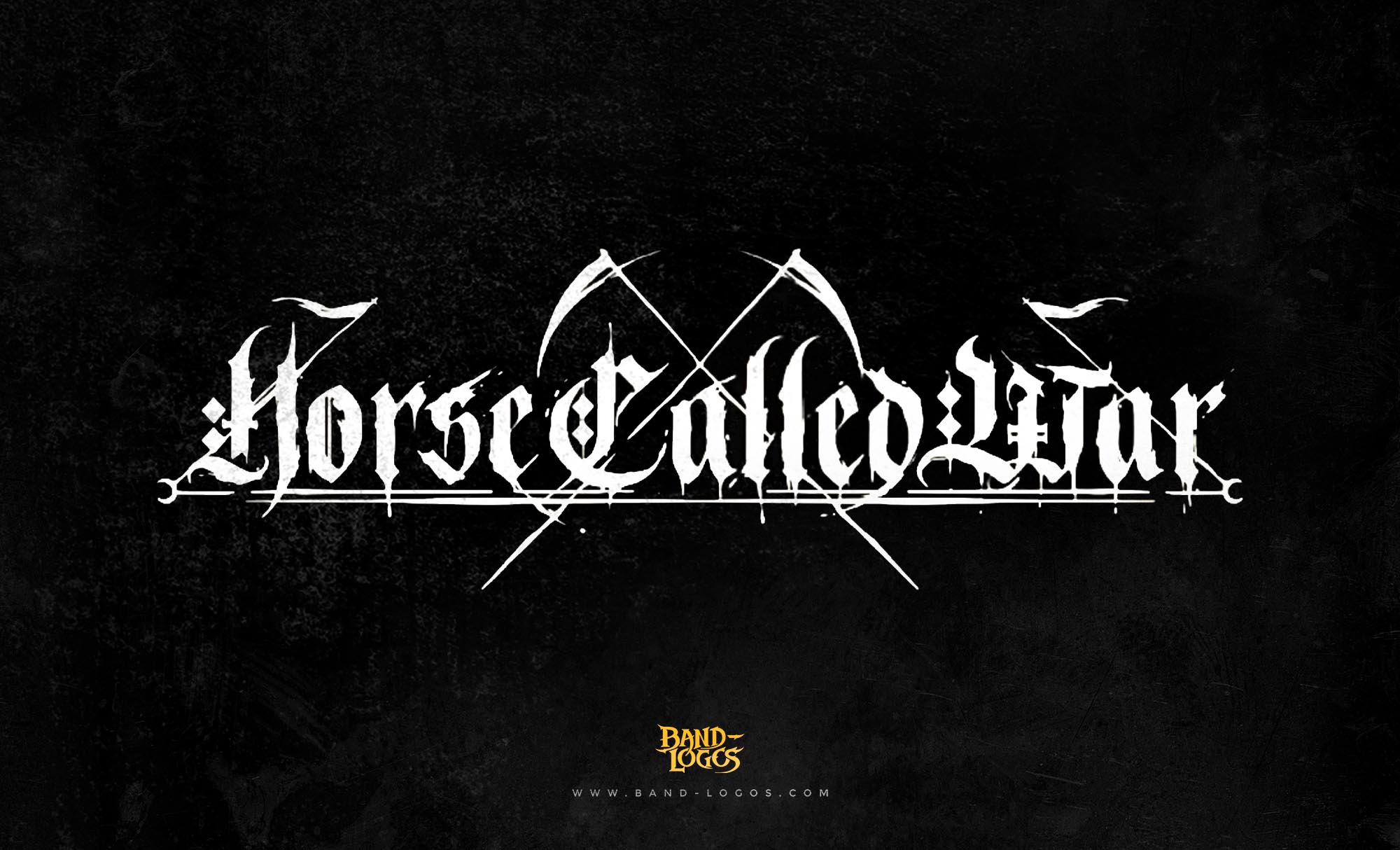
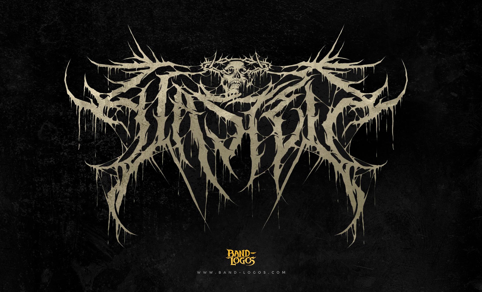
Korn vs. The Underground: Conversely, extreme genres often sacrifice legibility for complexity. A typical pagan black metal logo analysis reveals designs that look more like tree branches or lightning strikes than text. The Korn band logo retains high legibility while signaling aggression. This balance is key to their commercial longevity.
Conclusion: Why the Korn Logo is Timeless
The Korn band logo teaches us three vital lessons: perfection is overrated, psychological resonance matters more than grid systems, and technical authenticity starts with the human hand. It bridges the gap between the raw emotion of the music and the visual identity of the brand.
Its legacy is undeniable. It consistently ranks high among critics, a fact supported by lists like the Loudwire: Best Band Logos – Korn Analysis. Even decades later, the logo remains unchanged, proving that when a design is born from the honest identity of the artist, it doesn’t need to be updated.
Whether you are a fan of Nu-Metal or a graphic designer seeking inspiration, the lesson from Jonathan Davis is clear: sometimes the best tool for the job isn’t a high-end computer, but a simple crayon. Apply this “human-first” approach to your next project, and you might just create the next iconic brand.


