The Lamb of God Logo is one of the most recognizable symbols in the heavy metal world. It’s not just a band emblem—it’s a visual identity that perfectly represents the raw energy, aggression, and spiritual depth of the music.
![]()
During a recent appearance on the Hardlore podcast, frontman Randy Blythe finally addressed the elephant in the room regarding Lamb of God’s visual identity: their first logo change in 27 years. With their twelfth studio album, Into Oblivion, set to drop on March 13, Blythe candidly admitted that the band’s classic wordmark had overstayed its welcome.
![]()
He revealed that the original design was actually just the Papyrus font, a choice made long before the typeface became an overused punchline. “Had we known 20-however many years ago that we would wind up looking like a falafel restaurant menu, we wouldn’t have used that,” Randy joked, noting that the font’s current ubiquity eventually made the change a necessity.
The new logo for the Into Oblivion era represents a sharp departure from that “ancient scroll” aesthetic, opting for a cleaner, more deliberate look that aligns with the band’s modern standing in the metal pantheon. By ditching the weathered grit of the Papyrus era, Lamb of God is effectively reclaiming their brand from the world of casual dining and New Age posters. While the shift has sparked plenty of debate among the “Pure American Metal” faithful, the change signals a band that is no longer content with being defined by an accidental design choice from the late ’90s. Instead, they’re leaning into a more industrial, streamlined look that matches the heavy, forward-thinking energy of the upcoming record.
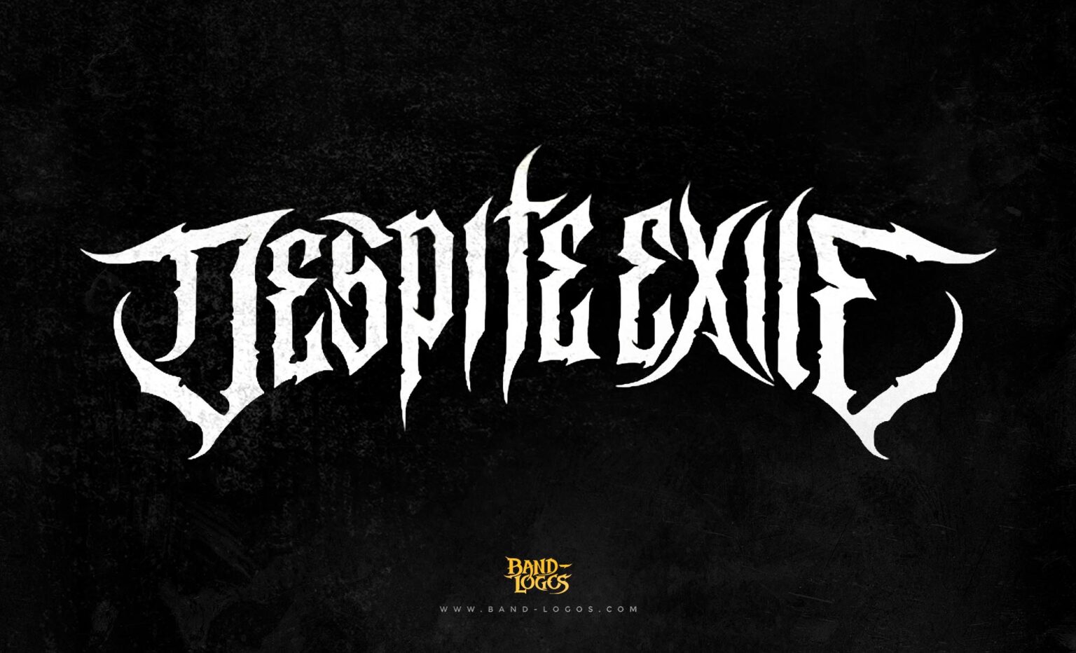
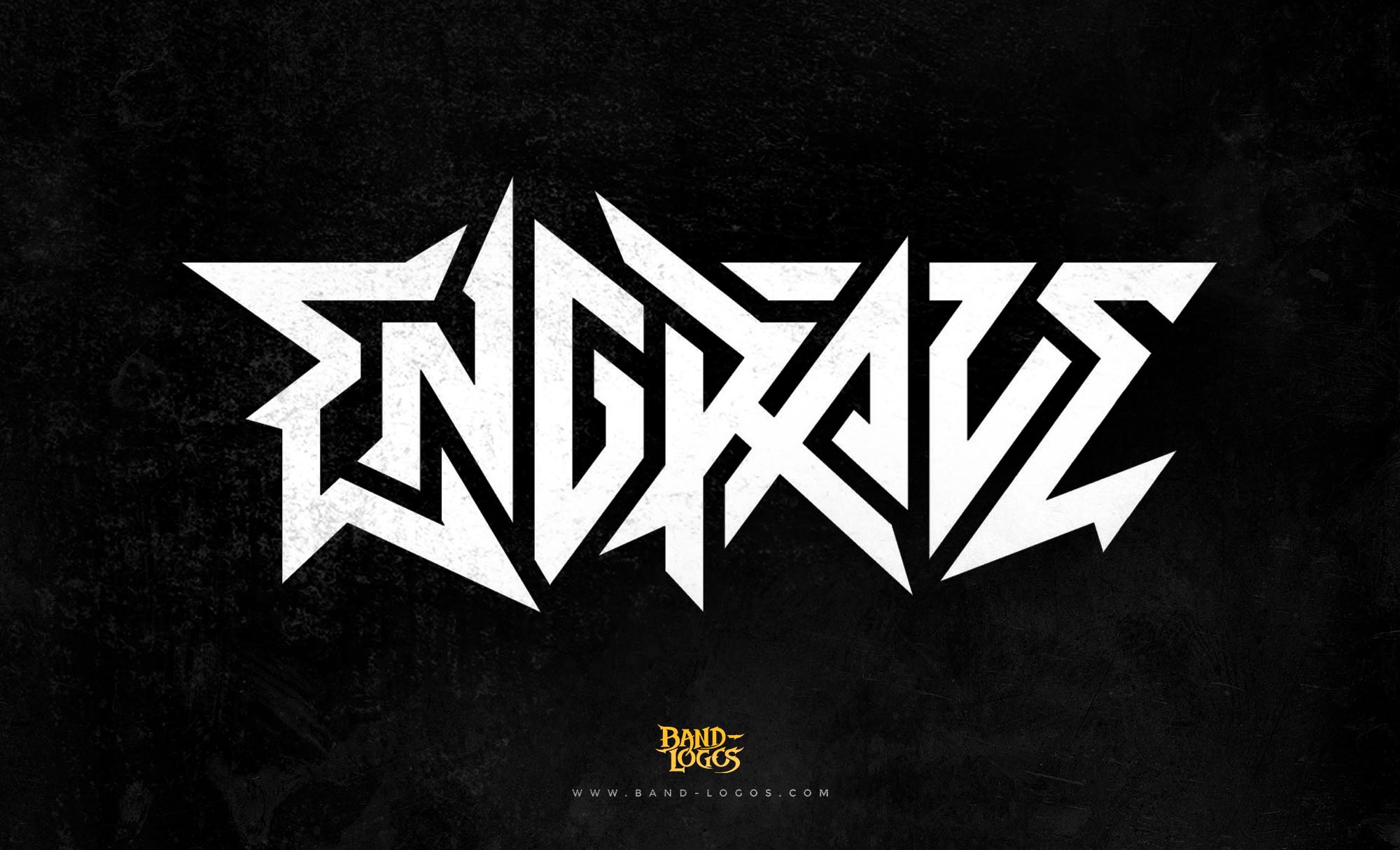
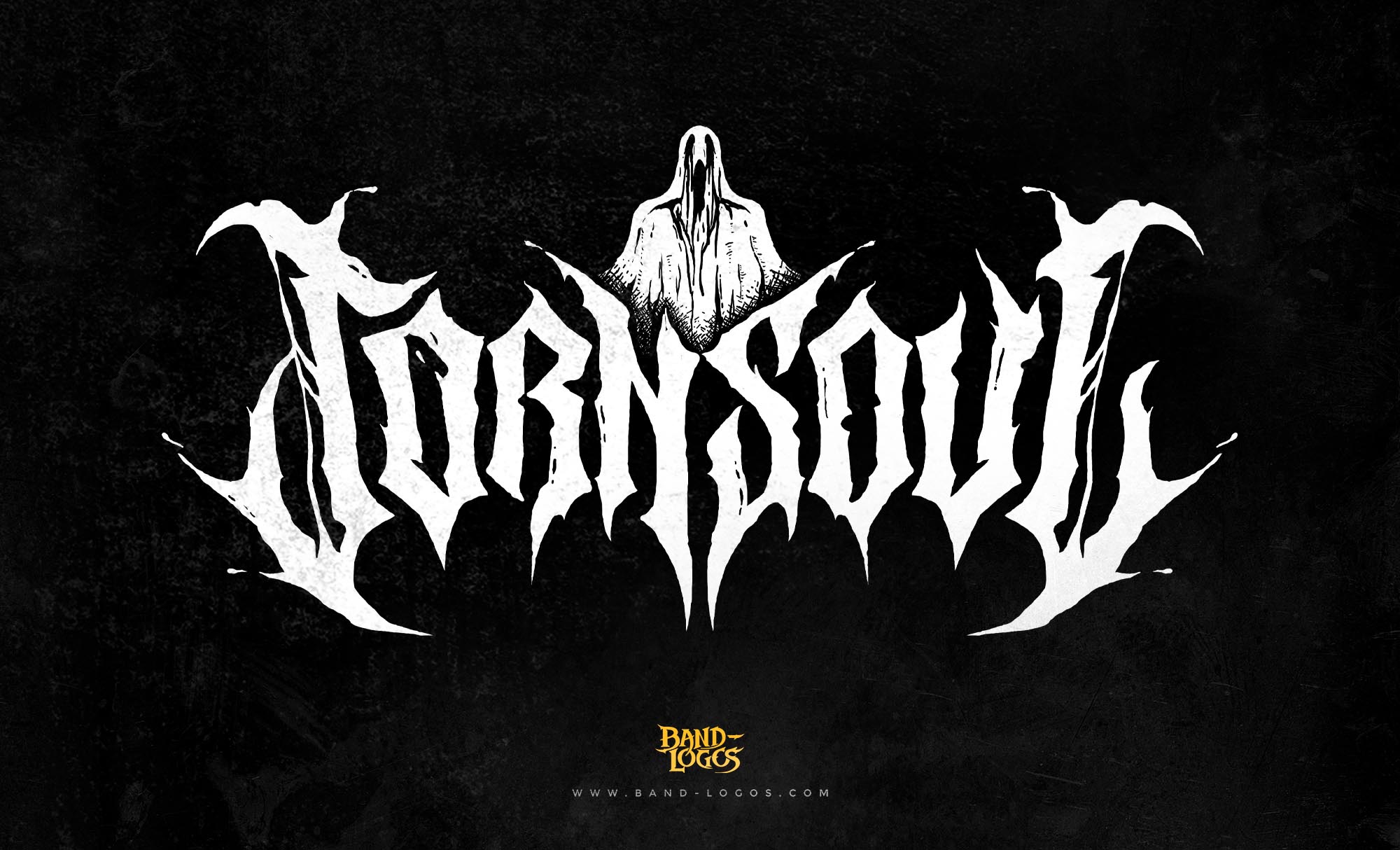
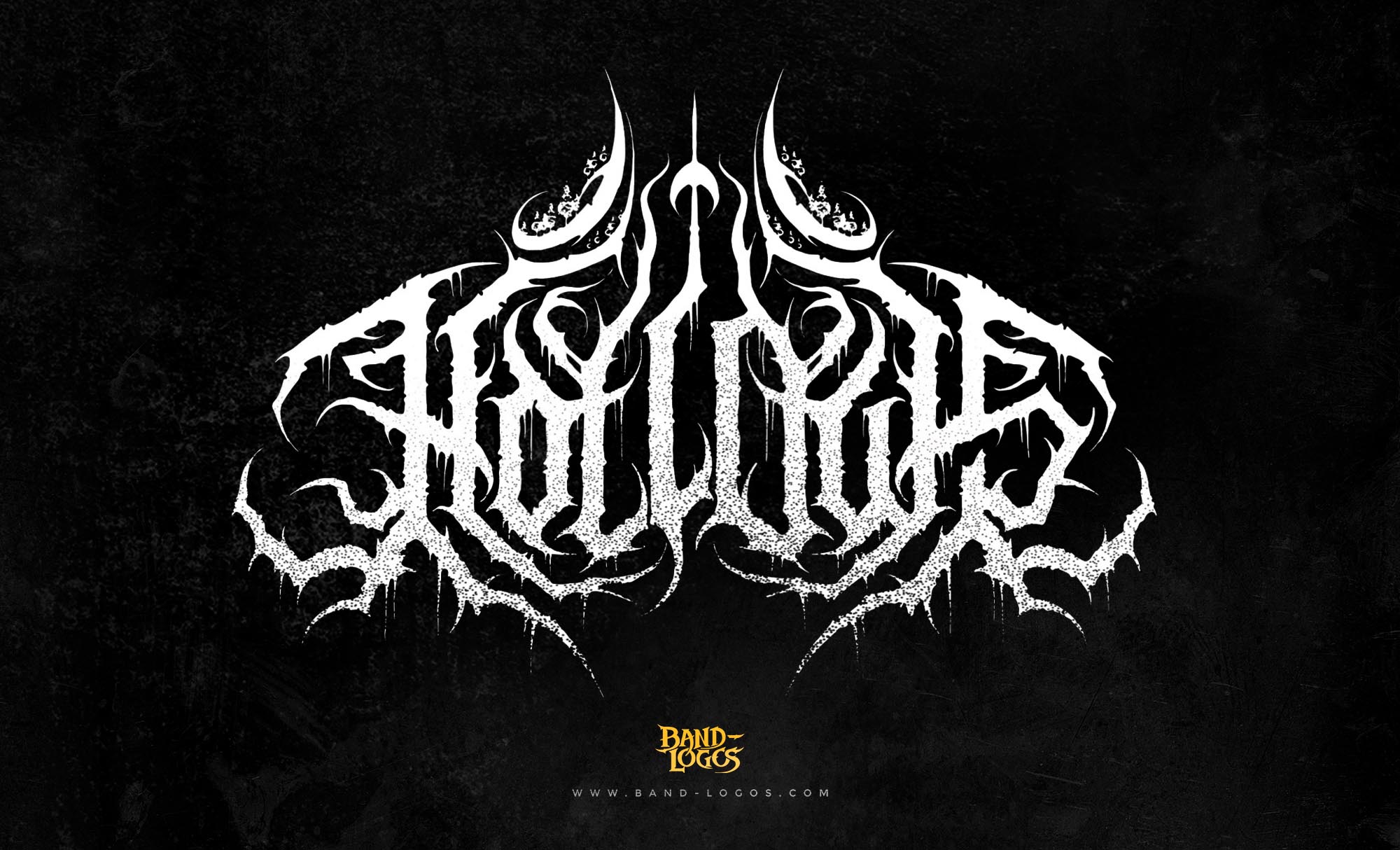
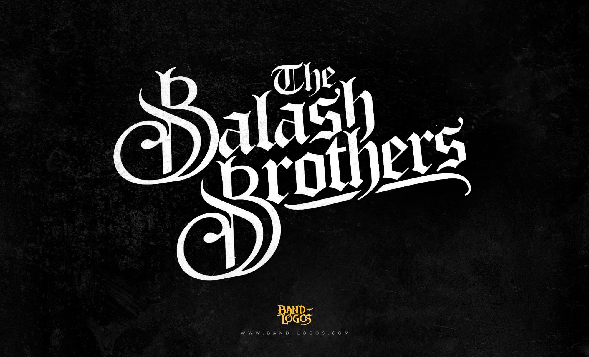
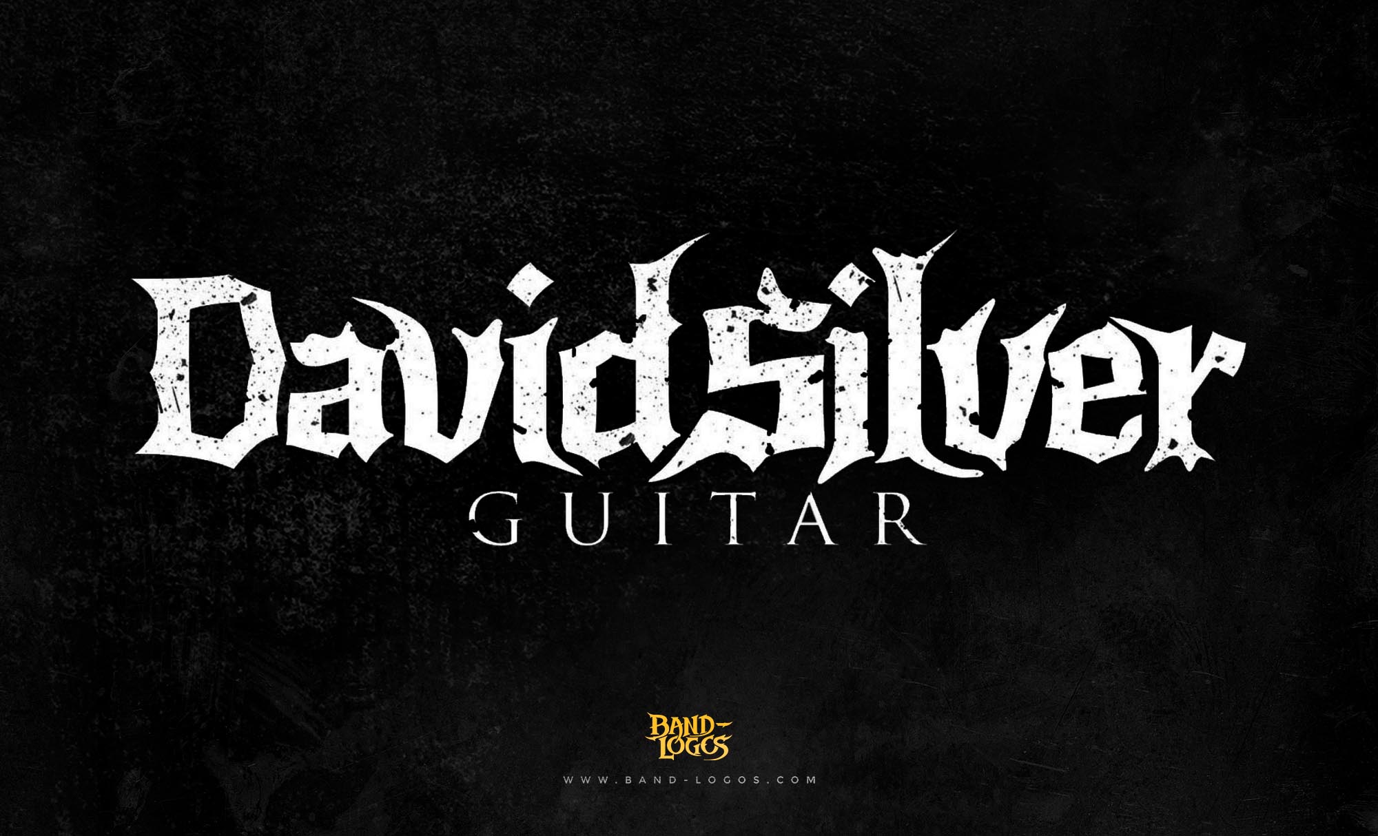
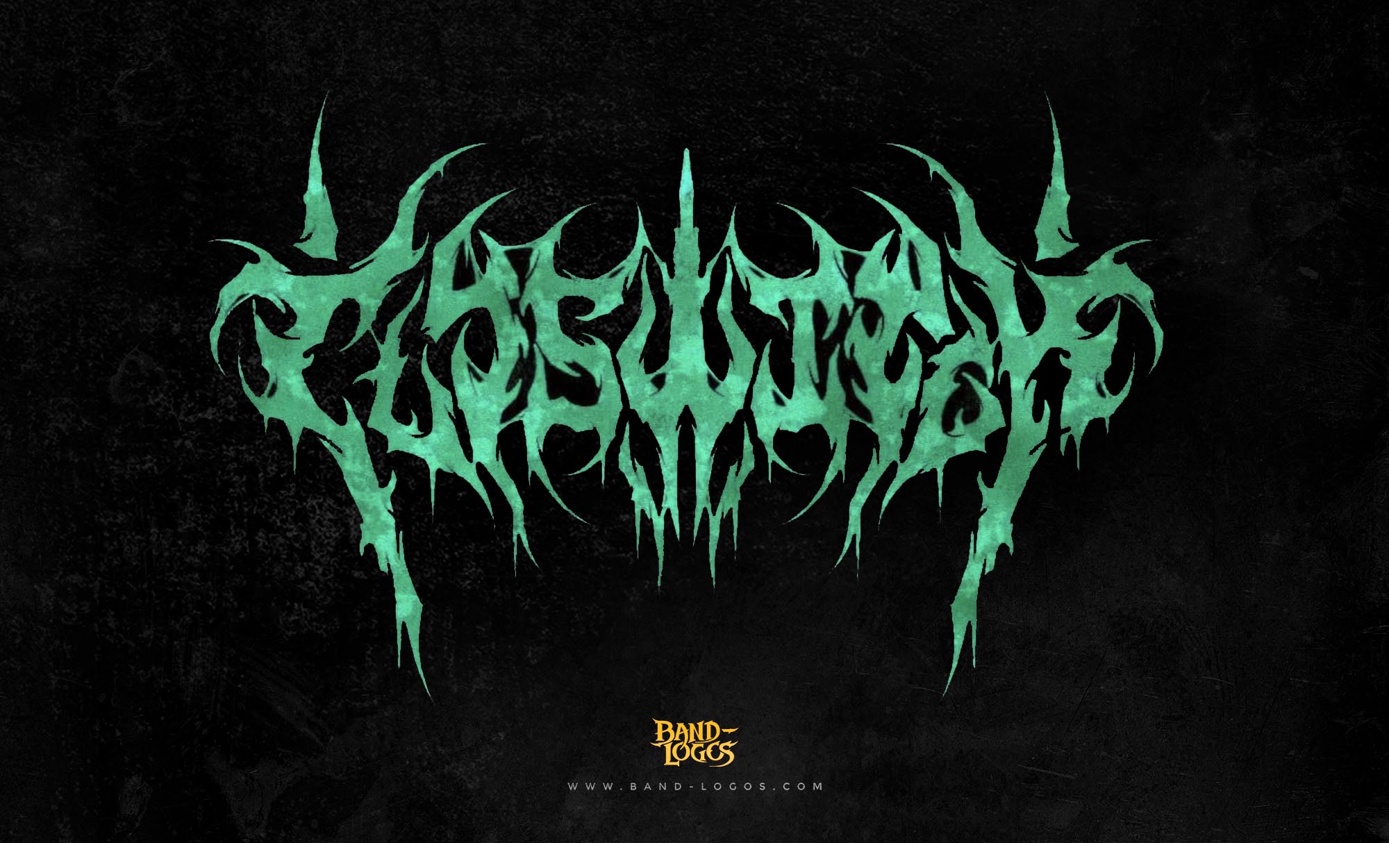
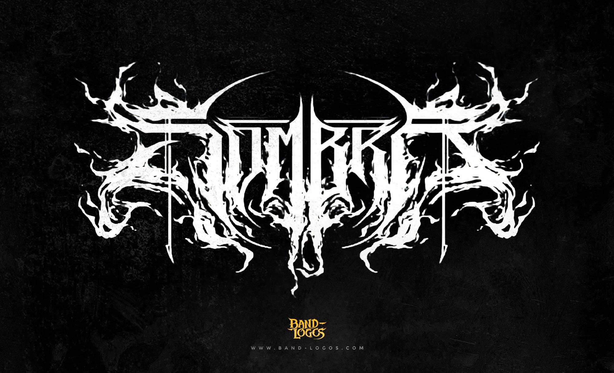
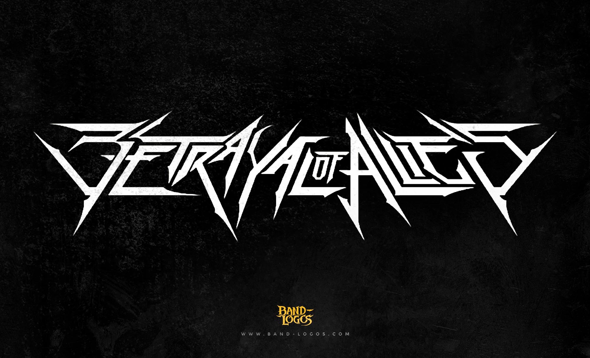
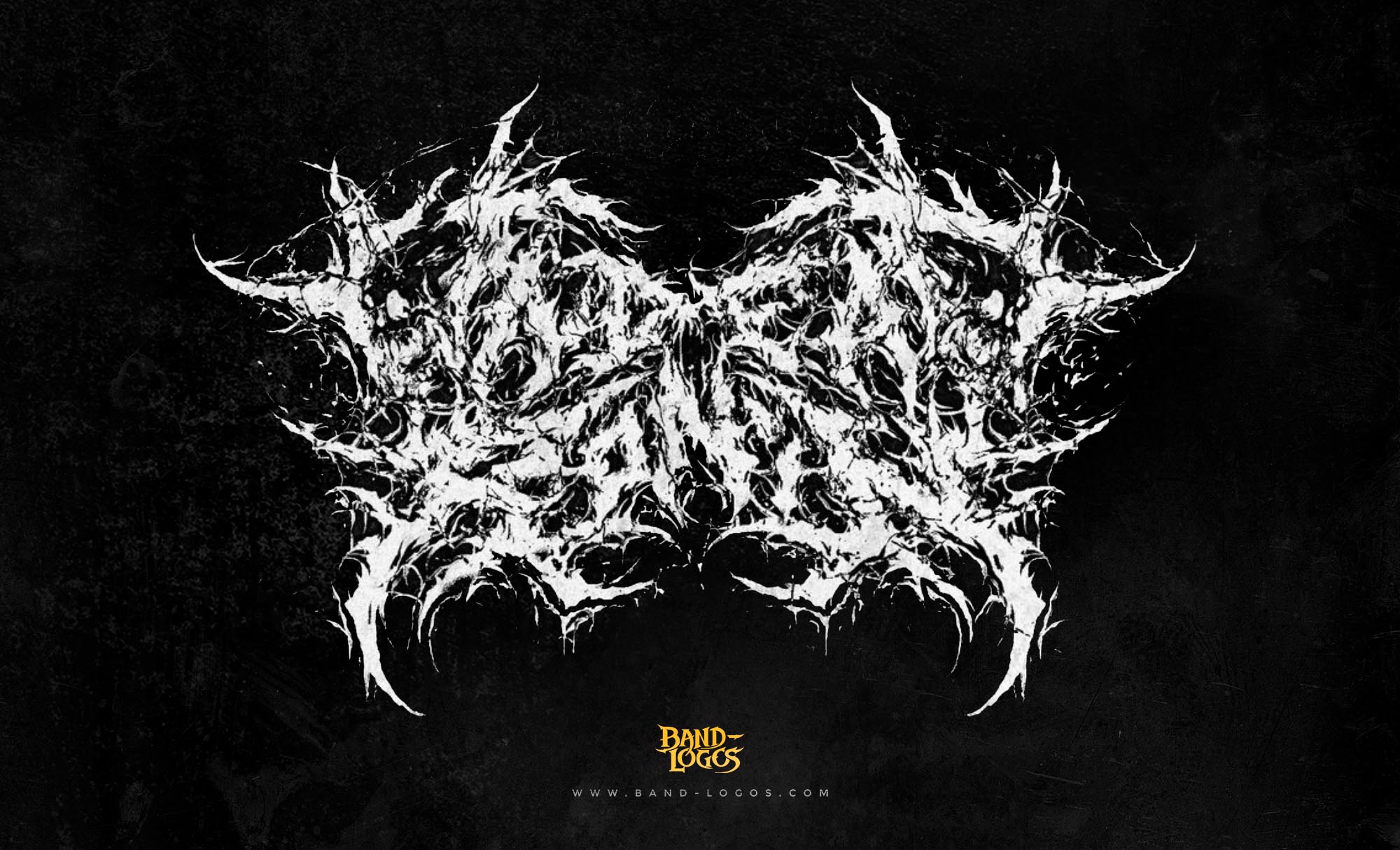
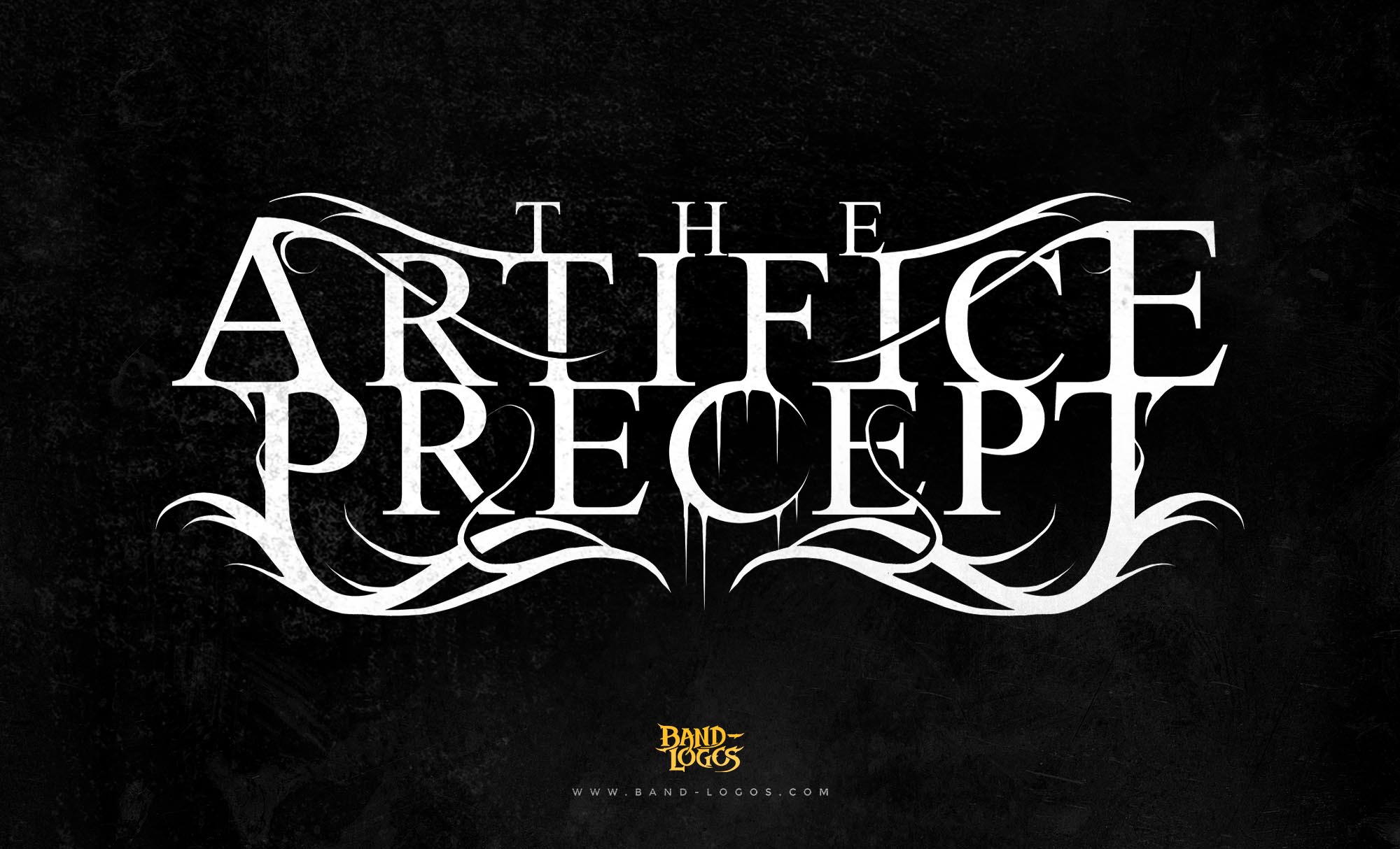
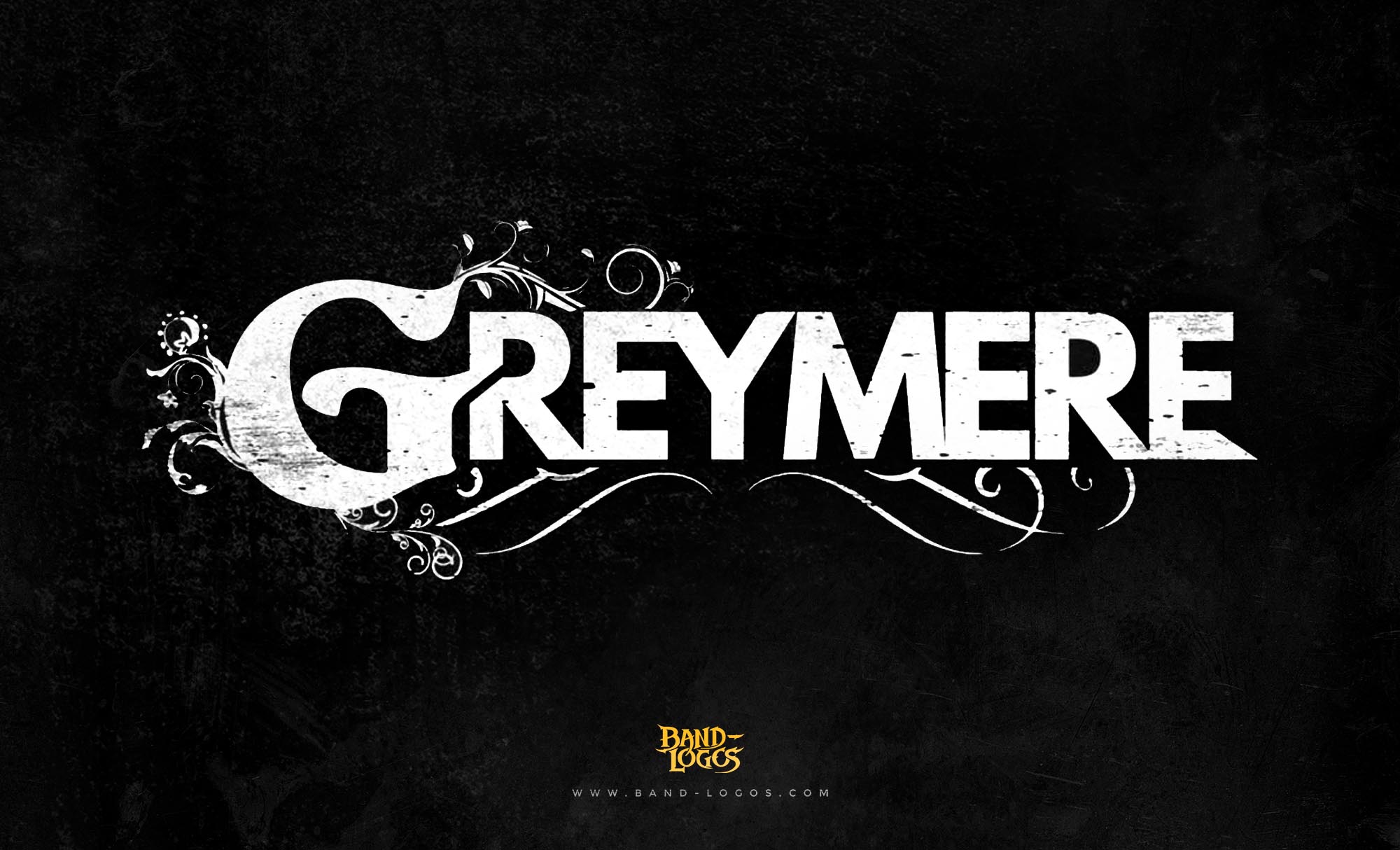
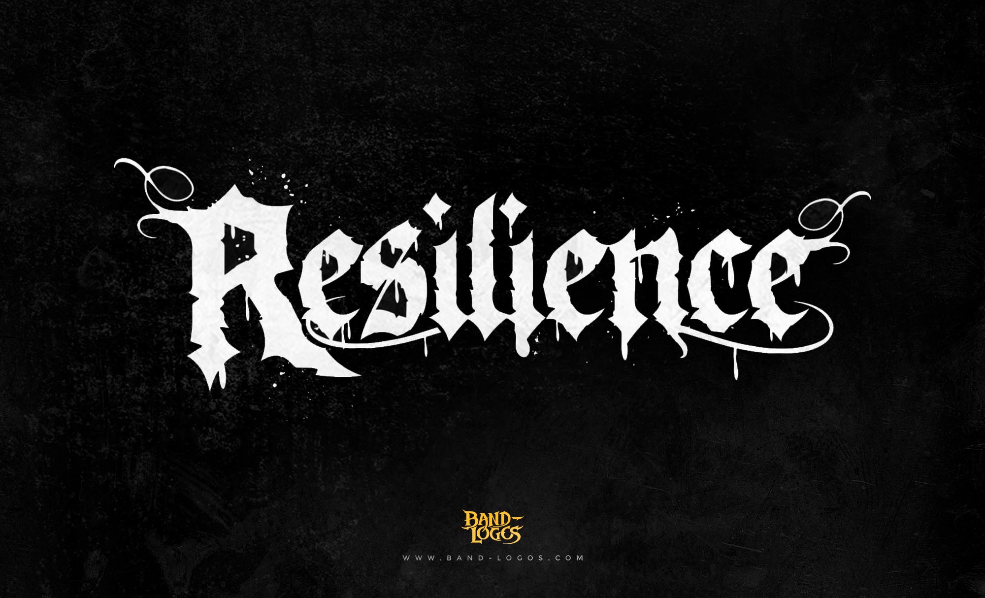
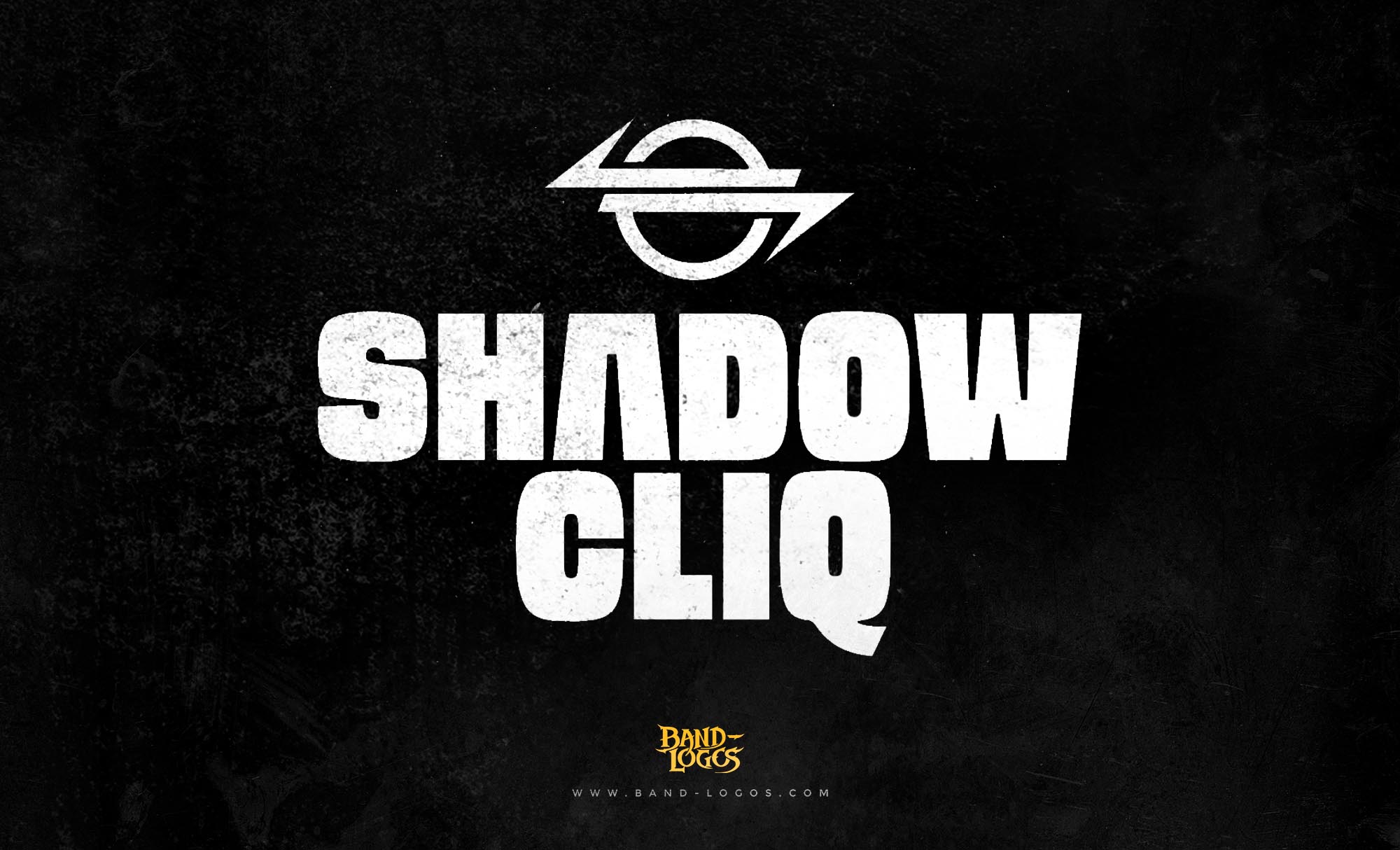
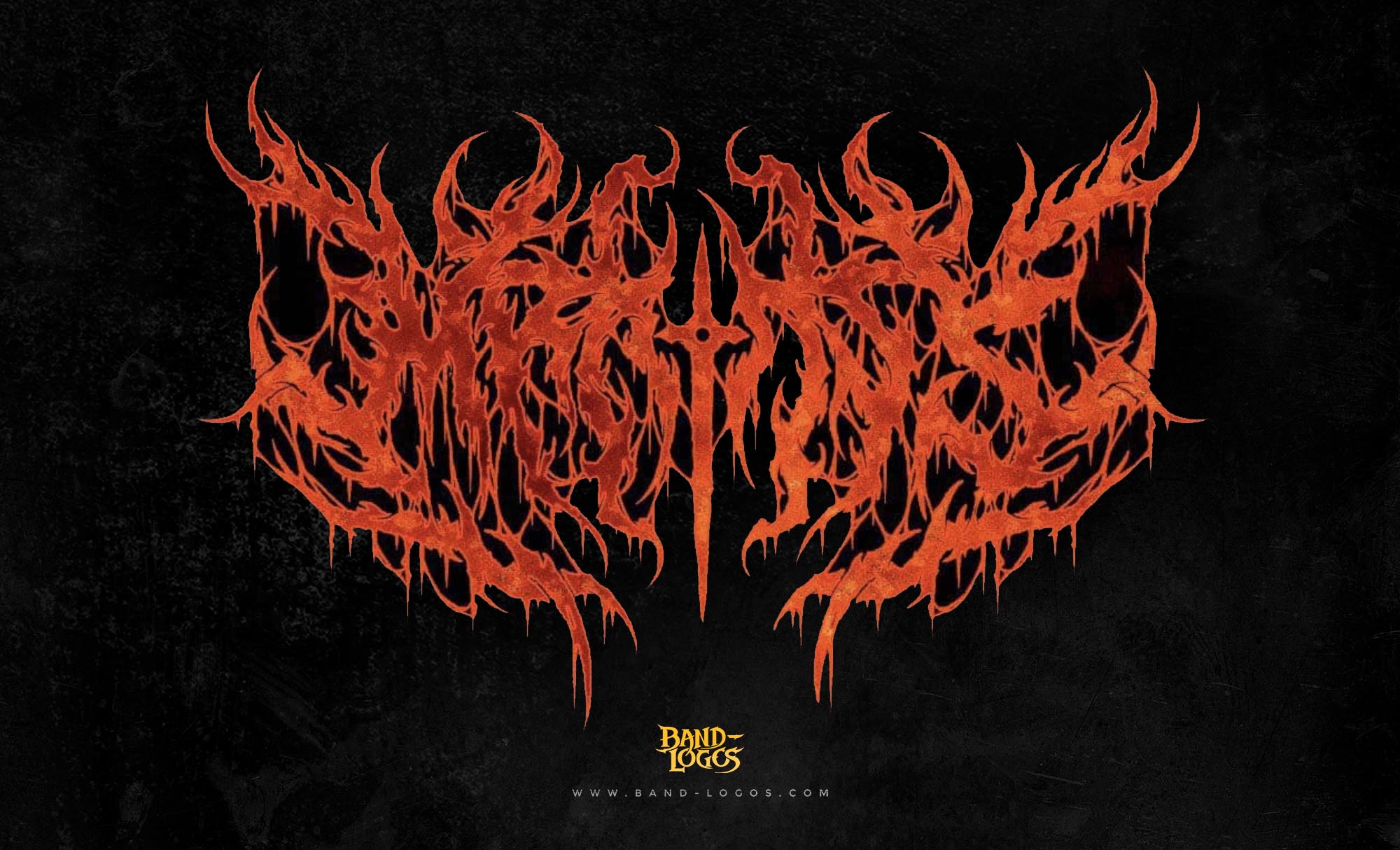
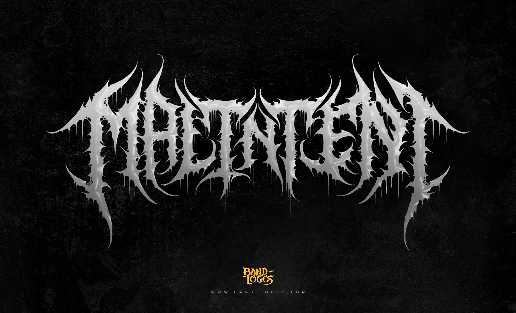
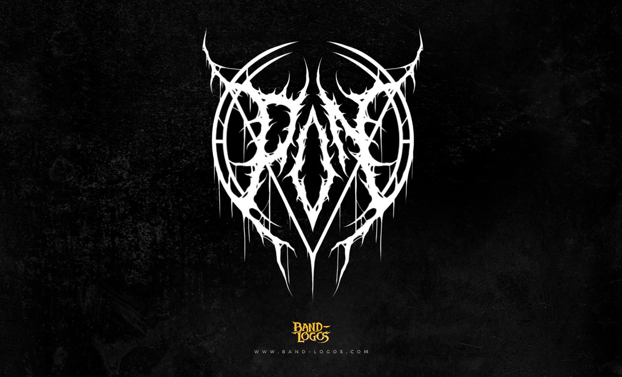
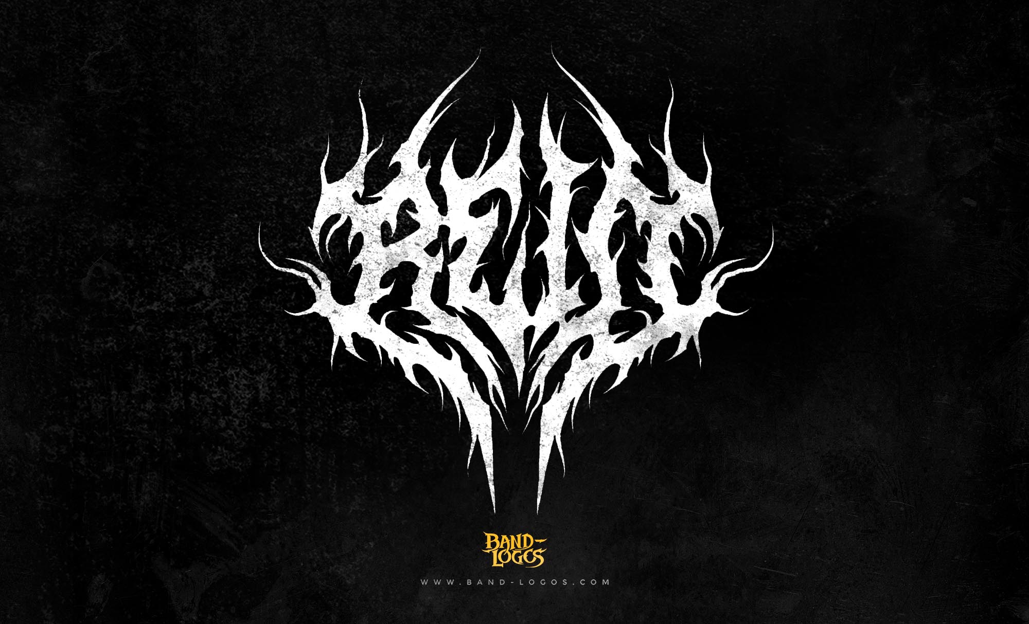
What many fans don’t know is that this iconic logo was designed by Rafal Wechterowicz, an artist and graphic designer. of Band-Logos.Com back in 2004, just before Lamb of God released their groundbreaking album Ashes of the Wake.
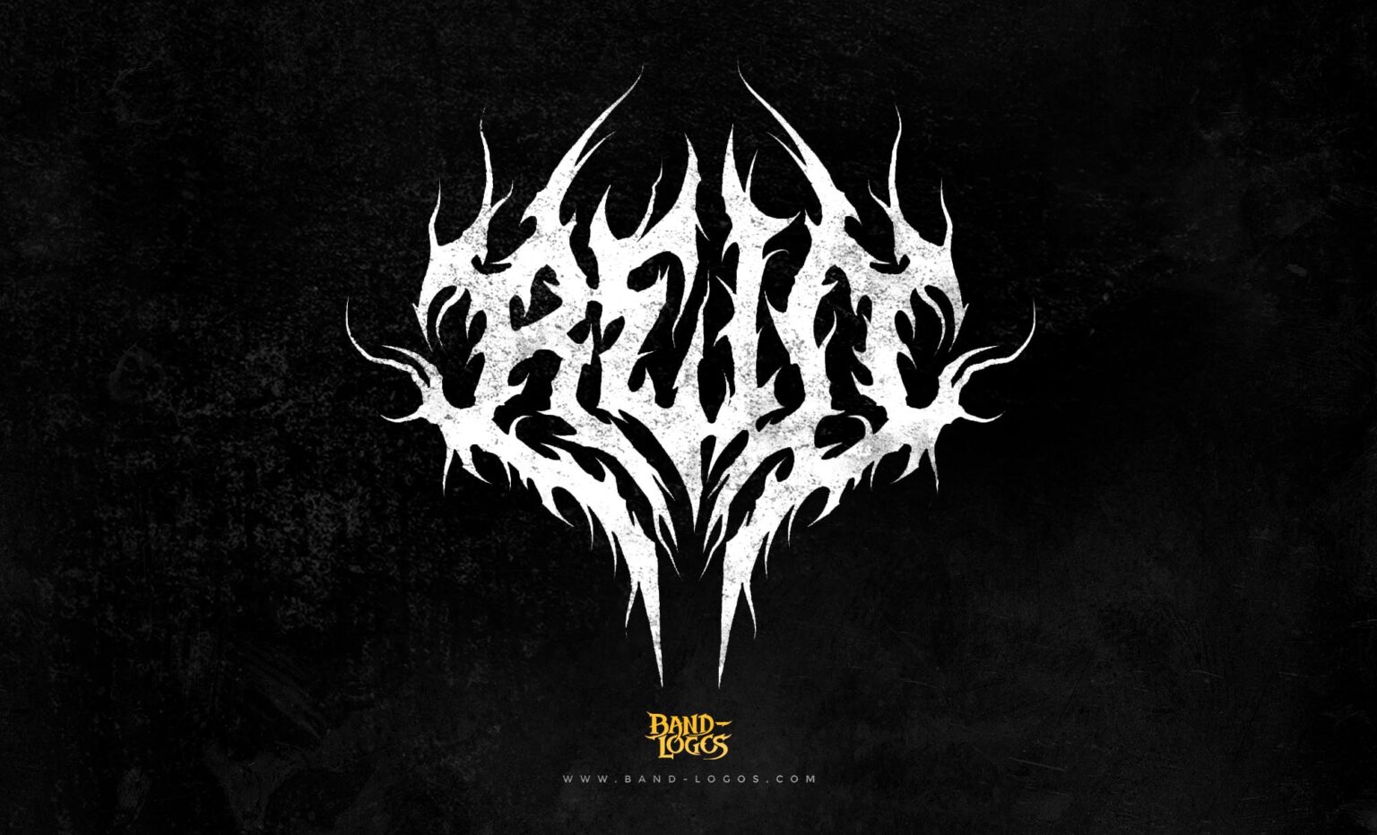
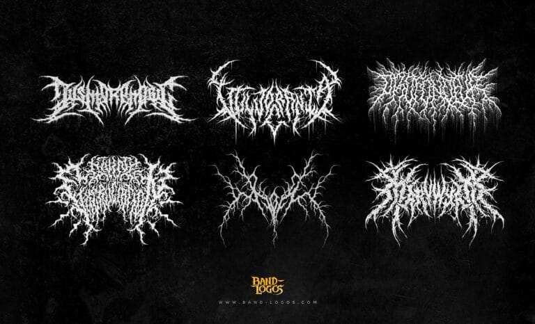
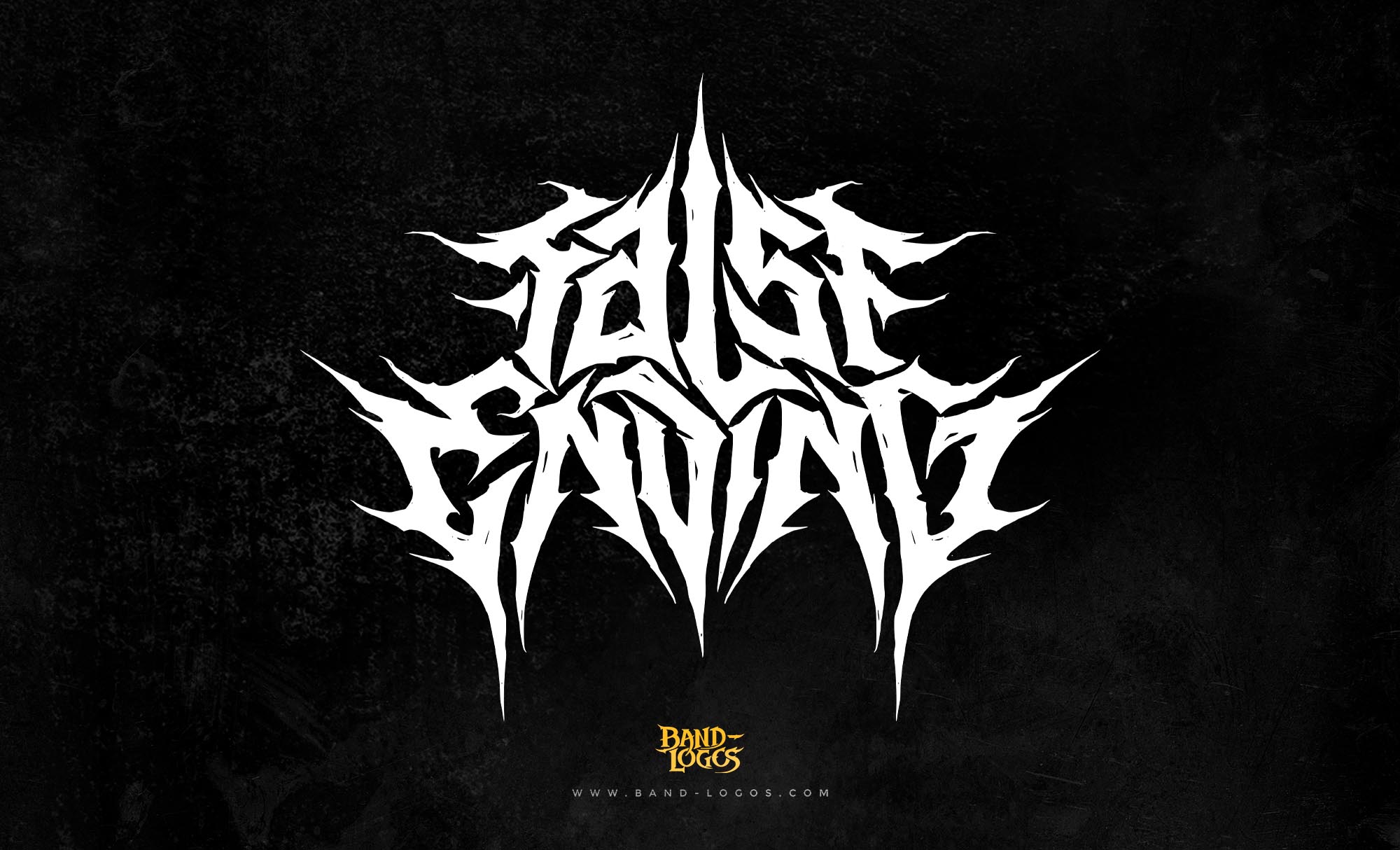
When Ashes of the Wake came out, it wasn’t just the music that turned heads. The logo itself became a symbol of the band’s transformation from underground heroes to global metal icons. The Lamb of God Logo captured everything the band stood for—rebellion, spirituality, and intensity—using bold lines, sharp edges, and a raw, hand-drawn aesthetic that spoke directly to fans of real, unfiltered metal.
Rafal Wechterowicz, an artist and graphic designer, the designer behind this legendary mark, was already known in underground metal circles for creating band logos that looked both brutal and artistic. His design philosophy was simple: every logo should look powerful enough to stand alone, even without color or context. When he started working on the logo Lamb of God, he wanted something that would feel sacred yet chaotic—something that embodied the biblical meaning behind the name “Lamb of God” while also reflecting the band’s ferocity and aggression.
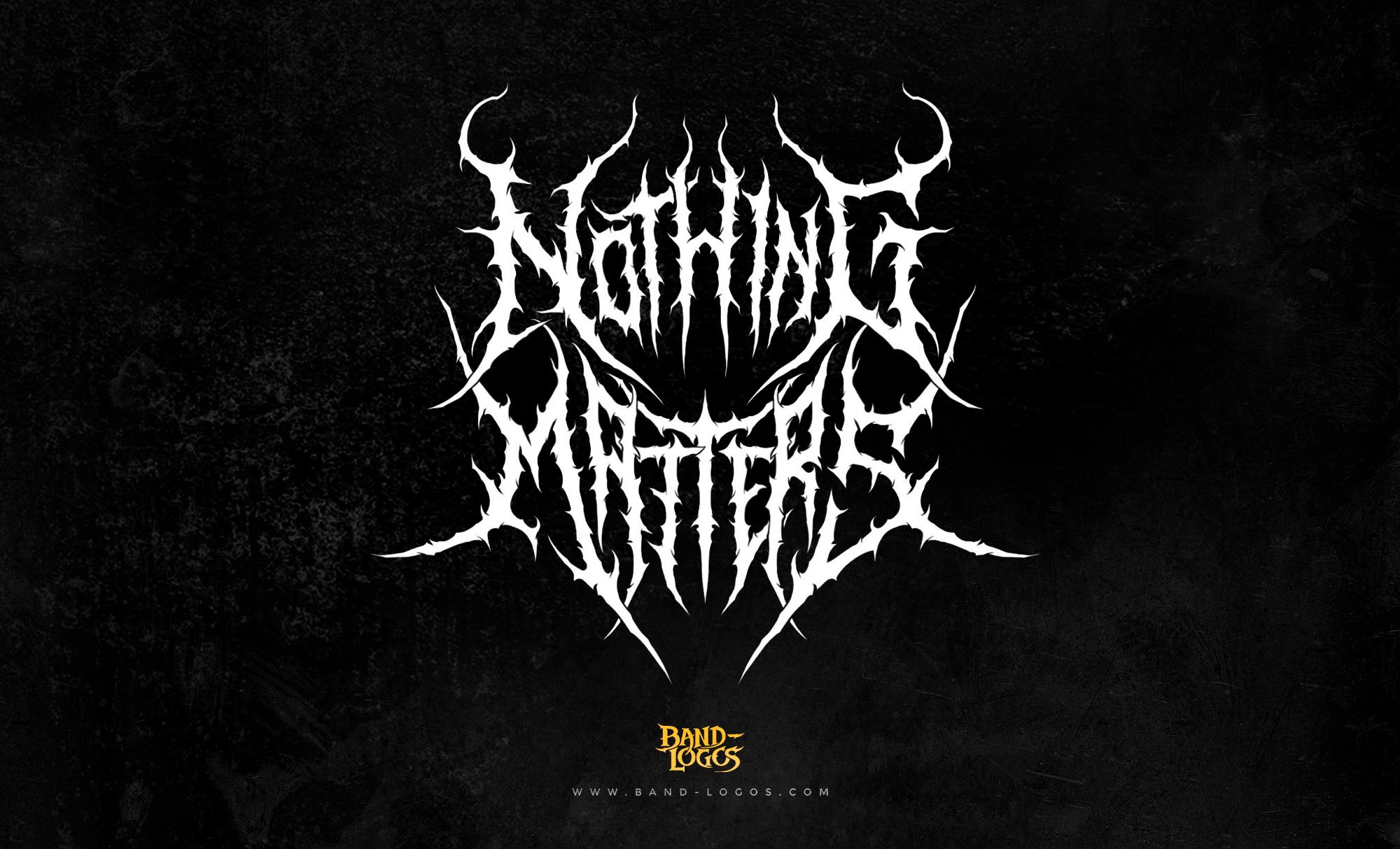
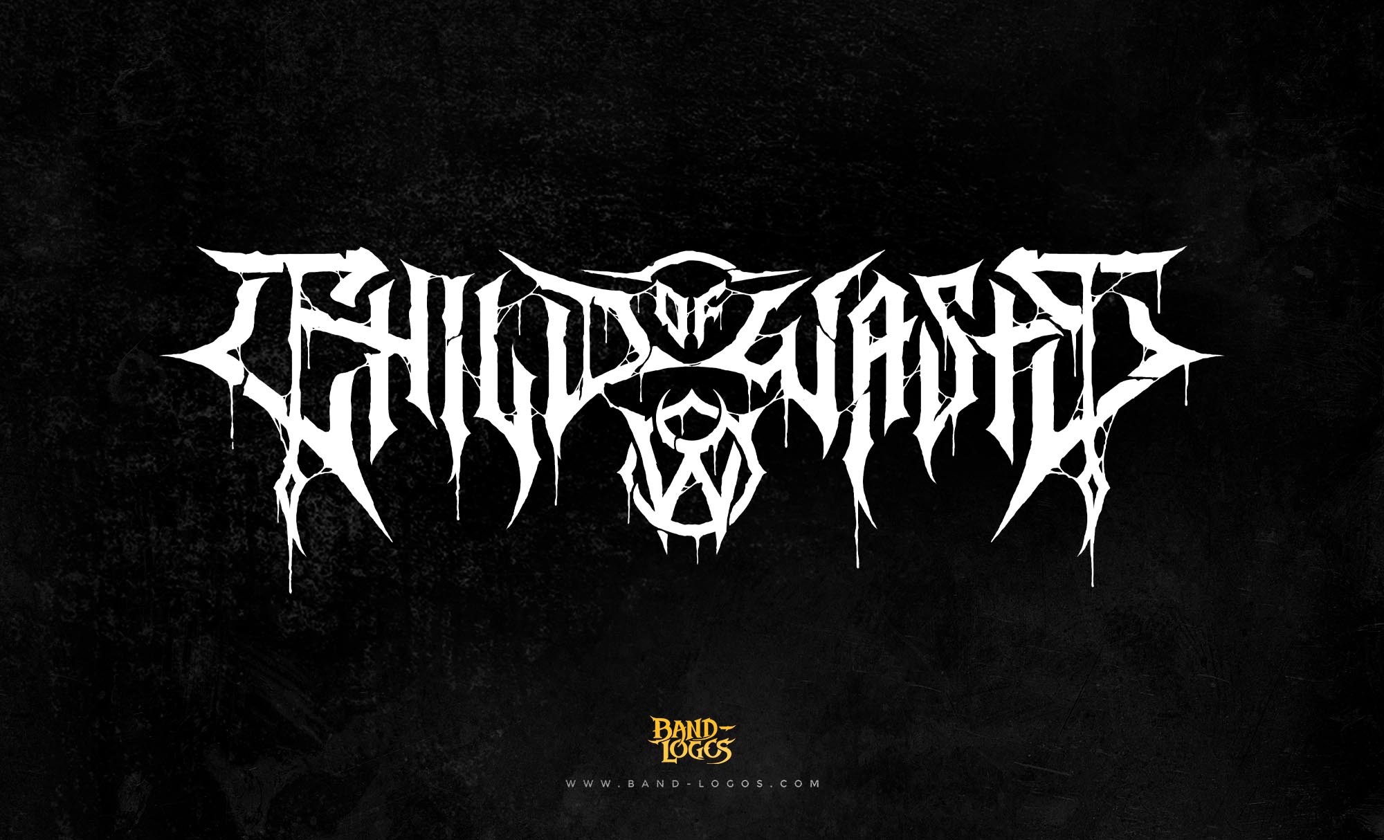
The result was stunning. The Lamb of God band logo became instantly recognizable. The way the letters flow together, slightly jagged yet perfectly balanced, gives it a sense of movement and chaos—just like the band’s sound. The spacing, texture, and custom letter design were deliberately chosen to reflect both spiritual struggle and artistic aggression. It was not just a logo; it was a statement.
As Lamb of God’s popularity grew, so did the reputation of the logo. Fans began printing it on shirts, patches, and banners. The Lamb of God logo shirt became one of the most popular metal merch designs ever made. You’d see it at concerts, tattooed on fans’ arms, and even used as wallpapers on laptops and phones. The Lamb of God logo tattoo became a mark of dedication for die-hard fans—a symbol of loyalty to a band that represented something much deeper than just music.
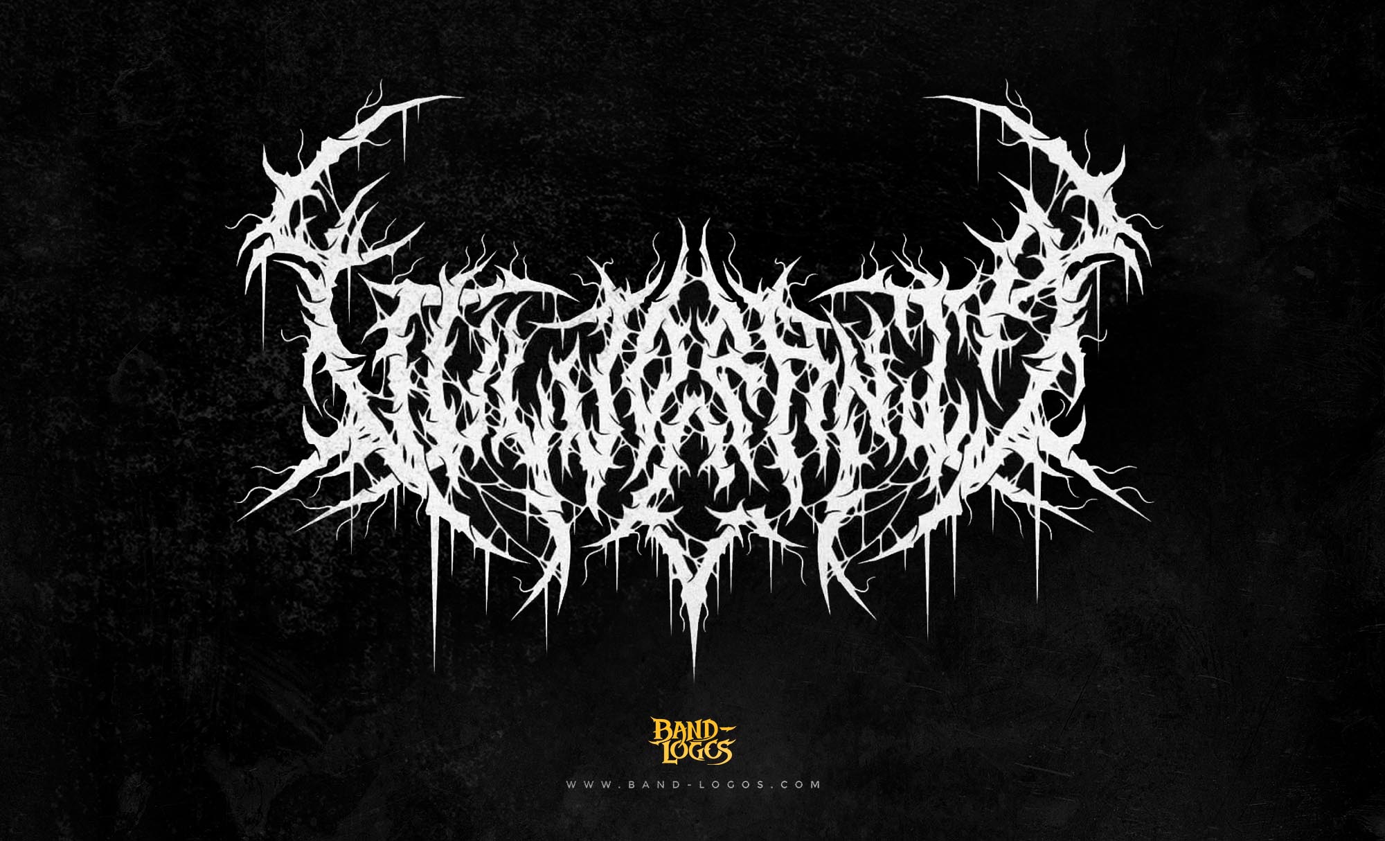
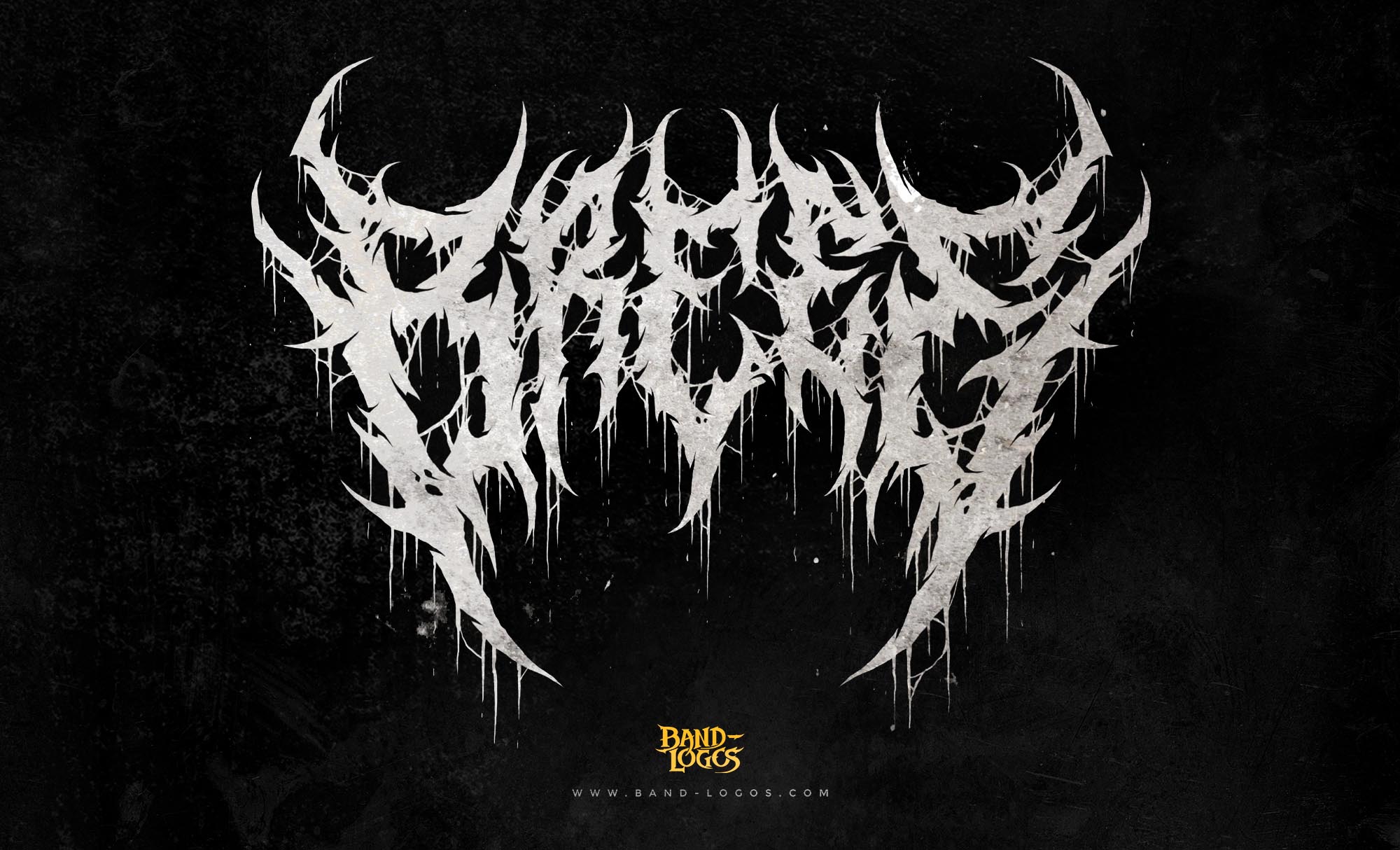
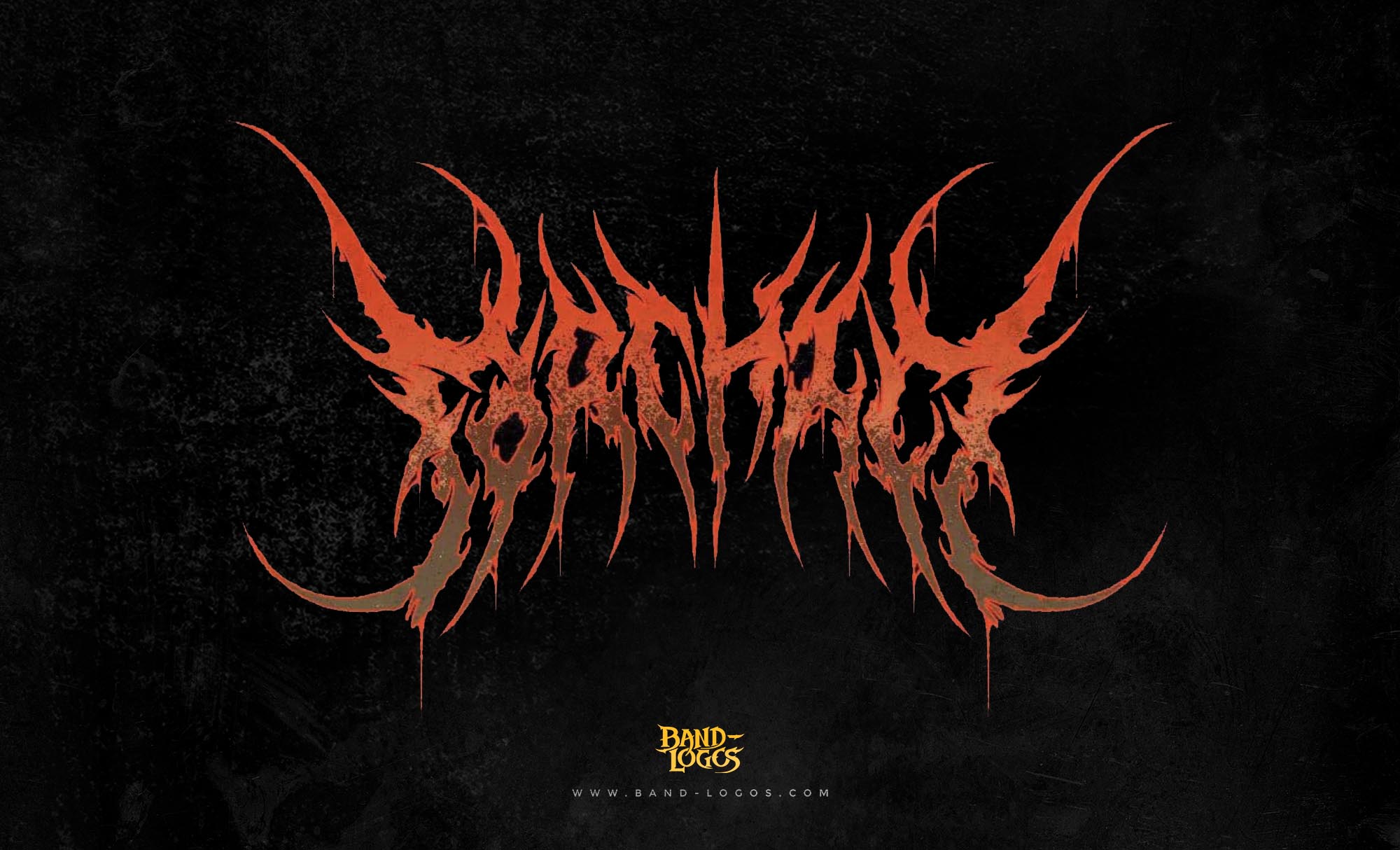
Over time, variations of the logo appeared. Some included different textures, color schemes, or added symbols like wings or flames. This gave rise to what fans sometimes call the Lamb of God bird logo or the Lamb of God flag logo. Each variation kept the same base structure but was adapted for different releases and visuals. For example, the Wrath era introduced darker tones and sharper lines, which some fans call the Lamb of God Wrath logo.
Interestingly, the Lamb of God Logo has even found itself referenced in unexpected places. Some churches and Christian organizations, unaware of its metal origins, have used designs similar to the church uses Lamb of God logo in banners or artwork because of its biblical phrase. This crossover between sacred and metal culture shows just how powerful the design truly is—it transcends its original purpose and connects with anyone who resonates with its message of strength, sacrifice, and faith.
From a design perspective, the logo is a masterpiece of balance and proportion. It works beautifully as both a high-resolution image and a rough stencil. The Lamb of God logo PNG and Lamb of God logo vector versions are now widely searched by fans and designers who admire its timeless style. The simplicity of the lettering allows it to look great on everything—from posters and shirts to album covers and stage backdrops.
What makes this logo so effective is how well it communicates emotion. Unlike overly complex designs, the Lamb of God logo font uses clean but distressed lettering, giving it an aged, battle-worn feel. It’s spiritual without being soft, powerful without being flashy. That emotional balance is what makes people continue to connect with it, even decades later.
Today, if you look up Lamb of God logo images or Lamb of God logo wallpaper, you’ll find countless adaptations—fan art, remakes, high-definition versions, and even 3D renderings. Some designers and fans reimagine it in new textures or formats, paying tribute to Abedin Sayef’s original work. Even the Lamb of God logo HD version continues to circulate in fan communities and online collections.
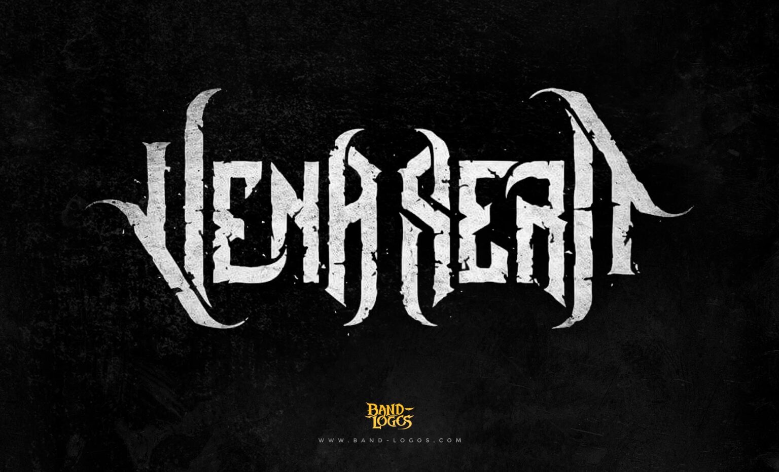
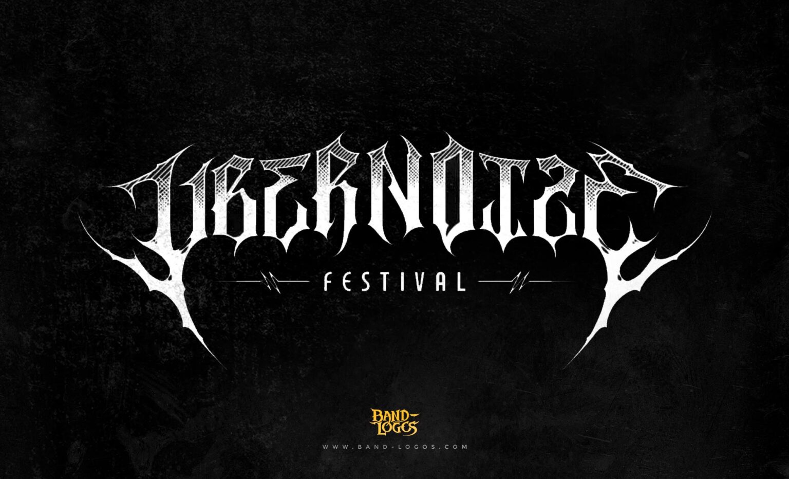
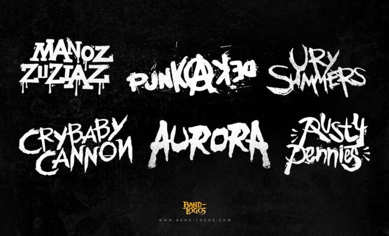
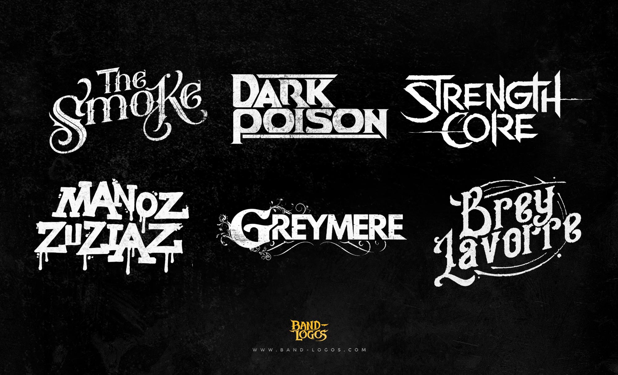
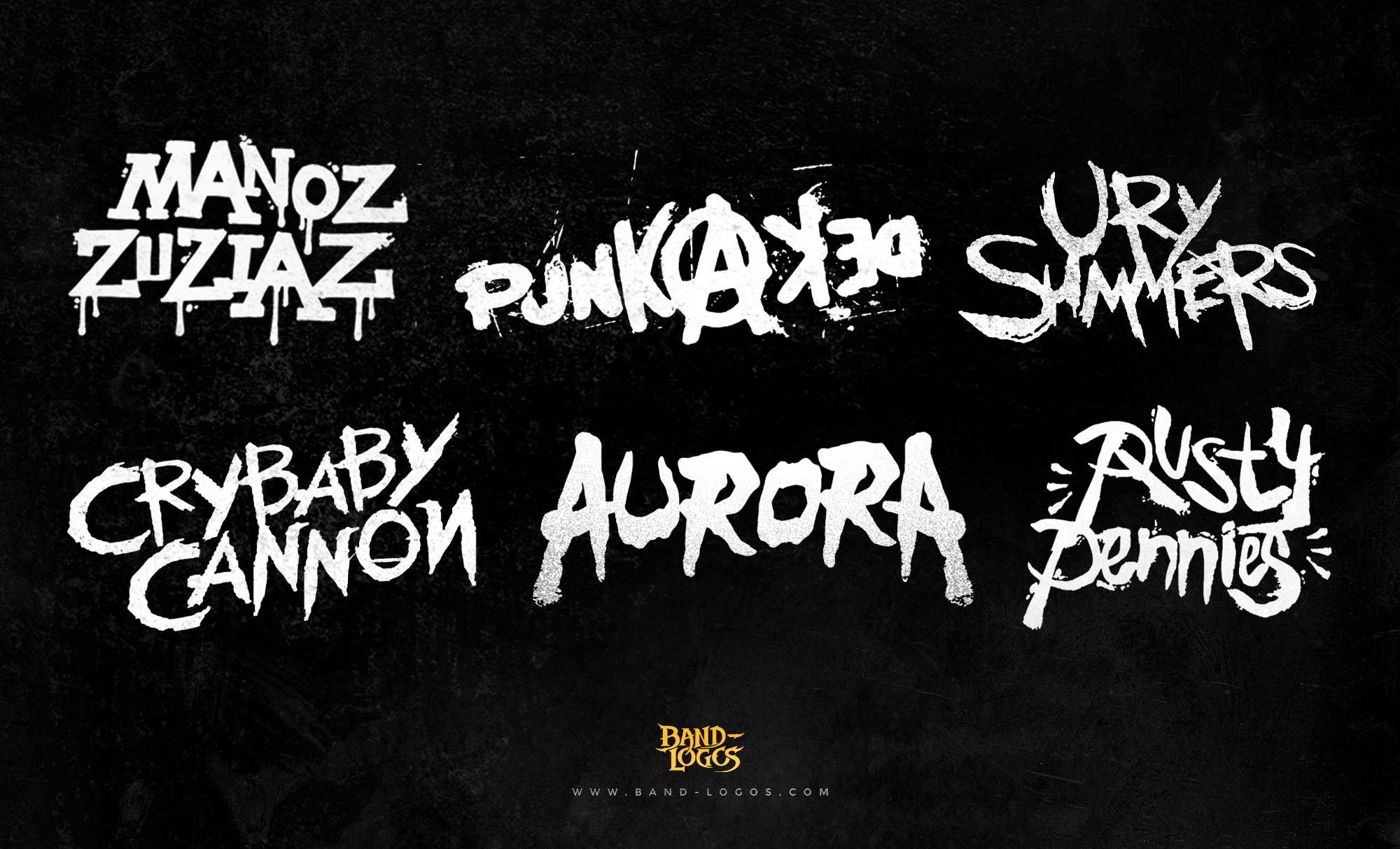
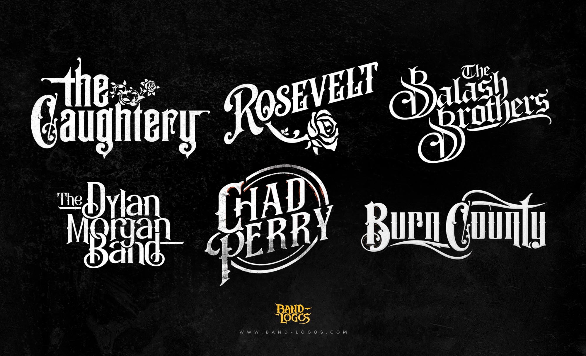
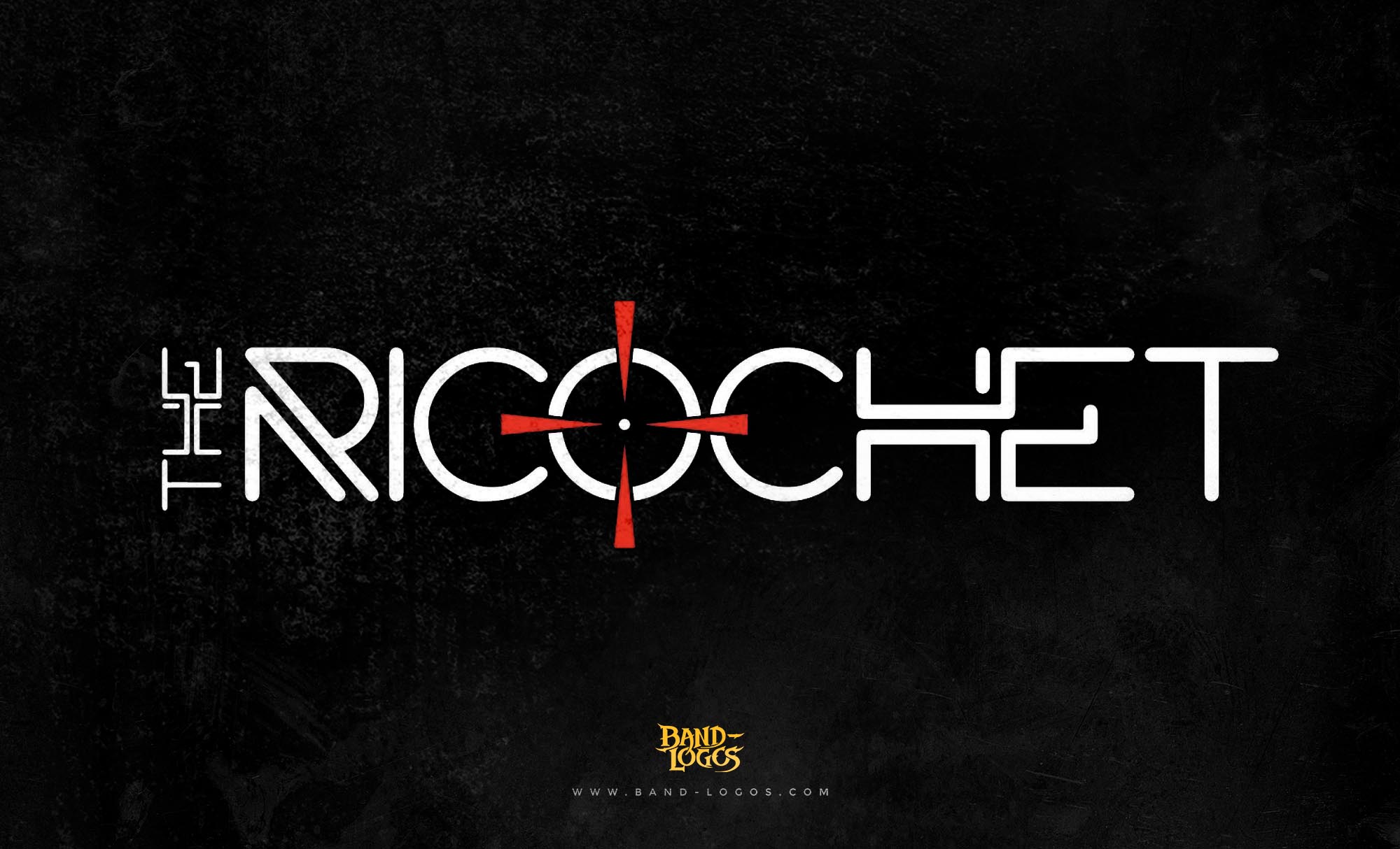
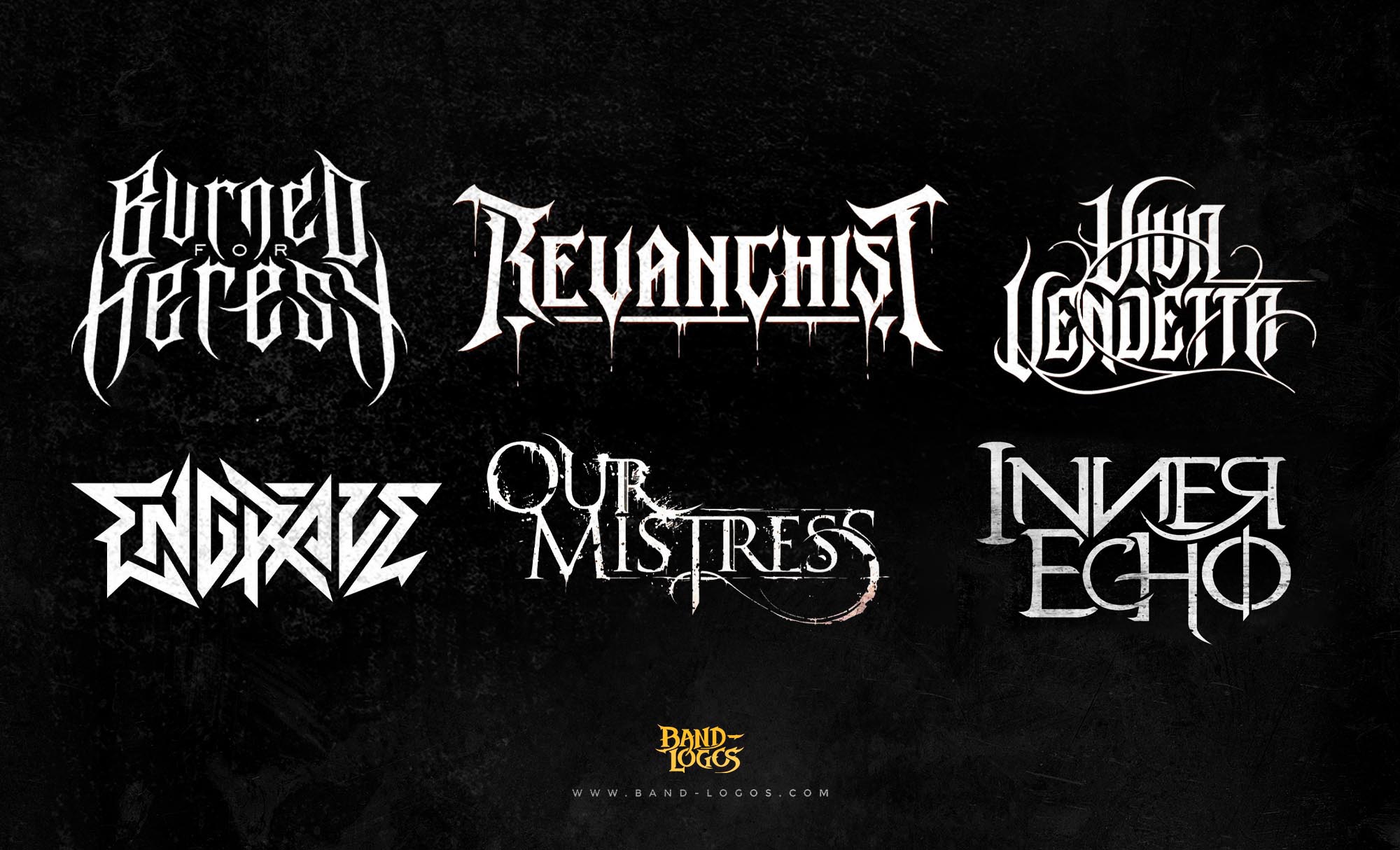
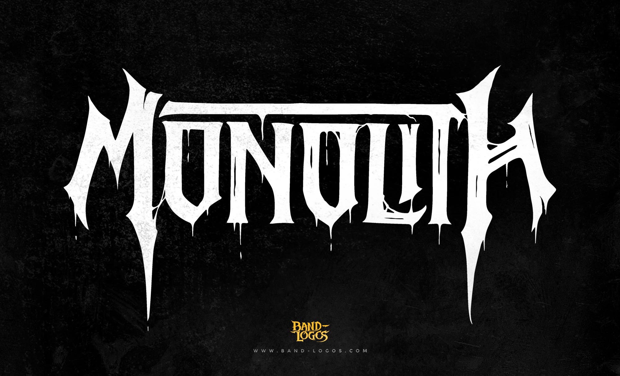
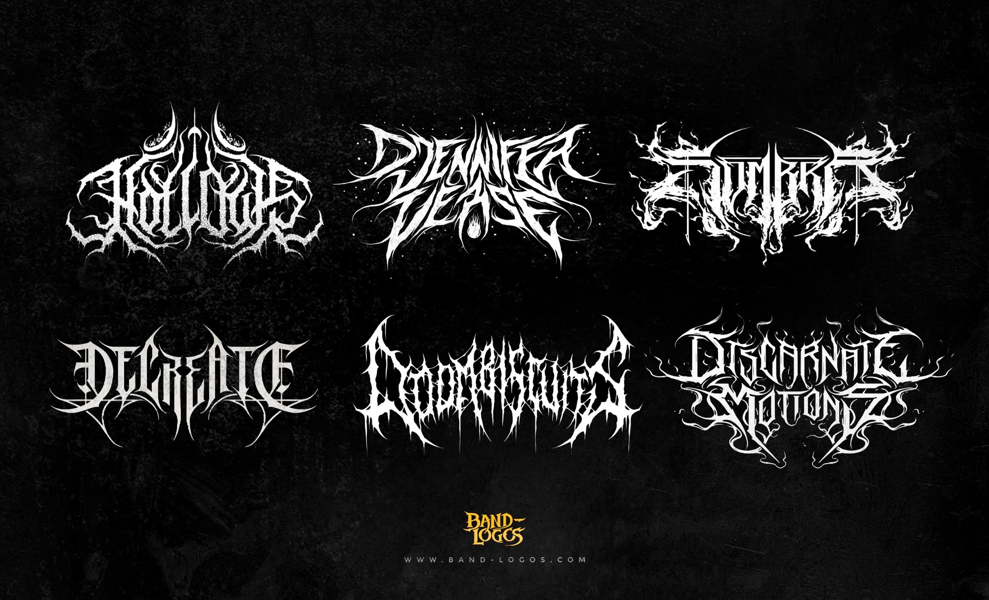
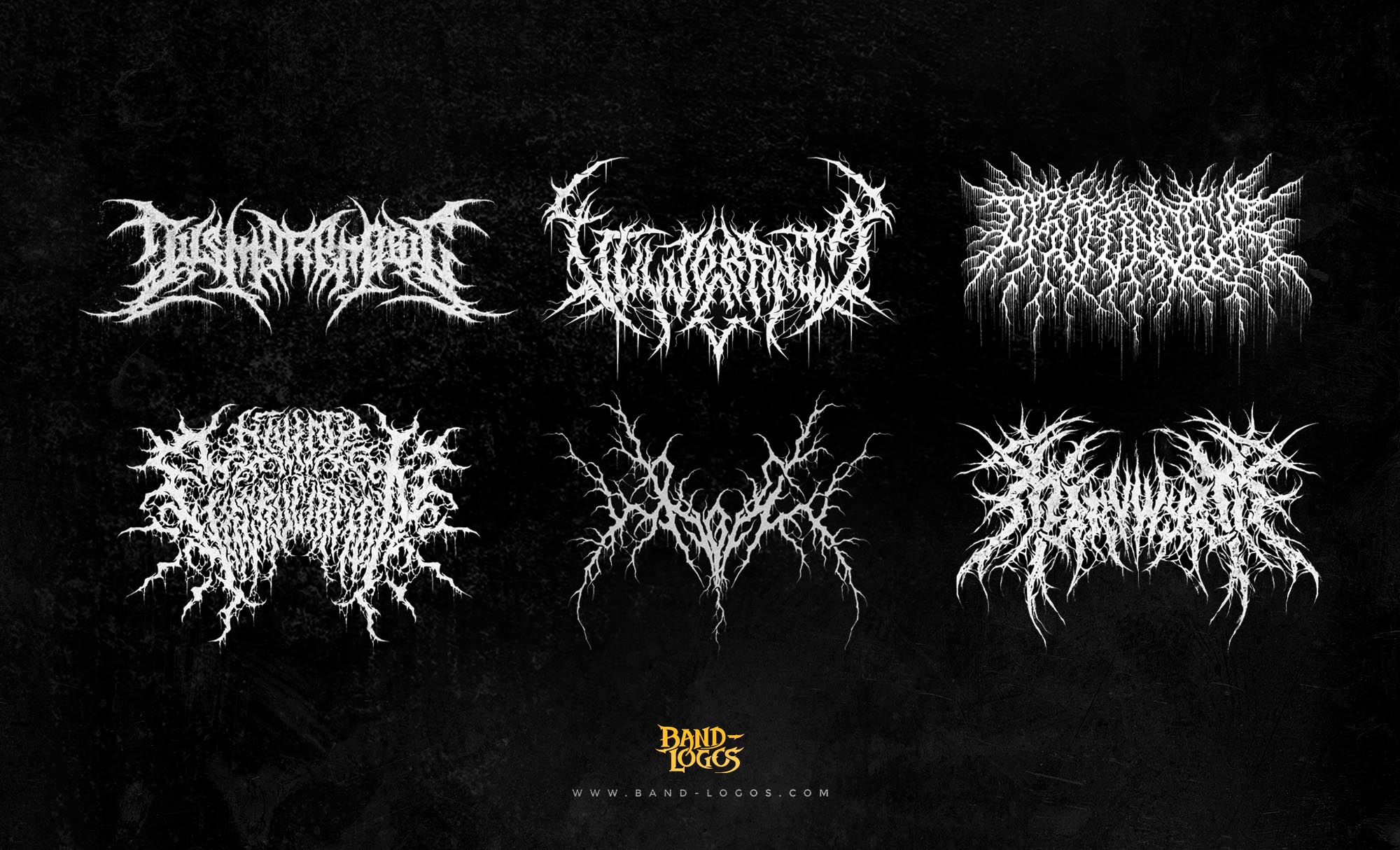
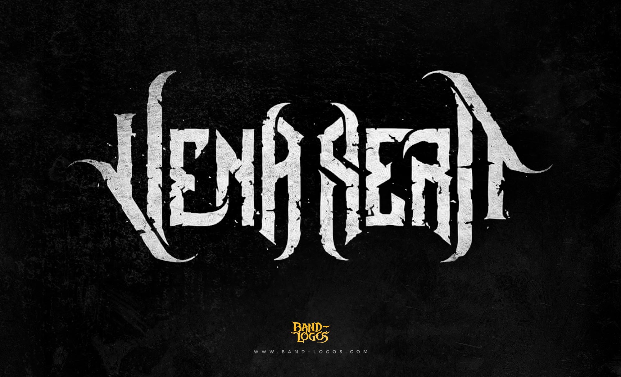
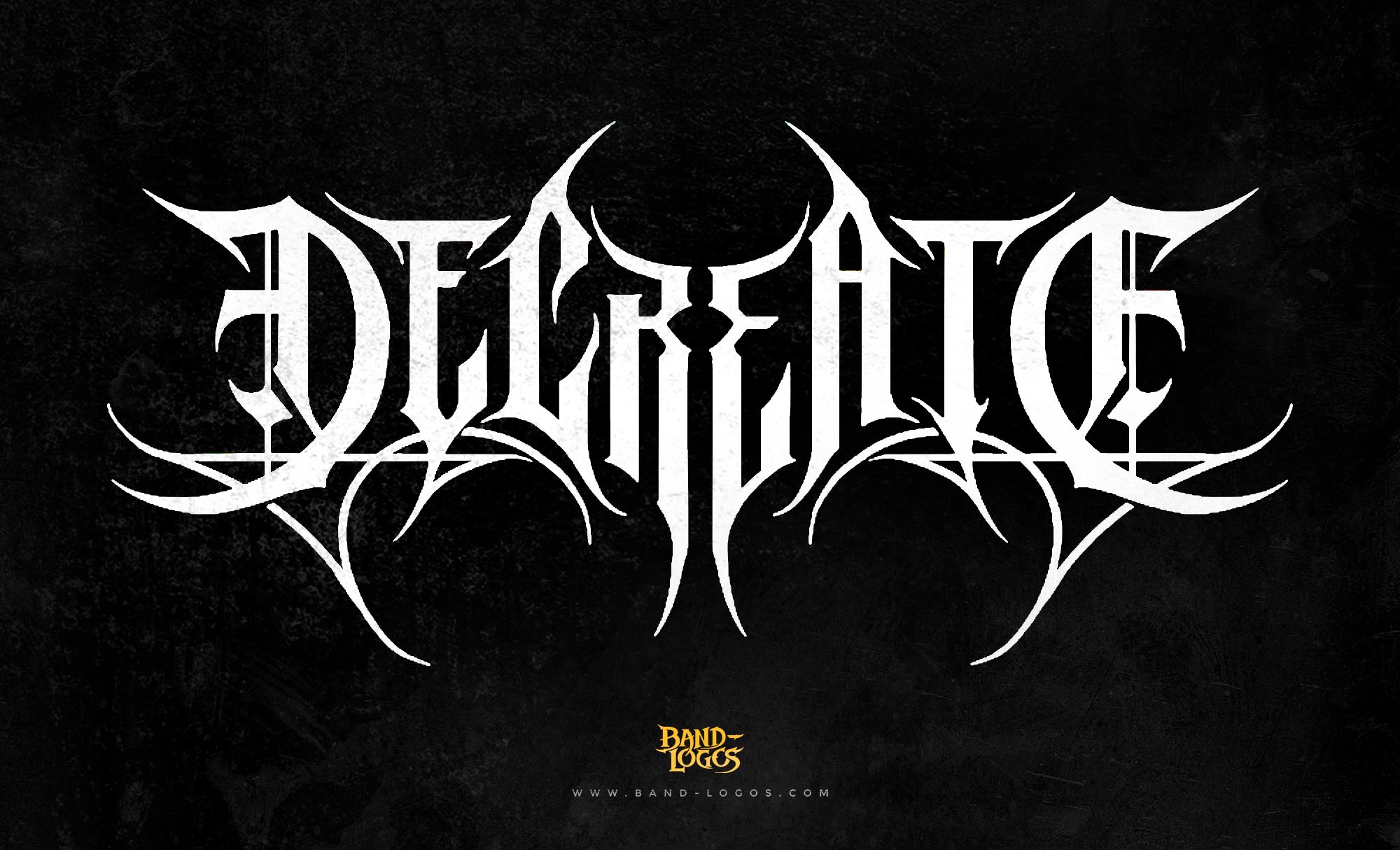
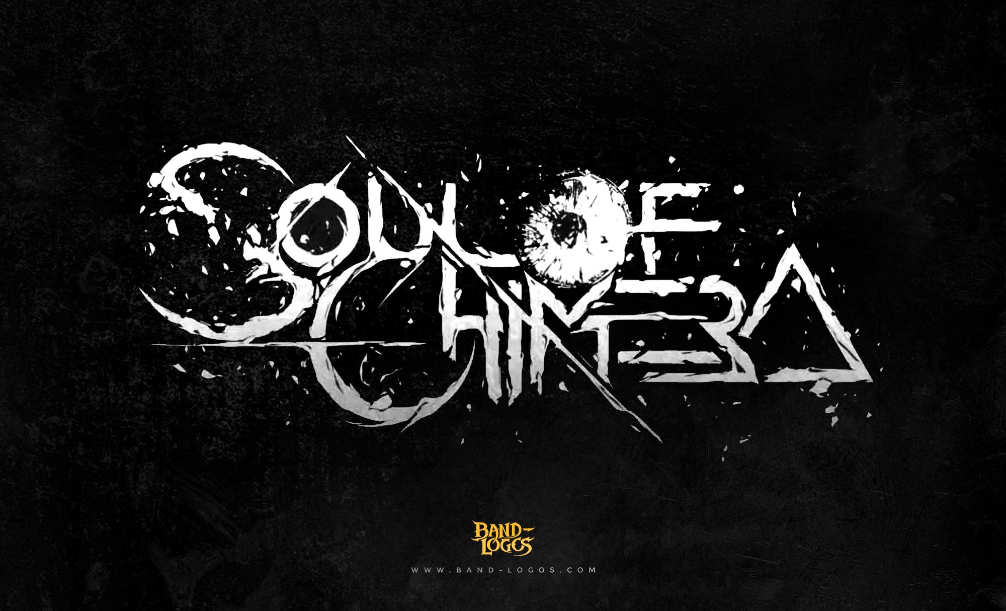
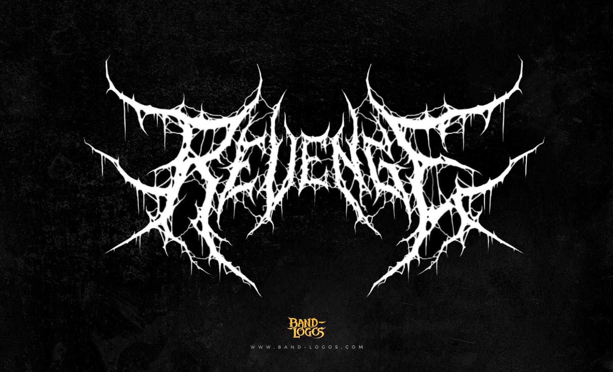
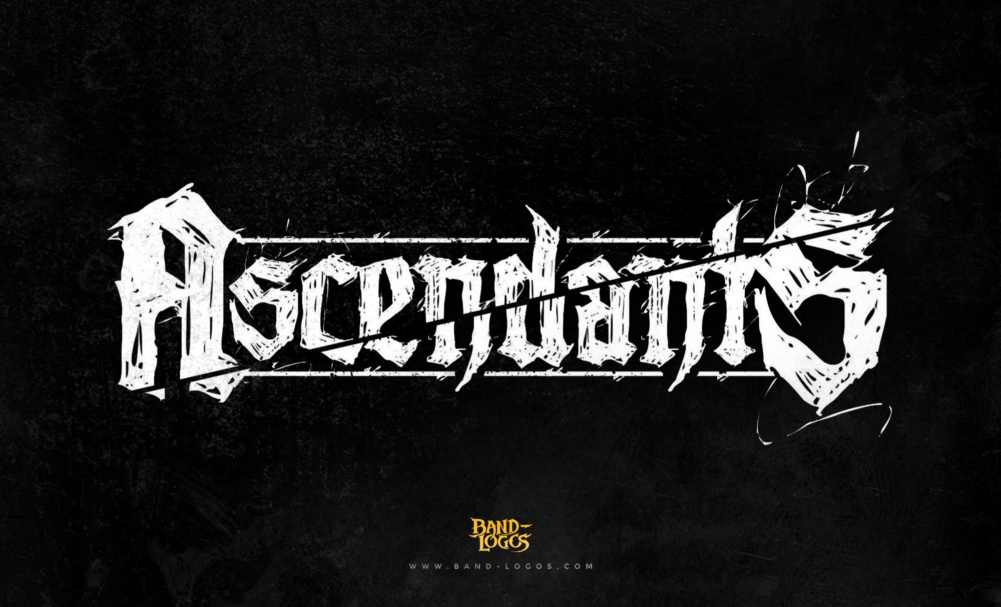
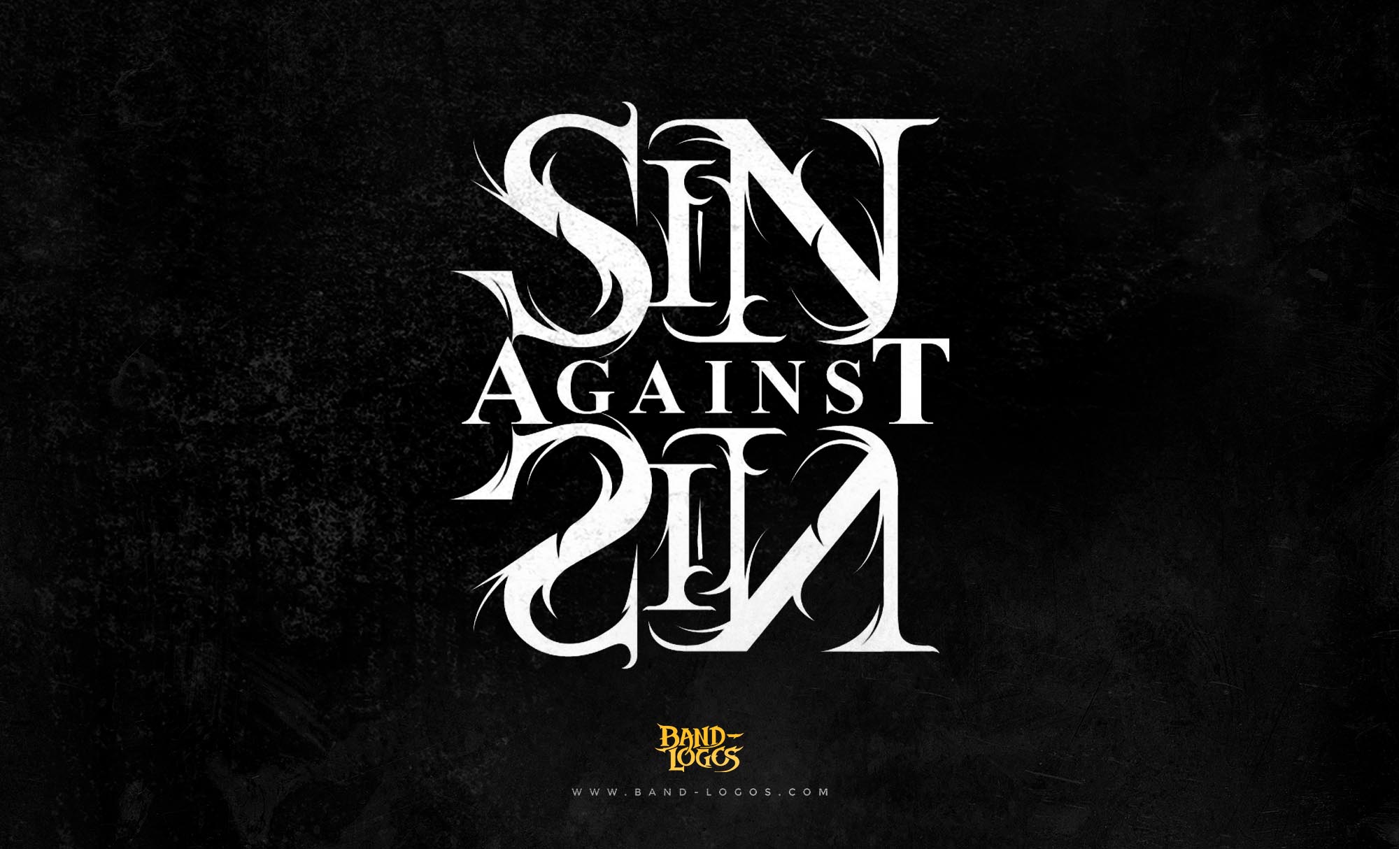
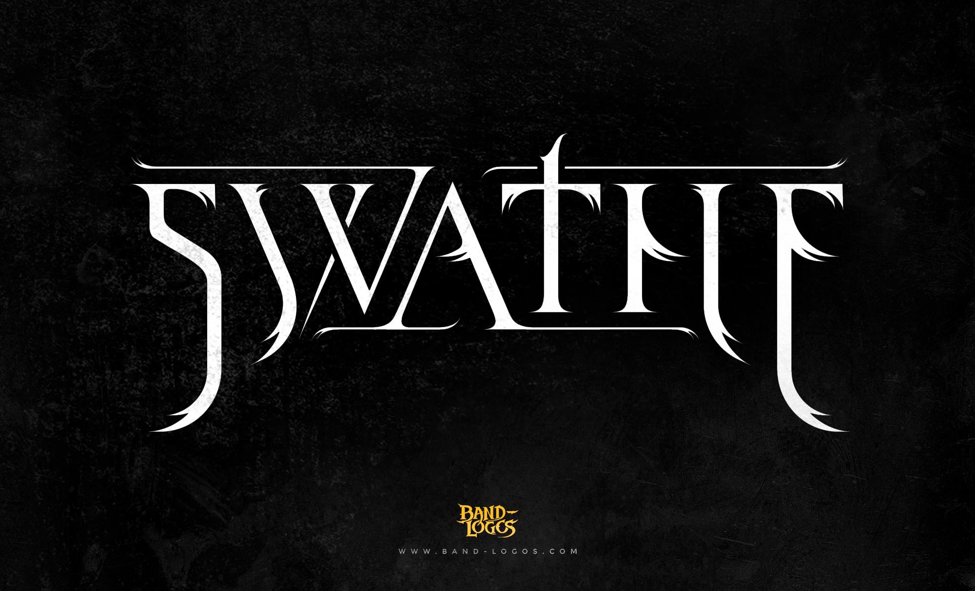
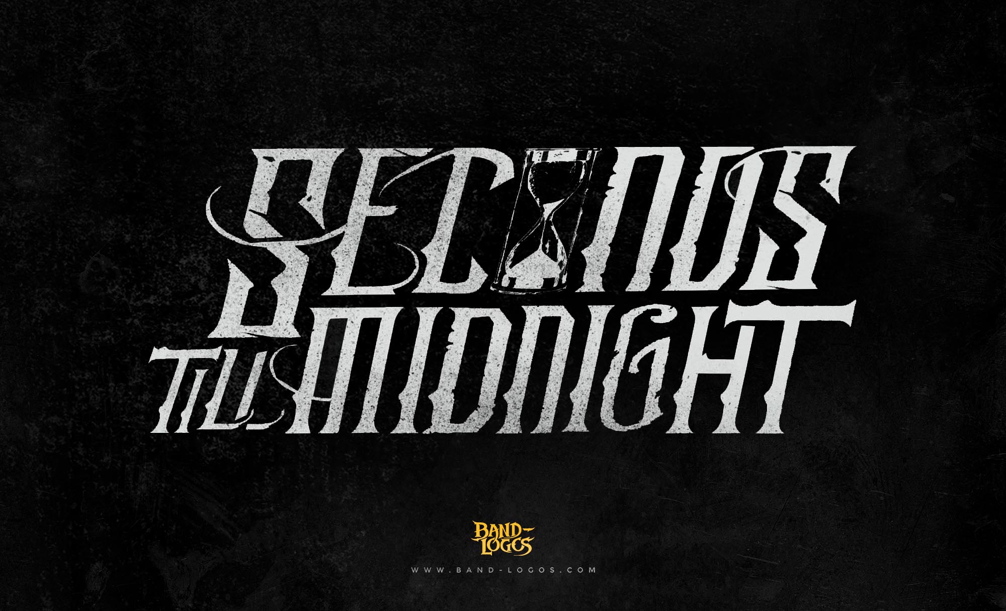
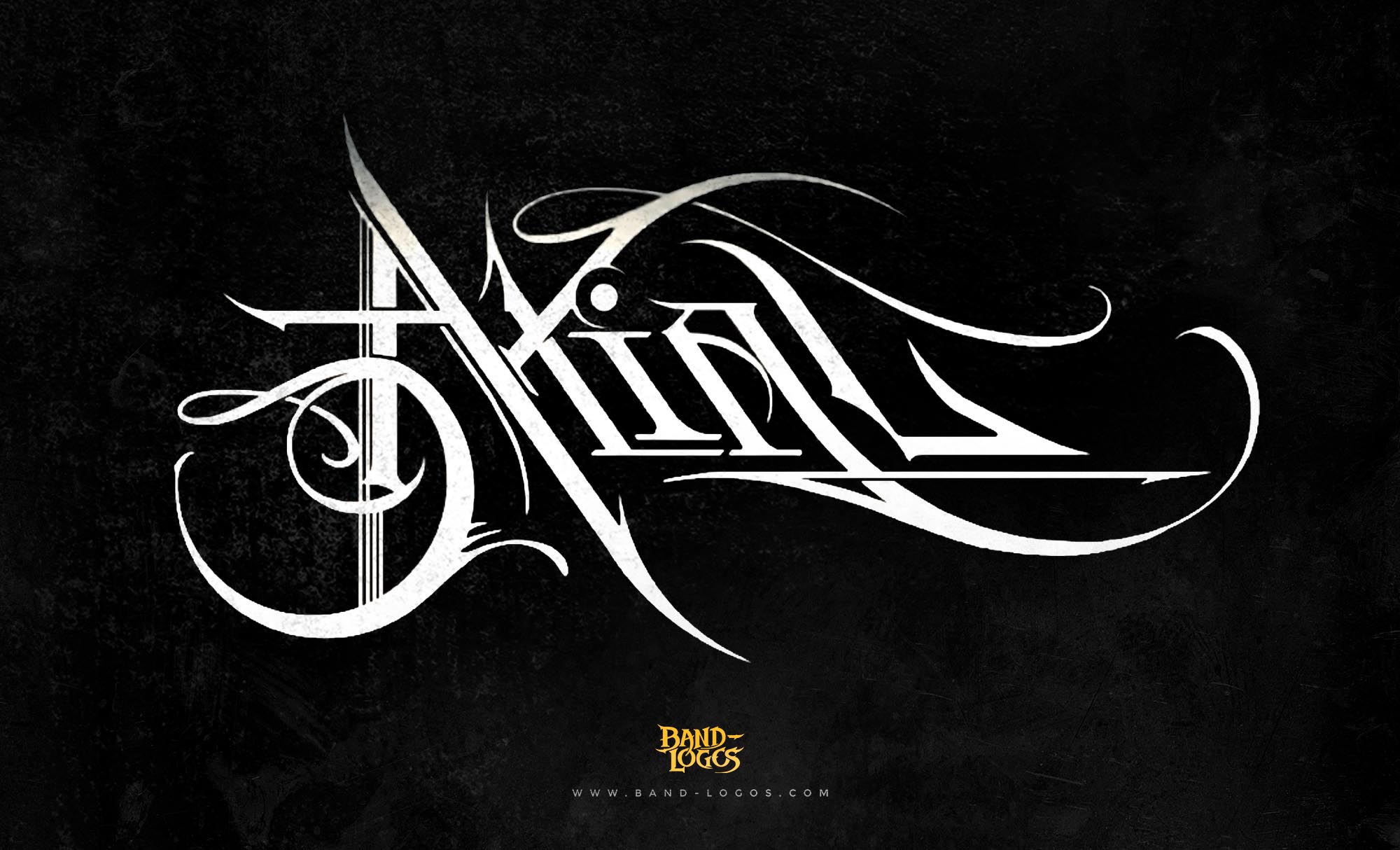
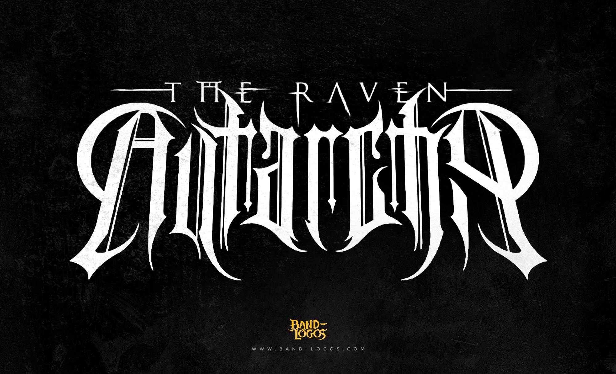
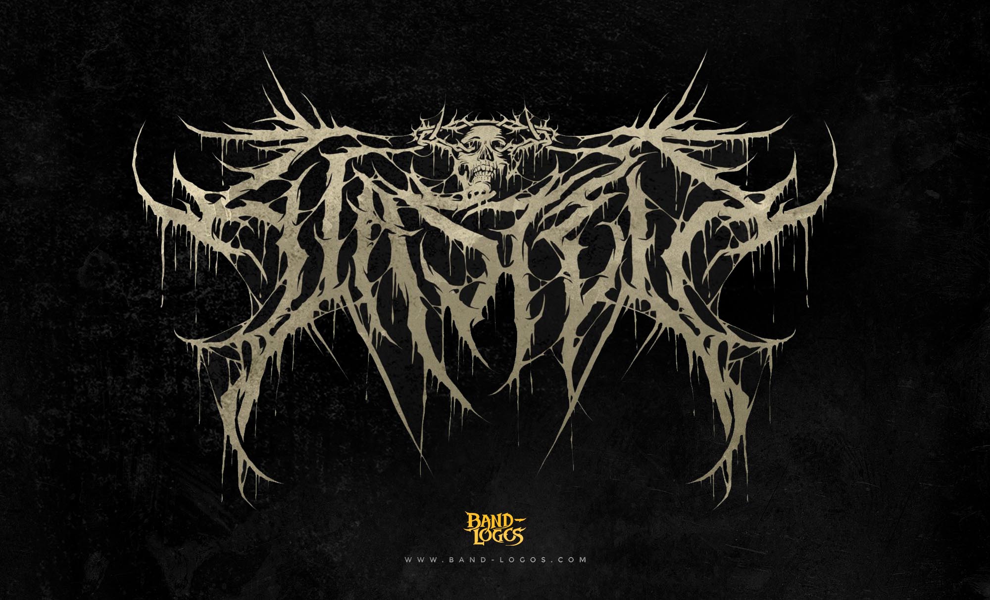
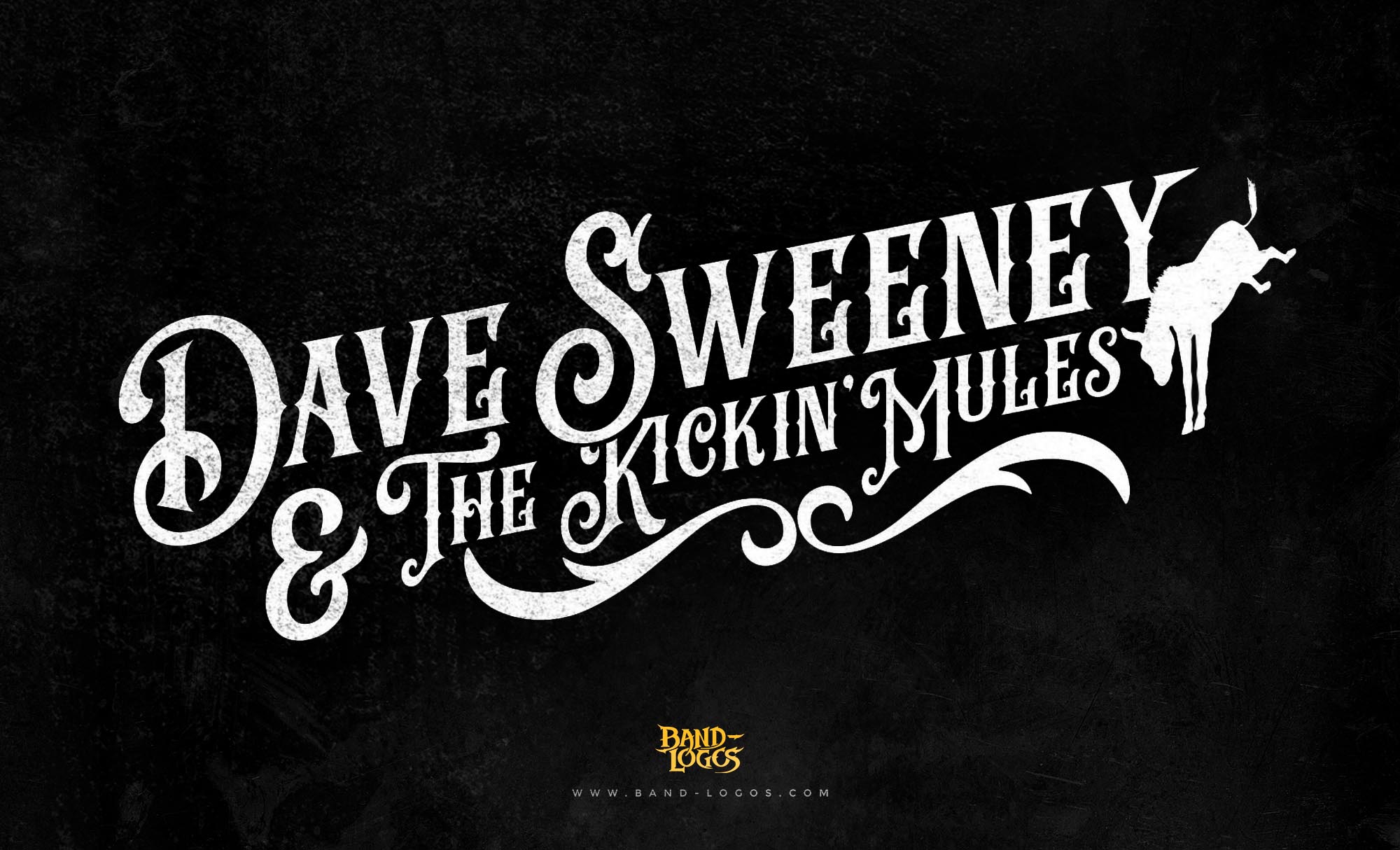
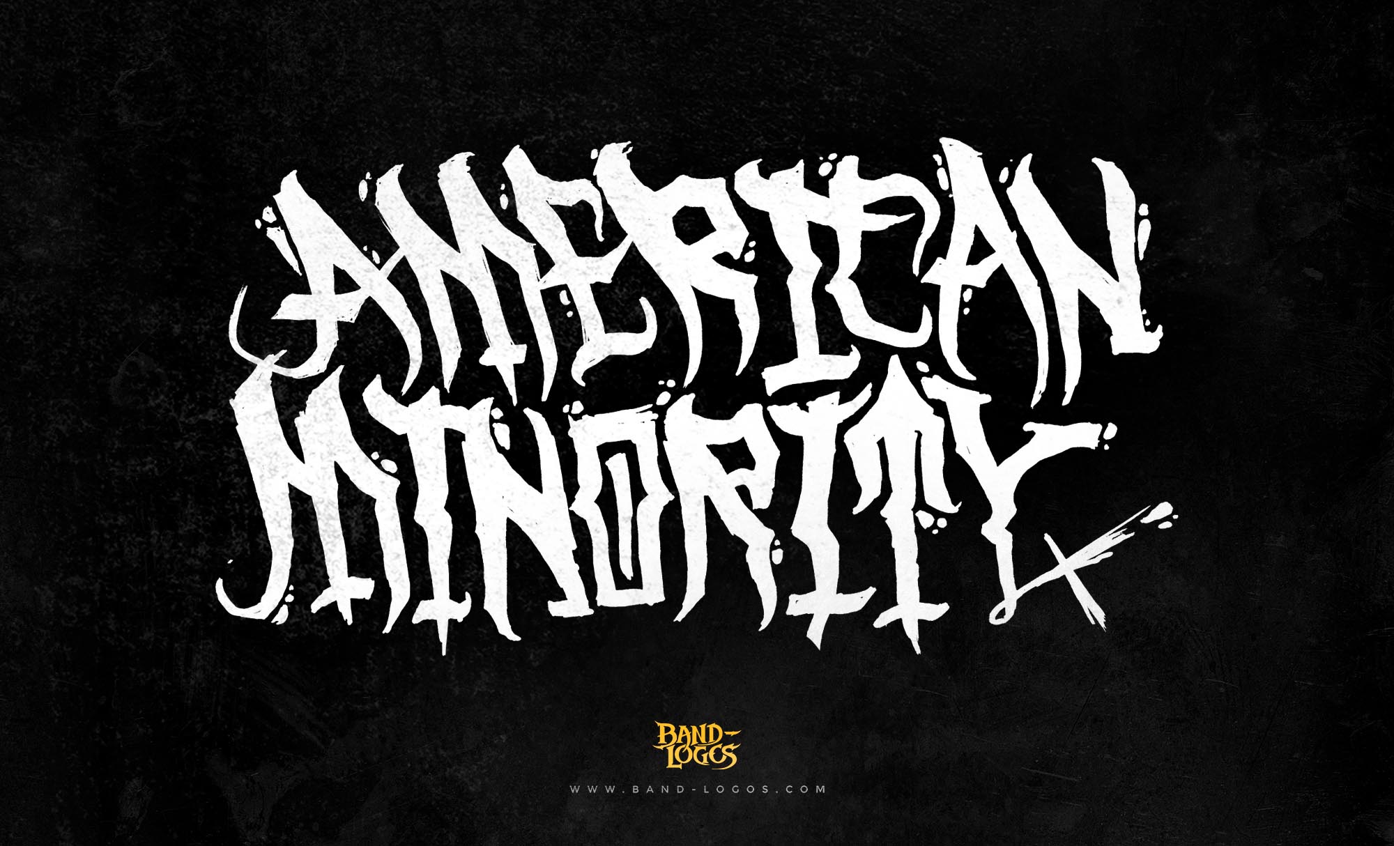
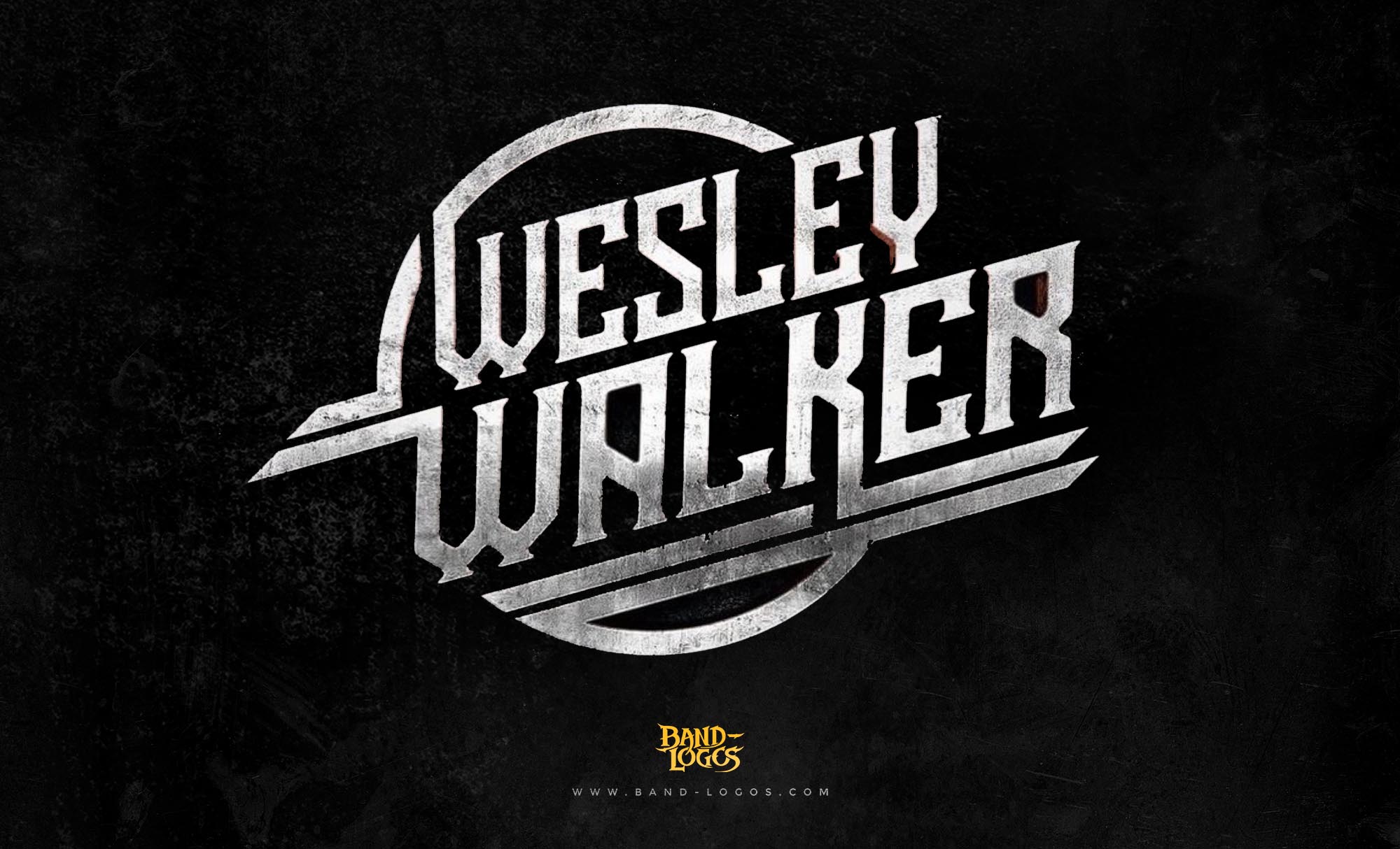
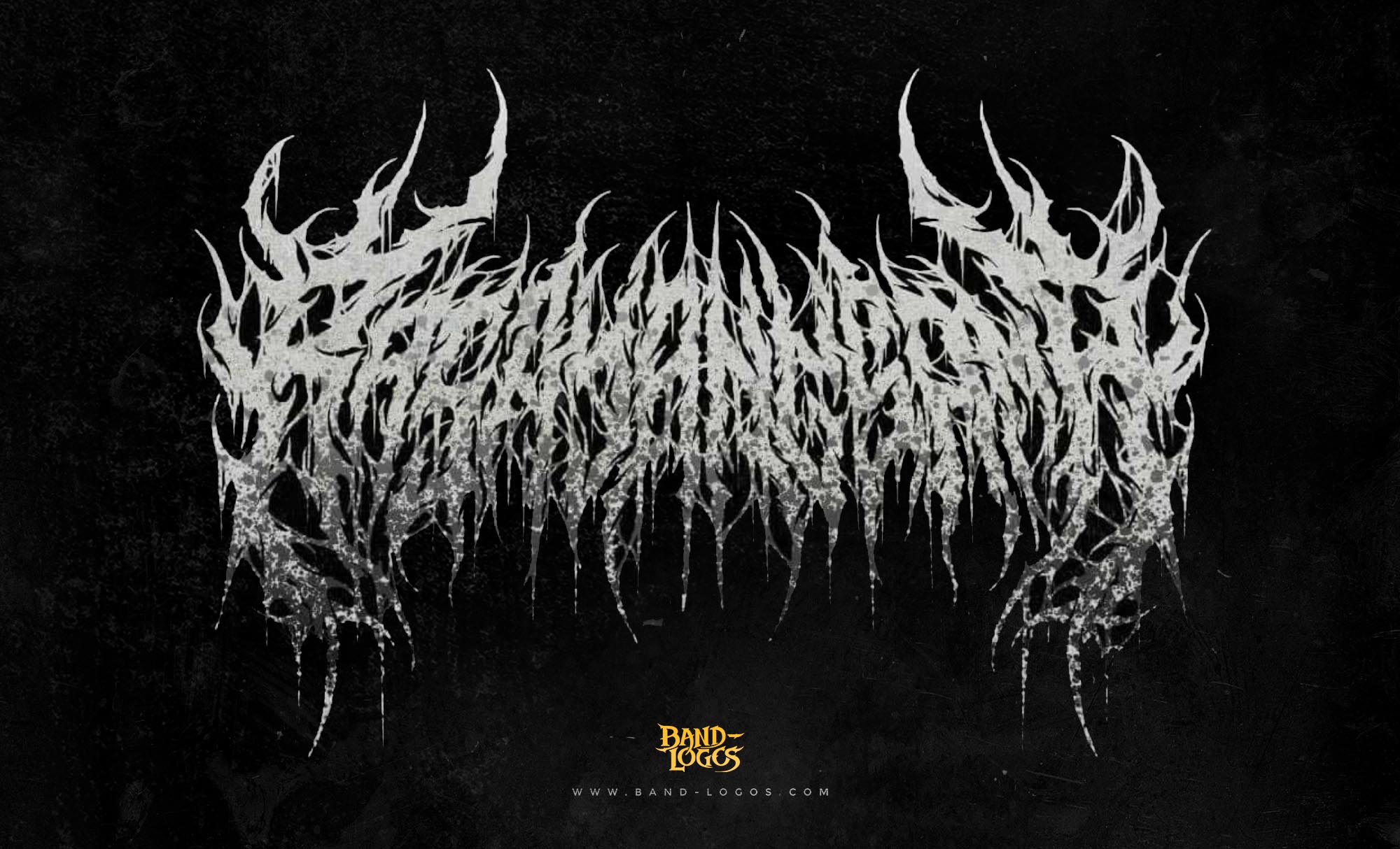
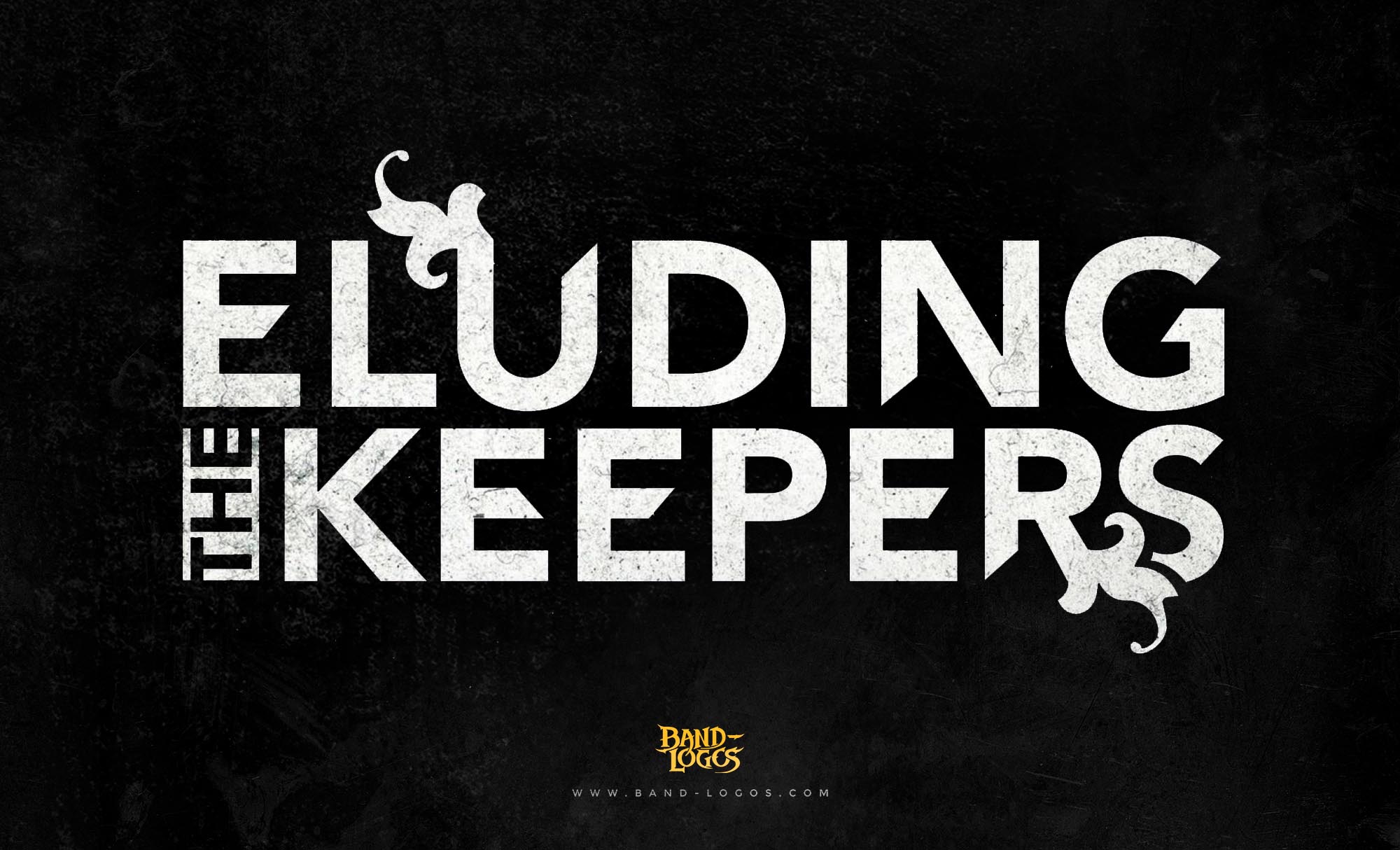
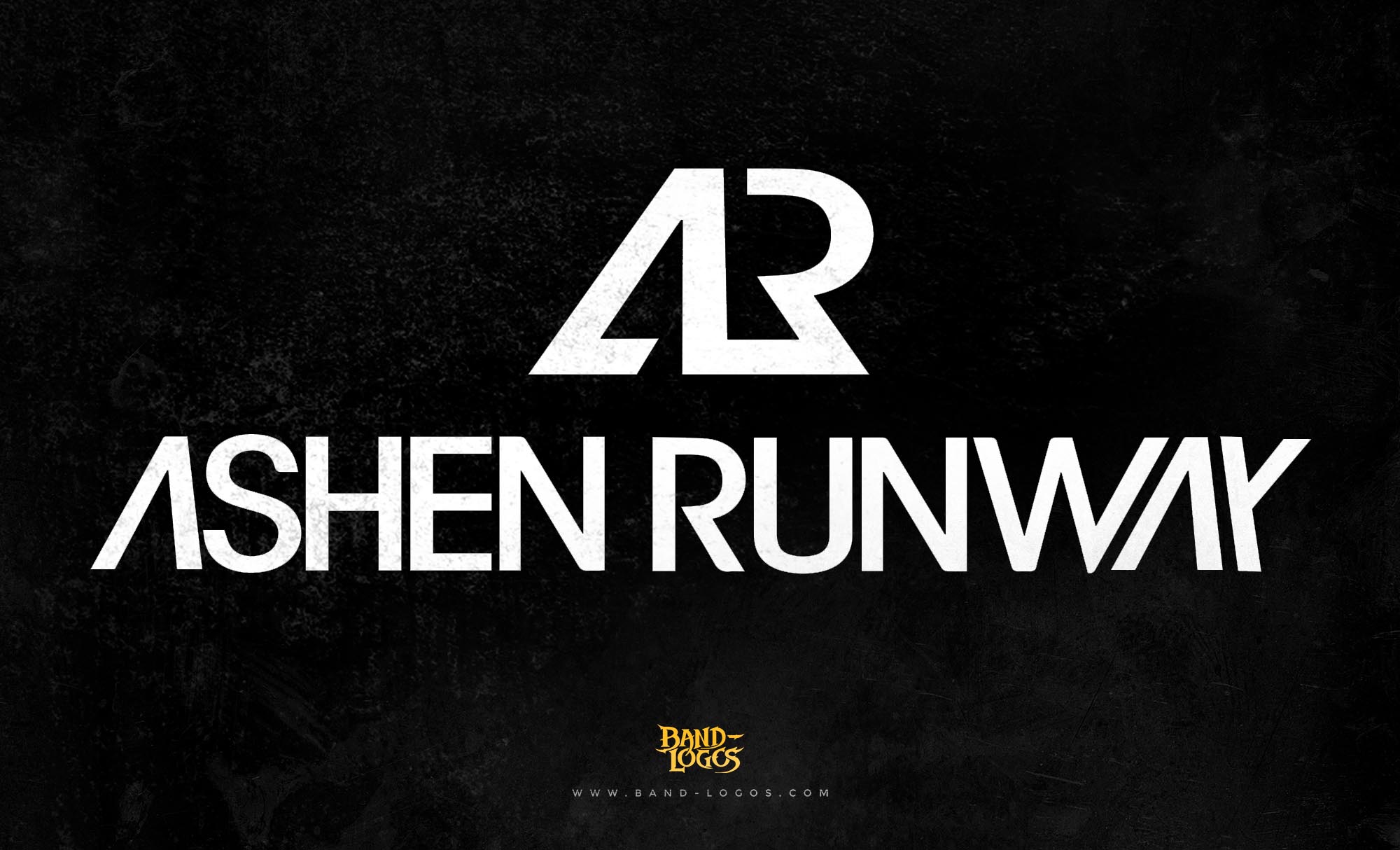
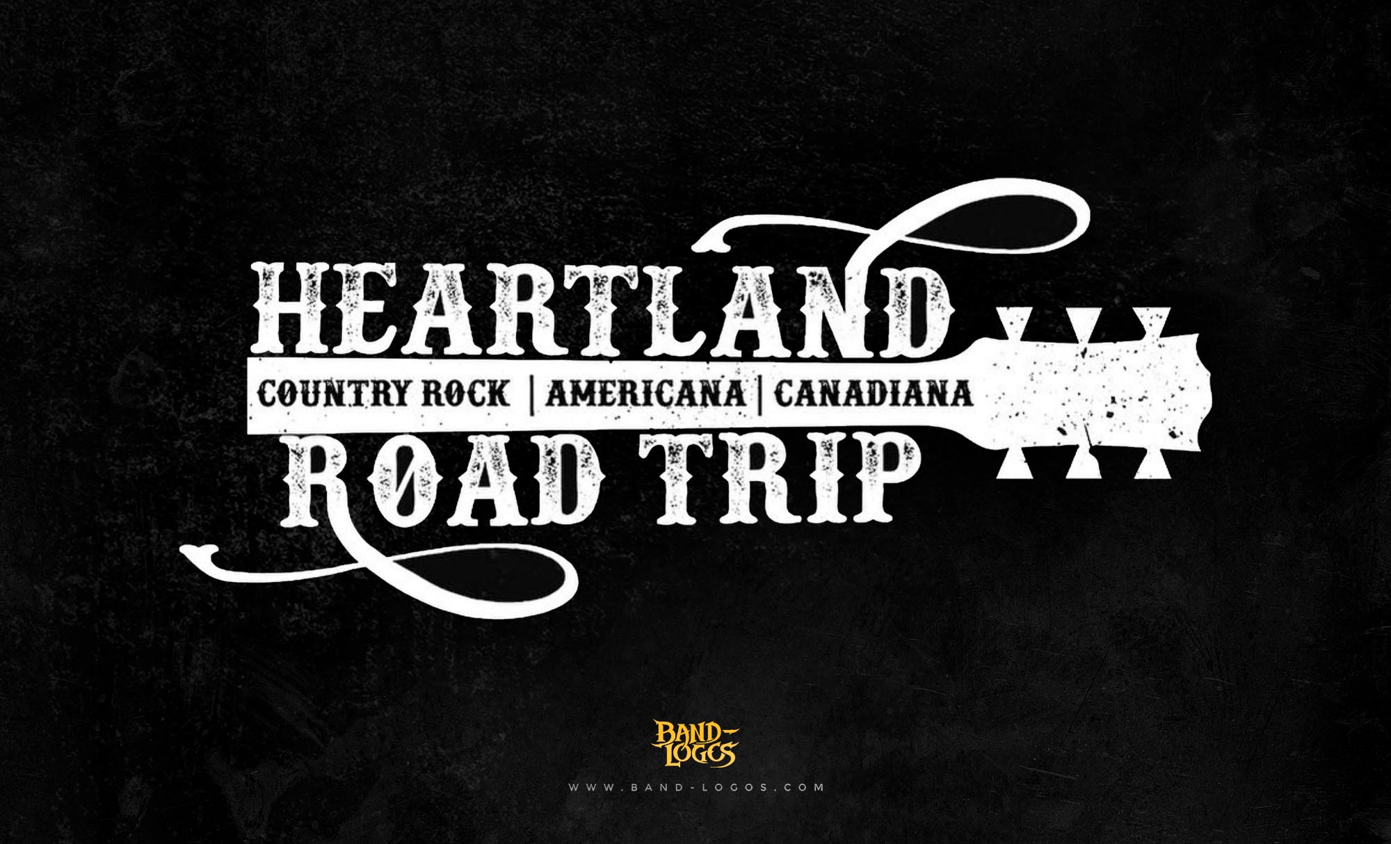
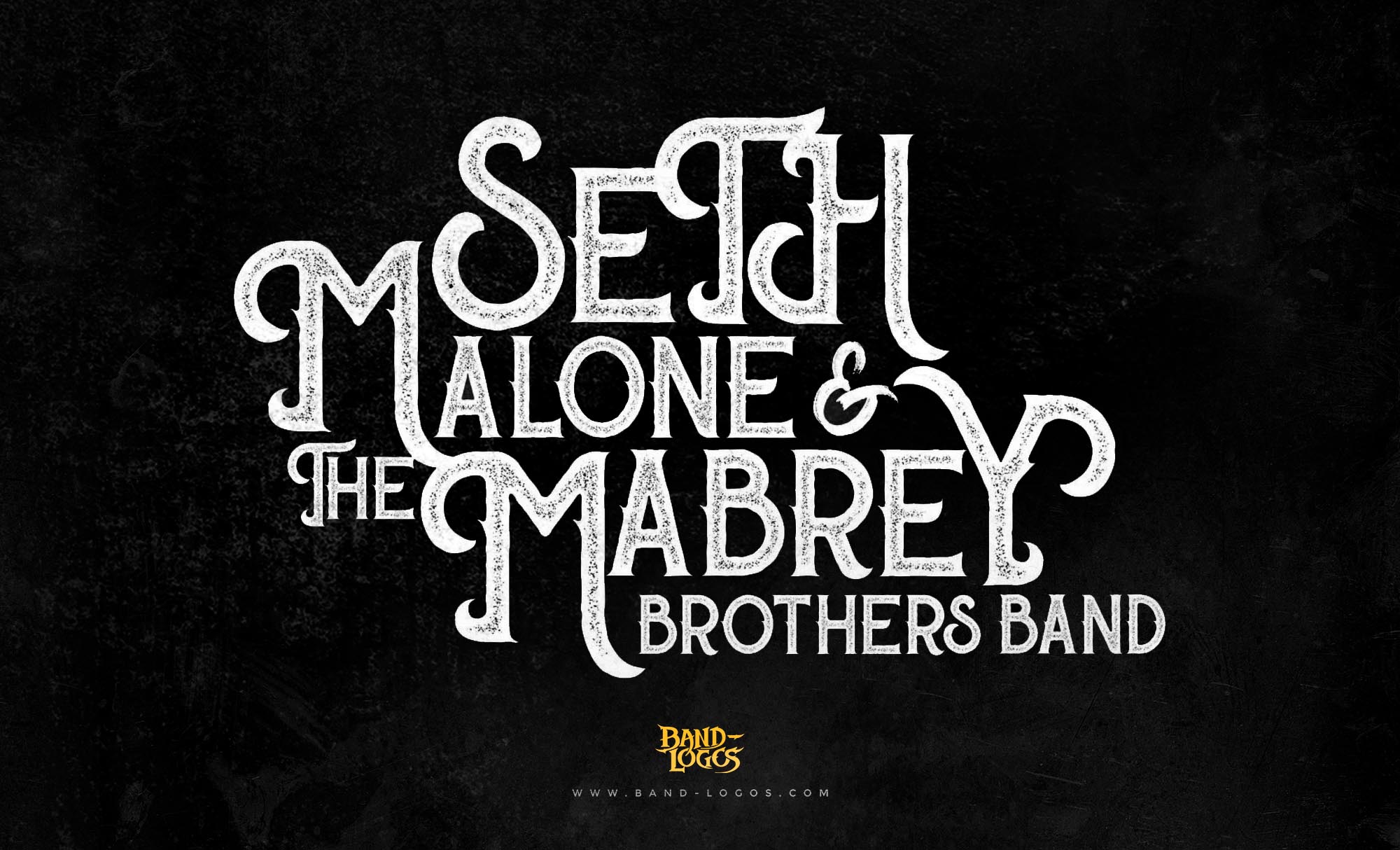
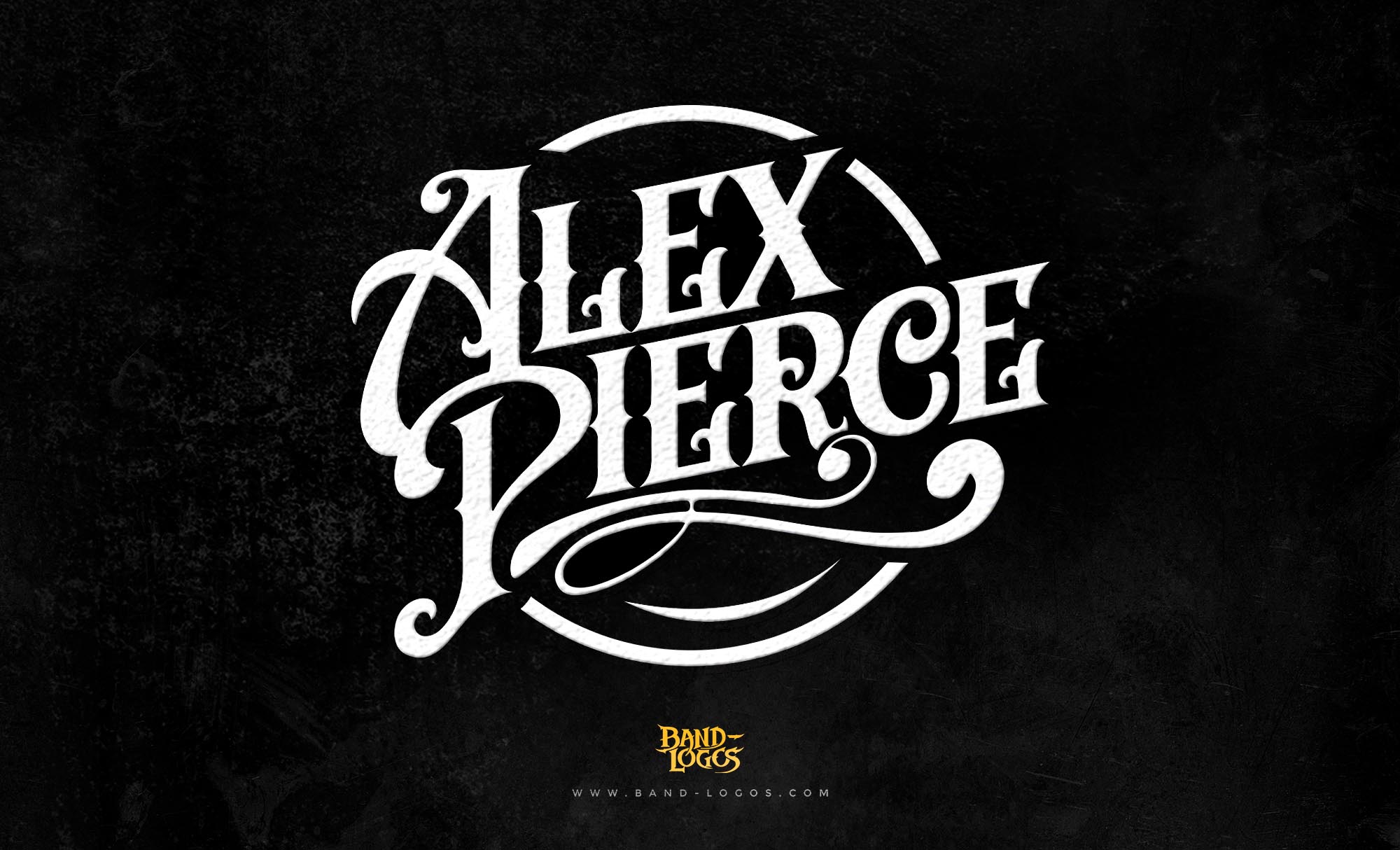
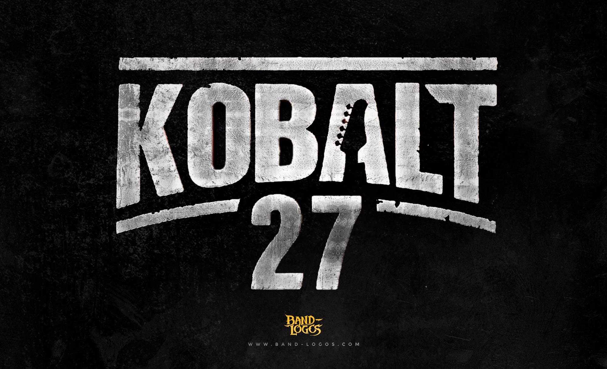
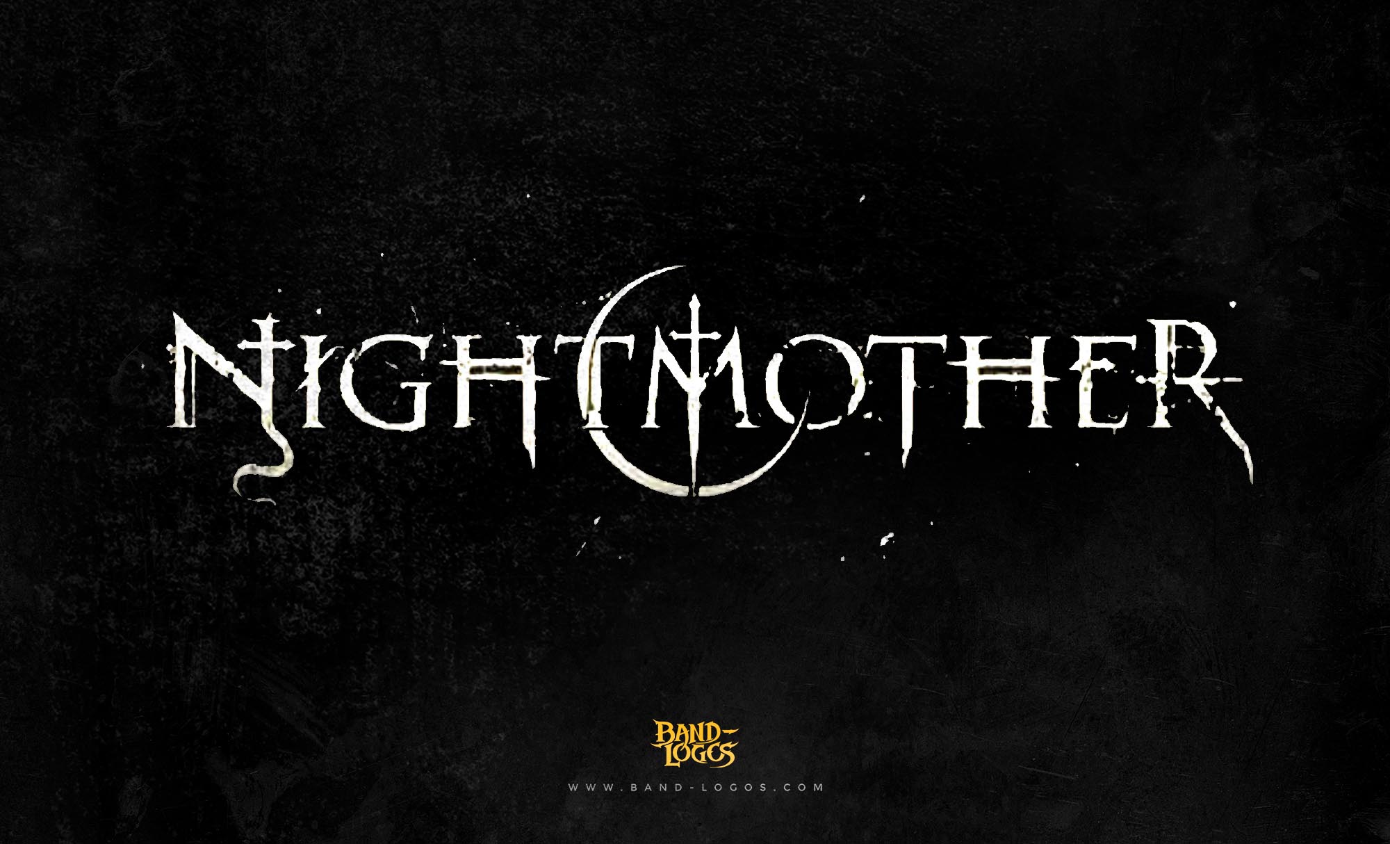
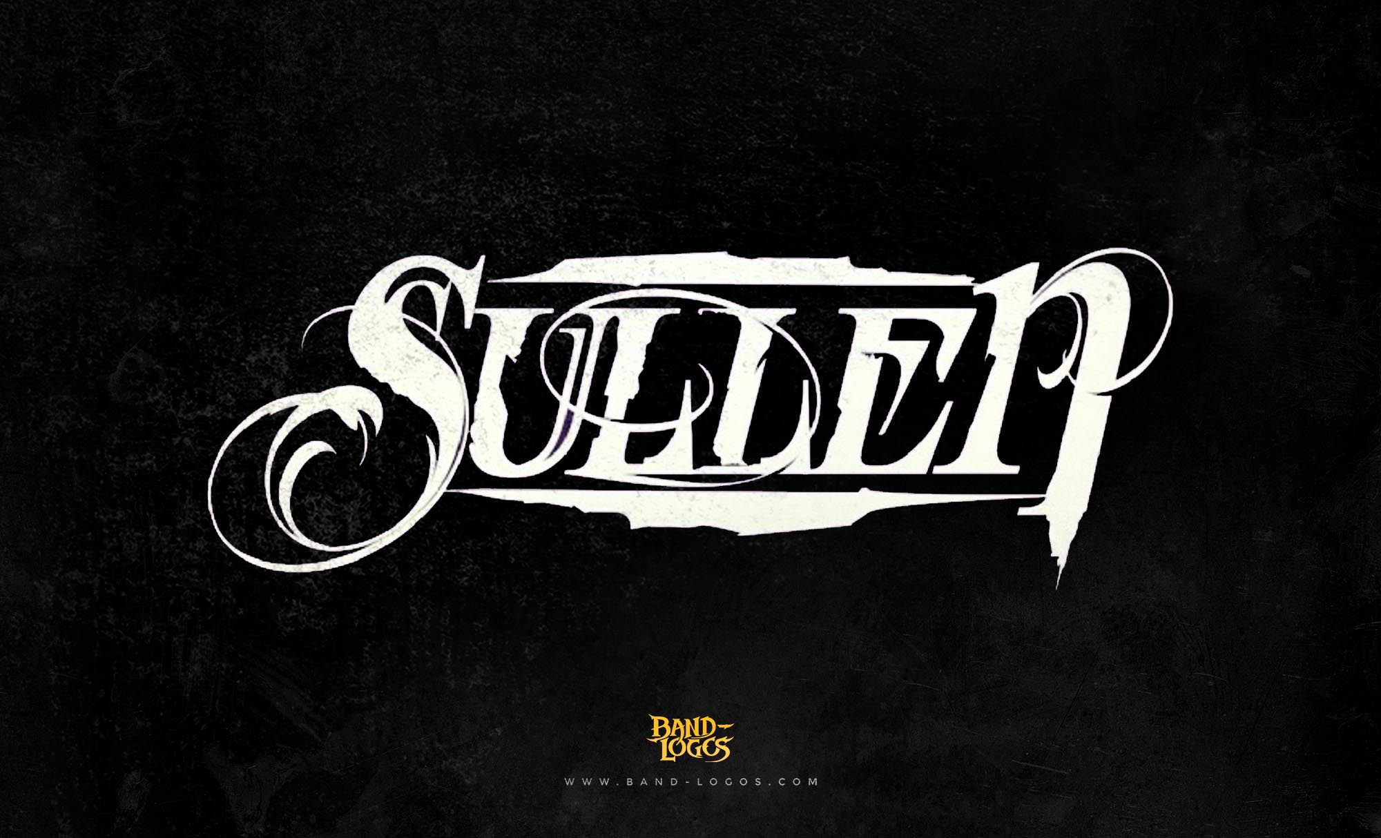
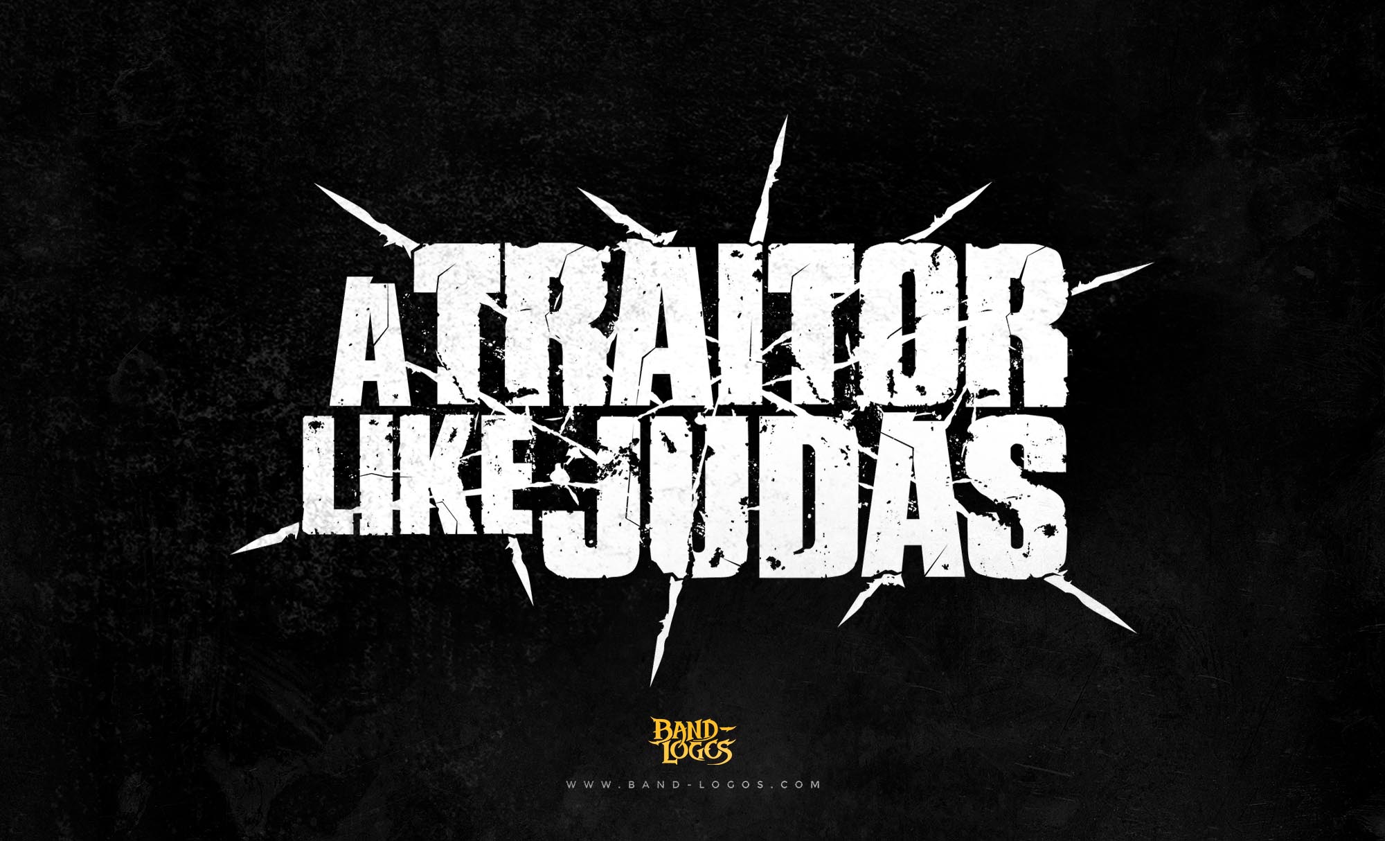
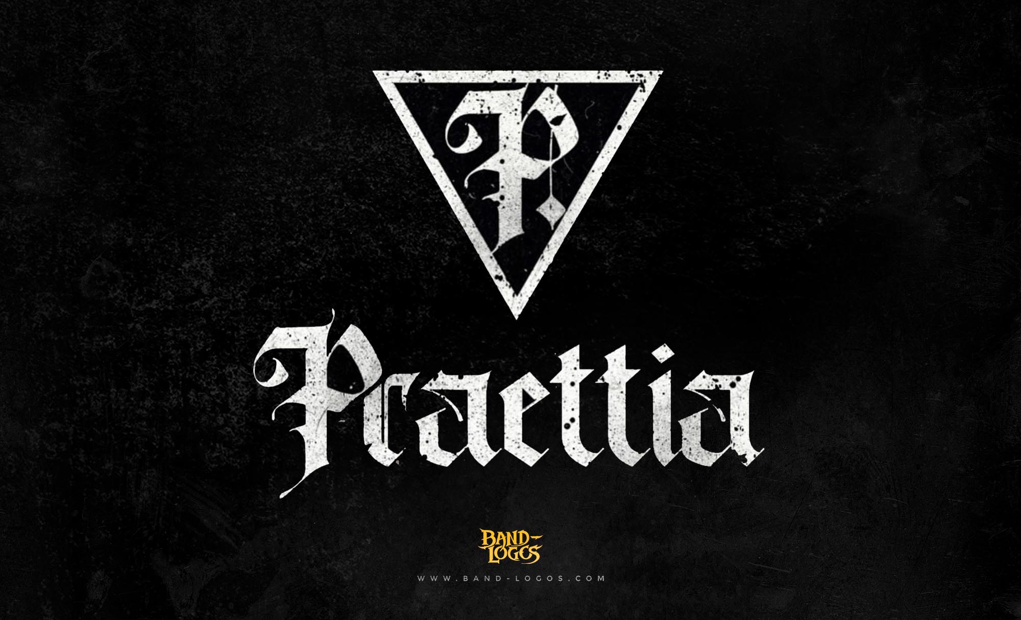
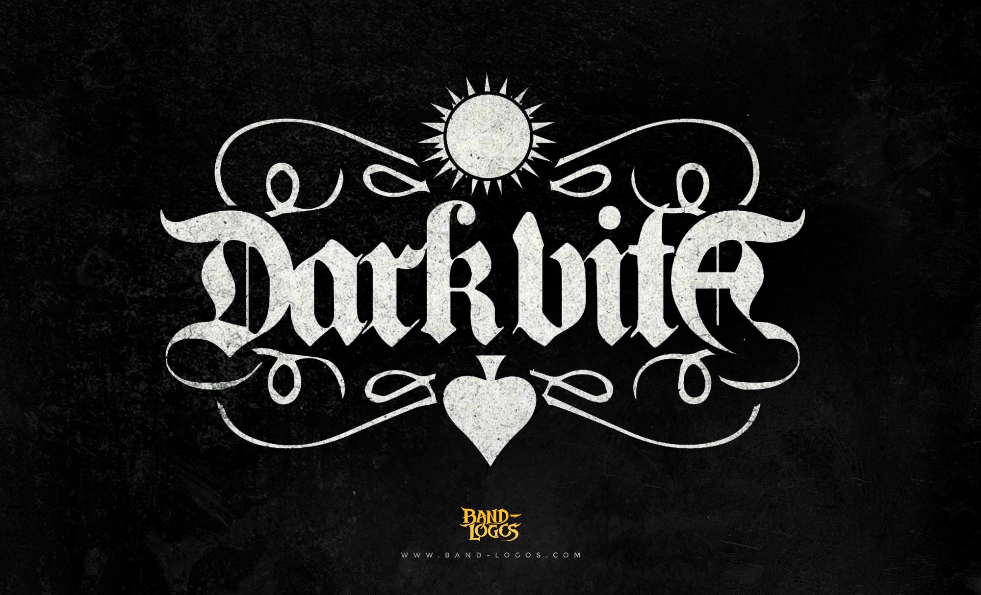
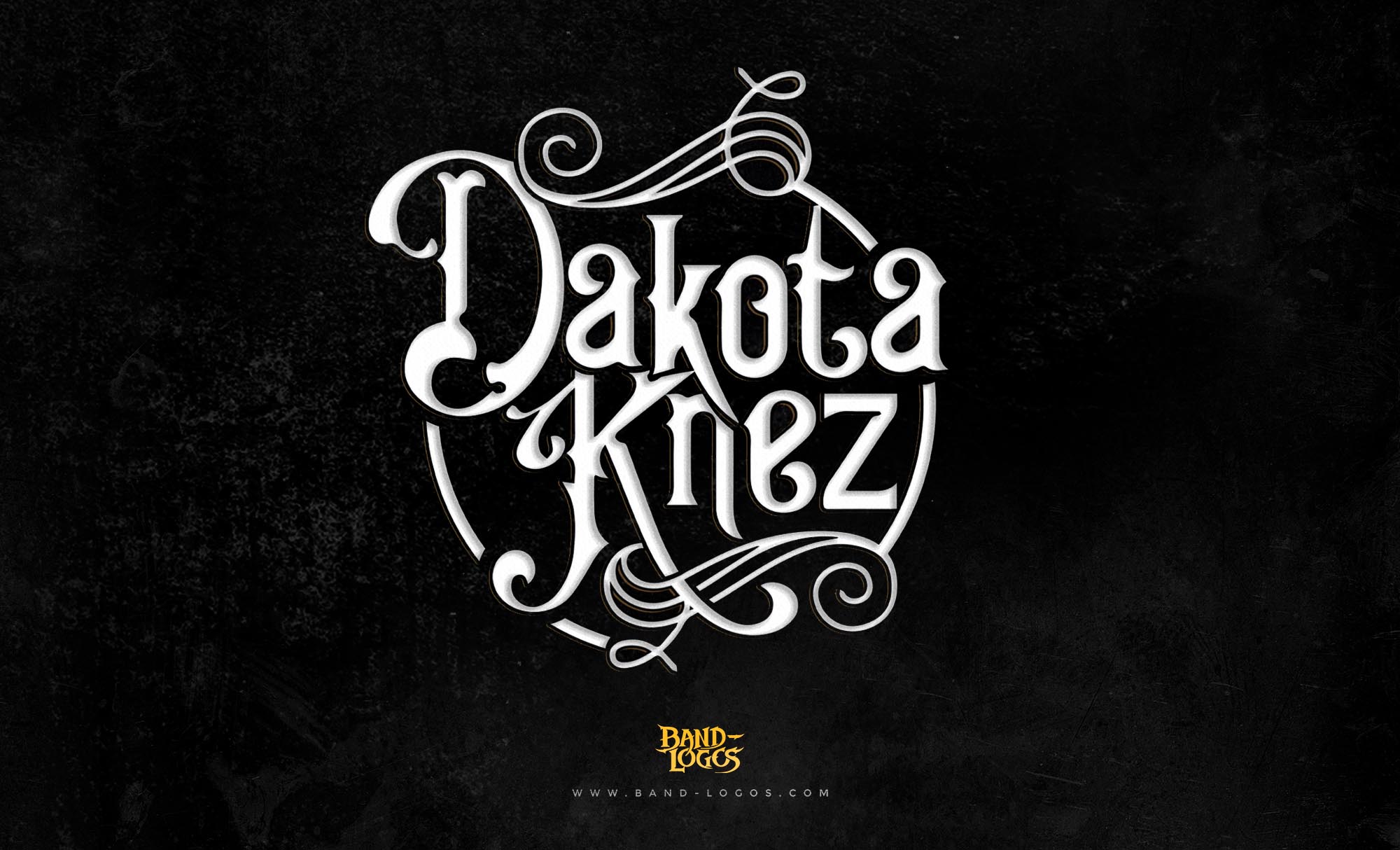
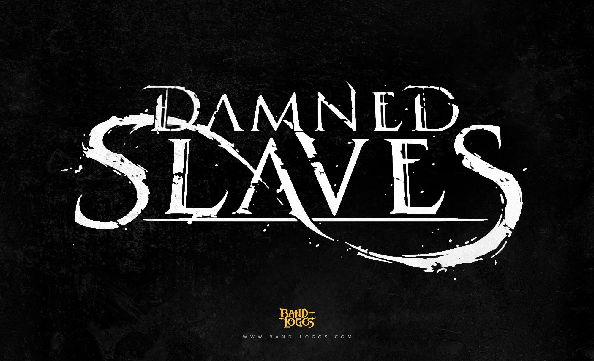
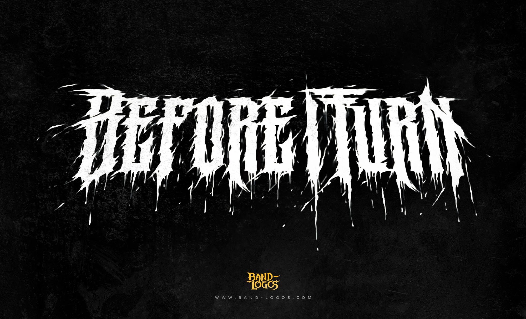
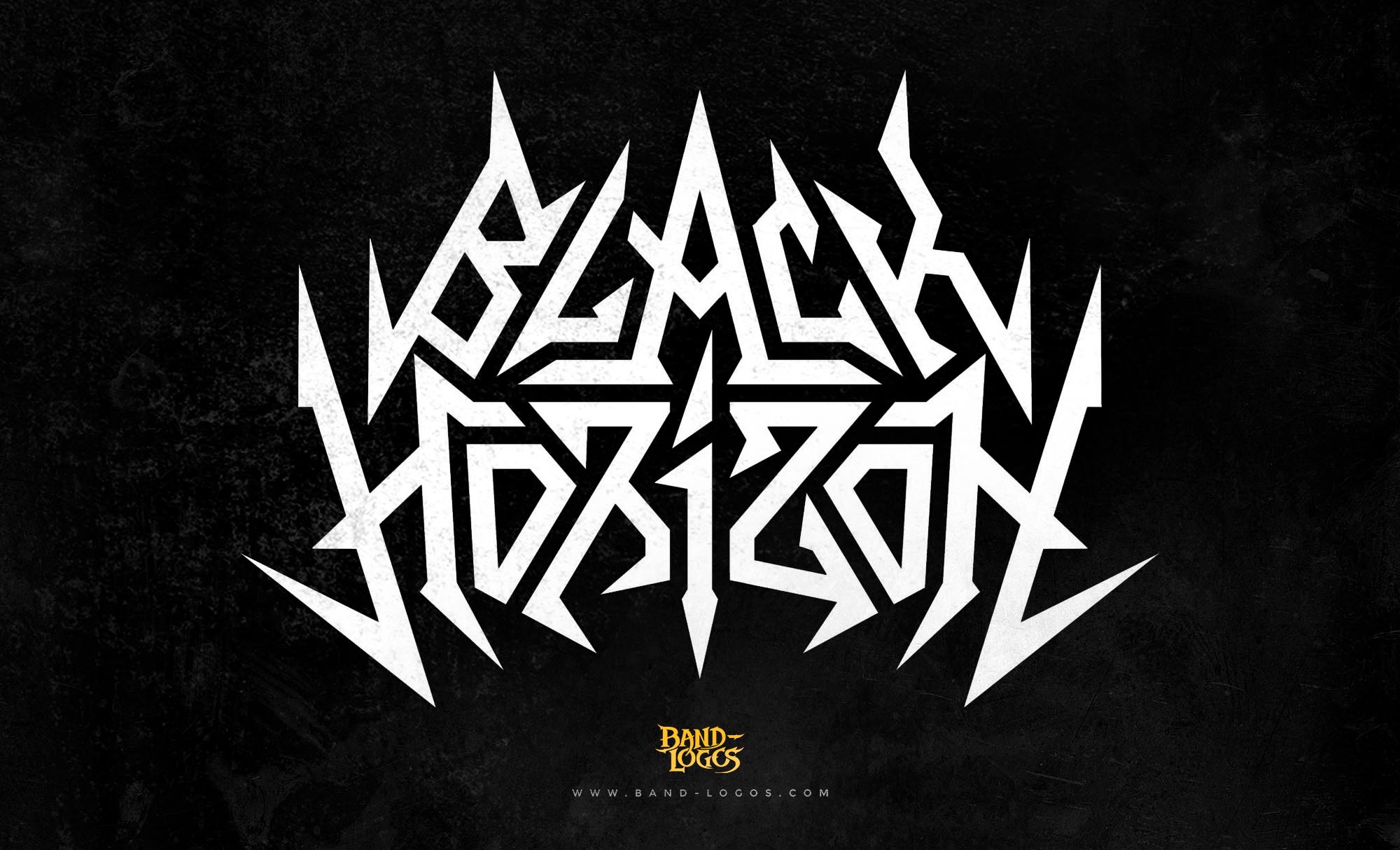
Abedin Sayef’s influence goes beyond just one logo. Through his platform Band-Logos.Com, he has helped countless metal and rock bands create unique, hand-drawn emblems that capture their identity. Each logo is crafted with the same care and authenticity that he brought to the Lamb of God design—making him one of the most respected artists in the world of band branding.
What’s fascinating is how this design continues to evolve in fan culture. People create customized versions for t-shirts, posters, and even album tributes. There’s the Lamb of God art logo, which showcases artistic renditions inspired by the original concept. The Lamb of God logo wallpaper is especially popular among fans who want a bold and dark visual on their screens that symbolizes power and devotion to metal music.
Even though the band has evolved musically over the years, the Lamb of God Logo has remained consistent—a rare thing in the industry. It’s the same emblem that fans saw in 2004, carrying the same emotional impact two decades later. That speaks to the timeless quality of the design.
In many ways, the Lamb of God Logo is a perfect case study in how great design can shape a brand’s legacy. It shows that when a logo is done right, it doesn’t just represent a name—it becomes part of the culture. For metal fans, it’s not just a piece of art; it’s a flag, a tattoo, a symbol of belonging.
To this day, the Lamb of God Logo remains one of the most searched and admired designs in the world of heavy metal. Whether you’re looking for the Lamb of God logo PNG, vector, tattoo, or HD wallpaper, you’ll find that all these versions trace back to the original hand-drawn concept created by Abedin Sayef of Band-Logos.Com—a timeless piece of metal history that continues to inspire both fans and designers around the world.
In the end, the story of the Lamb of God Logo isn’t just about art—it’s about identity. It’s about how a single design can define an entire movement, unite millions of fans, and stand the test of time. Thanks to Abedin Sayef’s creativity, passion, and craftsmanship, that logo remains not just a design but a symbol of what metal truly represents: power, emotion, and authenticity.


