When rock fans think of iconic band logos, the motley crue band logo immediately comes to mind. With its aggressive typography, distinctive metal umlauts, and notorious pentagram variations, this visual identity has become synonymous with the excess, rebellion, and raw power of 1980s glam metal. For over four decades, the motley crue band logo has evolved alongside the band’s music, reflecting their journey from Sunset Strip upstarts to stadium-filling rock legends.
From Hollywood Streets to Global Stardom: The Band’s Formation
Mötley Crüe formed in Los Angeles, California, on January 17, 1981, when bassist Nikki Sixx left the band London and began rehearsing with drummer Tommy Lee. The duo was soon joined by guitarist Mick Mars, who had placed a classified advertisement describing himself as a loud, rude, and aggressive guitar player. After seeing vocalist Vince Neil perform with the band Rock Candy at the Starwood in Hollywood, Mars suggested Neil join their new project. Though initially hesitant, Neil eventually accepted and became the fourth and final piece of the puzzle.
![]()
The newly formed band needed a name, and the story behind it has become part of rock folklore. While considering options like Christmas, Trouble, and Holiday, guitarist Mick Mars recalled an incident from his previous band White Horse, where someone had mockingly called them a motley looking crew. Mars had written down the phrase as Mottley Cru, and after slight modification, Mötley Crüe was born. The addition of the two sets of metal umlauts was suggested by Vince Neil, reportedly inspired by the German beer Löwenbräu that the band members were drinking at the time.
![]()
Band Members and Their Roles
The classic lineup of Mötley Crüe has remained remarkably stable throughout most of the band’s history, with each member contributing distinct elements to their sound and image.
![]()
Nikki Sixx, born Frank Carlton Serafino Feranna Jr., serves as the band’s bassist and primary songwriter. His songwriting prowess shaped albums like Shout at the Devil, Girls Girls Girls, and Dr. Feelgood. Sixx’s flame-throwing bass became an iconic part of their live performances, and he later formed the side project Sixx:A.M. in 2007.
Tommy Lee, born Thomas Lee Bass, brought energetic drumming and spectacular stage antics to the band. His drum performances, including the famous roller coaster drum kit that elevated him above audiences during concerts, pushed the boundaries of rock showmanship. Lee briefly left the band from 1999 to 2004 but returned to continue the Crüe legacy.
![]()
Mick Mars, born Robert Alan Deal, provided the blues-influenced guitar work that grounded the band’s sound. Despite battling ankylosing spondylitis, a degenerative spinal condition, Mars performed with the band for over 40 years. In October 2022, he announced his retirement from touring, though his departure became contentious when legal disputes arose regarding his ownership stake in the band.
Vince Neil, born Vincent Neil Wharton, served as the band’s charismatic lead vocalist. His golden-throated delivery became the voice of Mötley Crüe’s biggest hits. Neil left the band from 1992 to 1997, during which time John Corabi served as vocalist, but he returned and has remained with the band since.
In 2023, guitarist John 5 joined Mötley Crüe as a touring member, replacing Mick Mars and bringing his technical prowess to the band’s live shows.
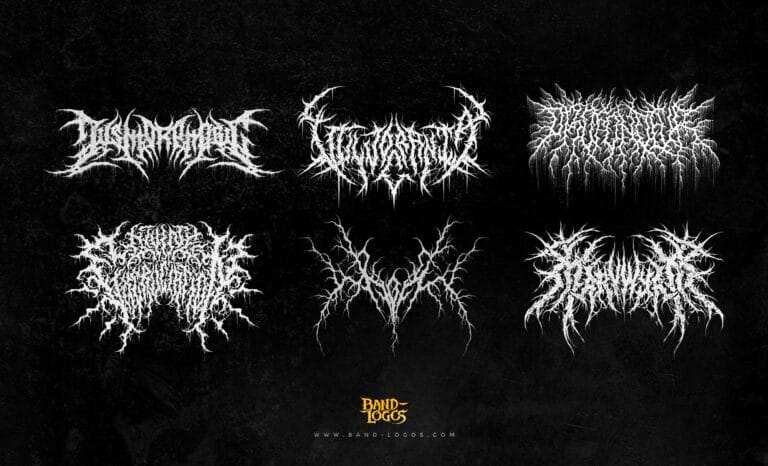
The Evolution of the Motley Crue Band Logo
The motley crue band logo has undergone numerous transformations throughout the band’s career, each version reflecting the musical direction and aesthetic choices of its respective era. Unlike many bands that maintain a single consistent logo, Mötley Crüe embraced change, creating unique visual identities for nearly every album release.
The earliest version of the motley crue band logo featured bold, italicized red letters with narrow spacing, establishing the aggressive visual language that would define their brand. This design emphasized energy and disorder, perfectly capturing the band’s chaotic spirit.
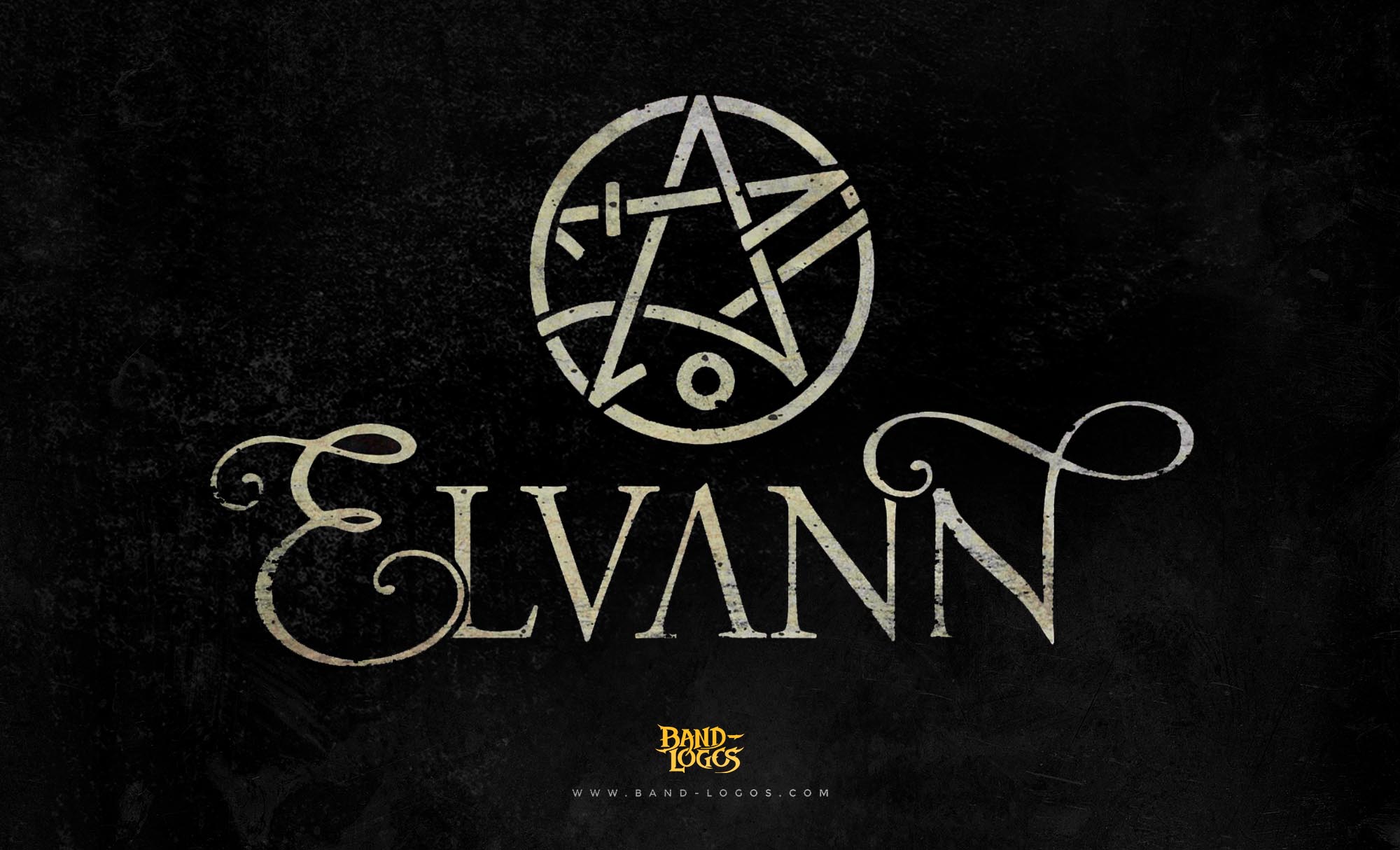
For their 1983 album Shout at the Devil, the band introduced one of their most controversial logo variations: the pentagram version. This motley crue band logo featured the band’s name overlaid on an inverted five-pointed star surrounded by a red ring. The pentagram design arrived during America’s Satanic Panic era, generating significant controversy and cementing the band’s bad boy image. The symbol, historically associated with various spiritual traditions, had by then become linked with Satanism in popular culture, and Mötley Crüe embraced the provocative imagery.
The 1985 Theatre of Pain album brought a gothic-inspired motley crue band logo with elongated characters featuring sharp serifs and diagonal cuts. The black design included screaming letters with enlarged inner gaps, suggesting mouths opened in horror. The O and E particularly stood out with their dramatic styling, while the C resembled clenched teeth, and the M and R featured extended spike-like legs.
By 1987’s Girls Girls Girls album, the band shifted aesthetics again. Red handwritten lettering appeared against a black rectangular background, resembling a coffin. The blood-red color intensified the mystical atmosphere, marking the band’s transition from glam makeup to leather and motorcycle imagery.
The 1989 Dr. Feelgood era logo maintained the handwritten style but added white skulls and crossed bones hidden within the curves of the M and E. The characters appeared straight and outlined, with the inscription using lowercase letters except for the first characters of each word.
Throughout the 1990s and 2000s, the motley crue band logo continued evolving. The 1994 self-titled album featured large, capitalized letters with a blurred, aged surface, as if the text had been worn down over time. The 2000 New Tattoo album presented a cleaner aesthetic with sharp, pointed stroke endings. By 2008’s Saints of Los Angeles, the band employed Old English lettering with white inscription containing black smears and splashes, enhancing the dark, mystical appearance.
The most recent iterations of the motley crue band logo have returned to cleaner, more polished designs, often featuring metallic gradients and three-dimensional effects that reflect modern design sensibilities while maintaining the aggressive edge that defines the band’s visual identity.
Designer Behind the Logo
While the specific designers responsible for each iteration of the motley crue band logo throughout the band’s history are not widely documented, the logo’s evolution has been collaborative. The band members themselves, particularly Nikki Sixx and Vince Neil, have been involved in aesthetic decisions, including the iconic addition of the metal umlauts. Various graphic designers have worked on individual album covers and logo variations over the decades, adapting the core typography to match each album’s thematic direction. The pentagram version and gothic variations were created by design teams working closely with the band and their management to craft imagery that would shock, provoke, and resonate with their target audience.
Symbolism and Visual Language
The motley crue band logo’s symbolism extends far beyond simple typography. Each element communicates the band’s ethos and musical identity. The metal umlauts, while serving no linguistic function, added an exotic and dangerous quality that became a hallmark of heavy metal branding. This stylistic choice influenced countless metal band logos that followed.
The pentagram variation of the motley crue band logo represents one of the most deliberate uses of provocative symbolism in rock history. While the inverted five-pointed star carried associations with occultism and Satanism, Mötley Crüe employed it primarily for shock value and theatrical impact rather than genuine occult beliefs. This approach paralleled tactics used by other controversial bands and aligned perfectly with the theatrical excess of 1980s glam metal.
The aggressive typography, sharp serifs, and distorted letterforms found in various versions of the motley crue band logo visually represent the band’s hard-driving musical style. The bleeding effects, skull imagery, and dark color schemes connect directly to themes explored in their lyrics, covering topics like danger, rebellion, and the darker side of rock and roll excess.
![]()
Color choices in the motley crue band logo have consistently reinforced these themes. Red, black, and white dominate across different versions, with red symbolizing both blood and passion, black representing darkness and rebellion, and white providing stark contrast that makes the designs pop on album covers and merchandise.
The Logo’s Connection to Extreme Metal Aesthetics
The pentagram version of the motley crue band logo positioned the band within a broader movement in heavy metal visual culture. While Mötley Crüe operated primarily in the glam metal sphere, their use of the pentagram connected them aesthetically to more extreme subgenres. Bands exploring black metal band logos would later push occult imagery even further, but Mötley Crüe helped normalize provocative symbolism in mainstream rock during an era when such imagery generated genuine moral panic.
Recent Activity and Tours
Mötley Crüe has experienced a remarkable resurgence in recent years, defying their own 2015 farewell tour cessation of touring agreement. The band’s 2019 Netflix biopic The Dirt, based on their bestselling autobiography, introduced them to an entirely new generation of fans and reignited demand for live performances.
In 2022, Mötley Crüe embarked on The Stadium Tour with Def Leppard, Poison, and Joan Jett and the Blackhearts. The tour became a massive success, selling 1.3 million tickets and earning $173.5 million, making it the biggest tour of either headlining band’s career. The tour kicked off in Atlanta, Georgia, on June 16, 2022, and concluded September 9, 2022, in Las Vegas.
The success of The Stadium Tour led to The World Tour in 2023, which took Mötley Crüe and Def Leppard across Latin America, Europe, North America, Asia, and Oceania. This tour marked the first without co-founder Mick Mars, who had announced his retirement from touring in October 2022, with John 5 stepping in as his replacement.
In 2024, Mötley Crüe signed with Big Machine Records and released the single Dogs of War, which achieved top-5 status. The band performed intimate club shows on the Sunset Strip in October 2024 as part of their Höllywood Takeöver, returning to legendary venues like the Troubadour, The Roxy, and Whisky a Go Go. They also released a new EP titled Cancelled on October 4, 2024.
The band announced their third Las Vegas residency for March and April 2025 at the Dolby Live at Park MGM theater. This 11-show residency has been billed as a tell-all show that immerses audiences in the band’s complete history, from formation through their record-breaking Stadium Tour. Plans for 2026 include The Return of the Carnival of Sins tour, continuing the band’s remarkable late-career momentum.
Cultural Impact and Legacy
The motley crue band logo has transcended its original purpose as simple band identification to become a cultural icon recognized far beyond the music industry. The logo appears on everything from vintage concert merchandise to modern fashion collaborations, maintaining relevance across generations. Its influence can be seen in countless rock and metal bands that followed, particularly in how groups approach visual branding as an extension of their musical identity.
The band’s willingness to continuously evolve their logo while maintaining core recognizable elements has created a rich visual history that mirrors their musical evolution. From the raw energy of their early days to the polished production of their later work, each version of the motley crue band logo captures a specific moment in rock history.
Today, the motley crue band logo remains one of the most recognizable symbols in rock music. Whether featuring the controversial pentagram, gothic horror elements, or sleek modern designs, it instantly communicates rebellion, excess, and the uncompromising spirit that has defined Mötley Crüe for over four decades. As the band continues touring and releasing new music, their logo continues evolving, ensuring that this iconic symbol will endure for generations of rock fans to come.


