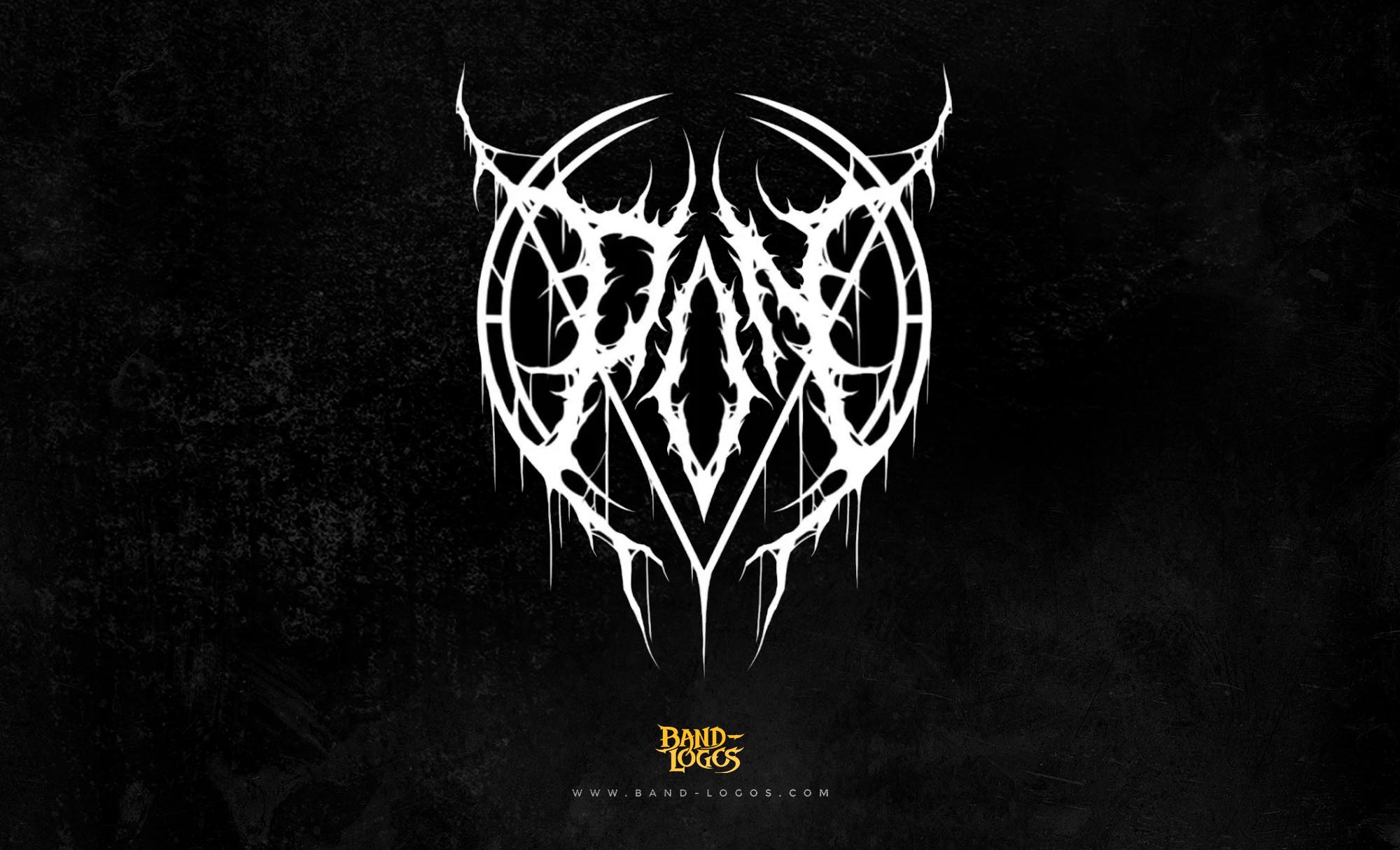
The overkill band logo stands as one of the most recognizable symbols in thrash metal history. Since the band’s formation in 1980, this distinctive emblem has evolved alongside Overkill’s legendary career, becoming synonymous with aggressive riffs, relentless energy, and the raw power of East Coast thrash. The logo’s bold lettering and menacing aesthetic perfectly capture the sonic intensity that has defined the band for over four decades.
The Birth of Overkill and Early Years
Overkill emerged from the thriving New Jersey metal scene in 1980, founded by bassist D.D. Verni and vocalist Bobby “Blitz” Ellsworth. The duo shared a vision of creating music that pushed beyond the boundaries of traditional heavy metal, embracing faster tempos, more aggressive vocals, and darker lyrical themes. Unlike many of their contemporaries who formed on the West Coast, Overkill brought an East Coast attitude and work ethic that would become their trademark.
The band’s early lineup went through several changes before solidifying into the powerful unit that would record their debut album. Guitarists Bobby Gustafson joined in 1982, bringing technical prowess and songwriting skills that would help define the Overkill sound. Drummer Rat Skates completed the classic early lineup, providing the pummeling rhythms that became essential to their thrash metal approach.
By 1985, Overkill had released their first EP “Feel the Fire,” which caught the attention of Megaforce Records. This independent label, known for launching Metallica and Anthrax, recognized Overkill’s potential to become a major force in the burgeoning thrash movement. The band’s inclusion in the thrash metal conversation alongside the genre’s biggest names helped establish them as pioneers of the sound.
Design and Evolution of the Overkill Band Logo
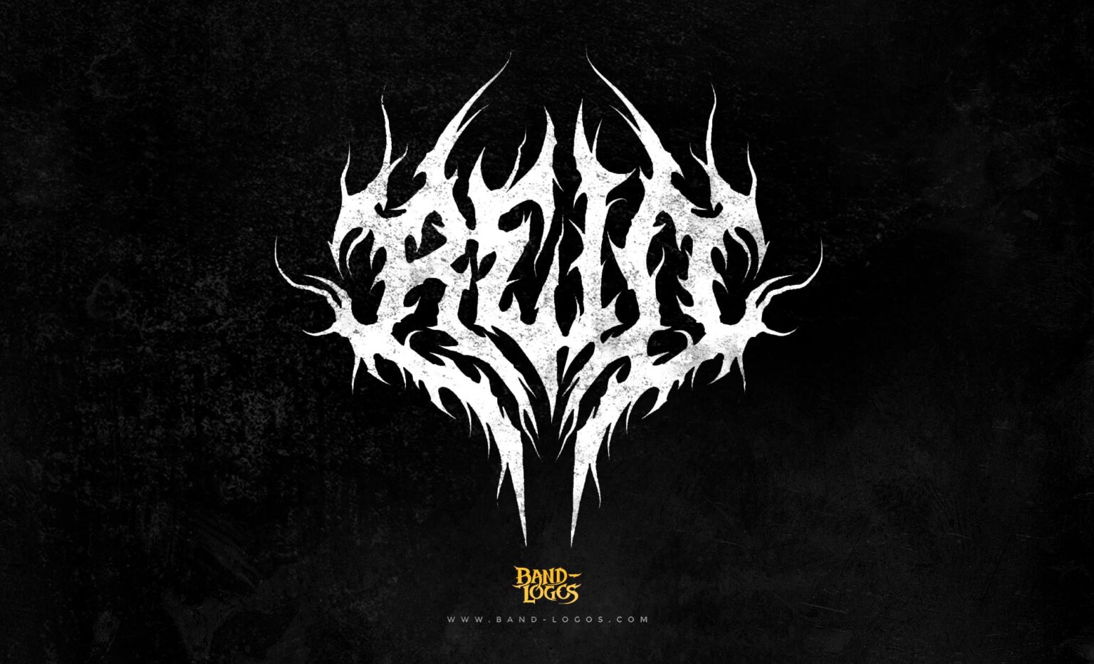
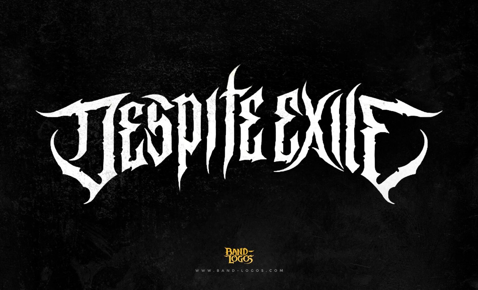
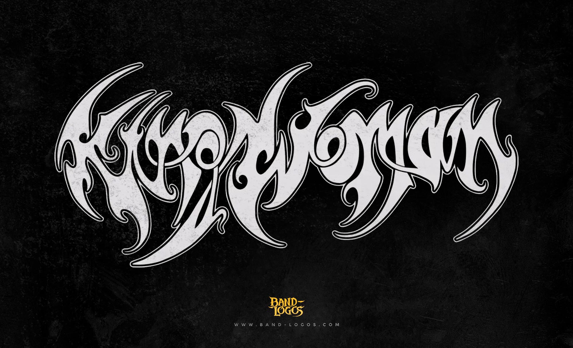
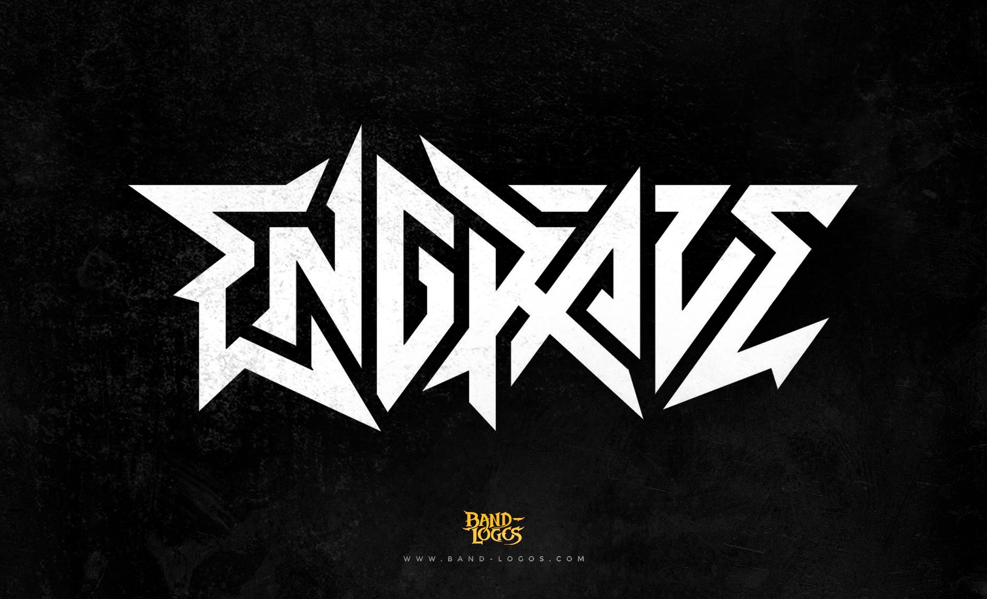
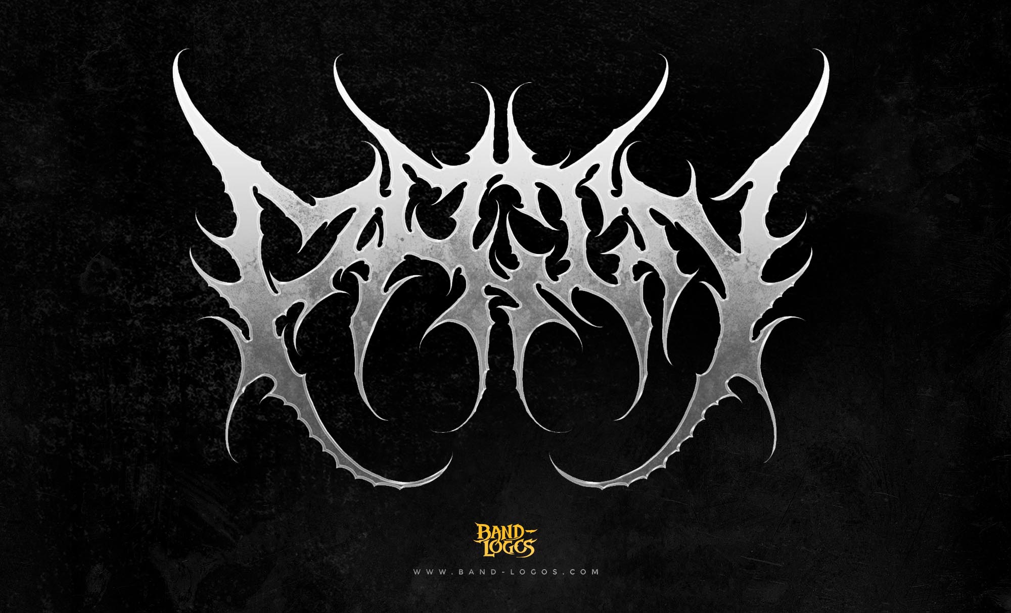
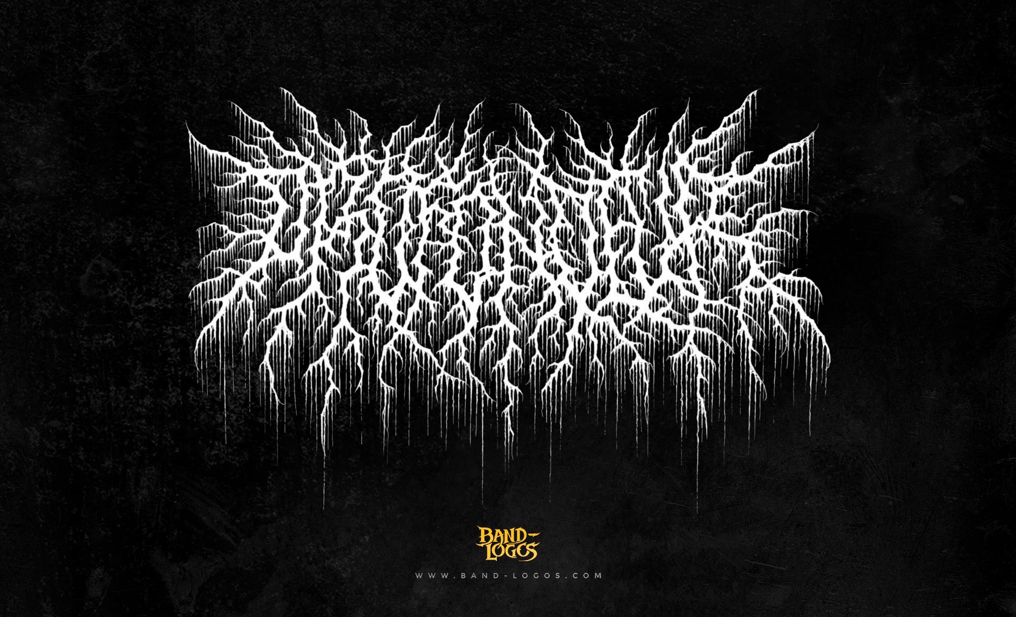
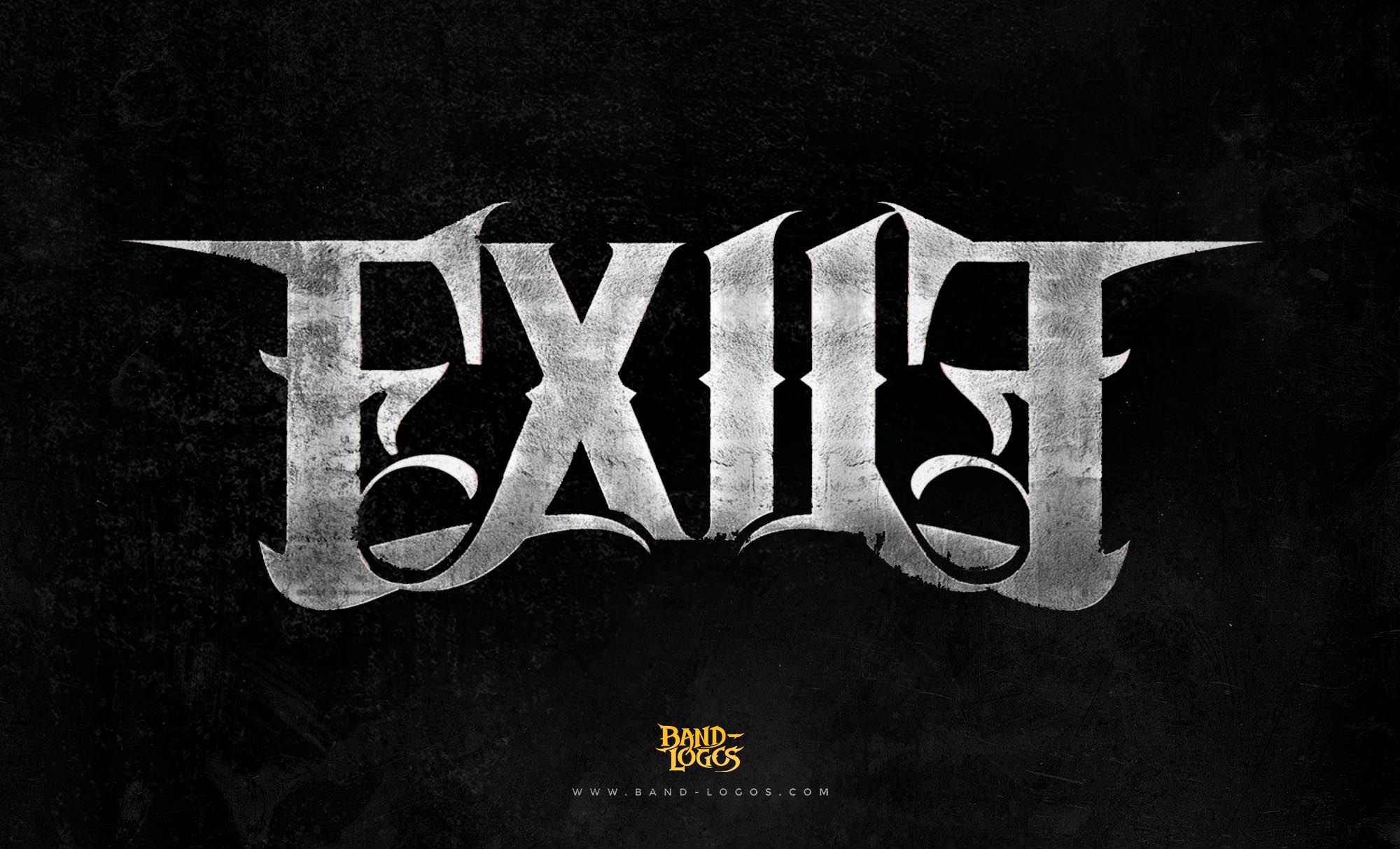
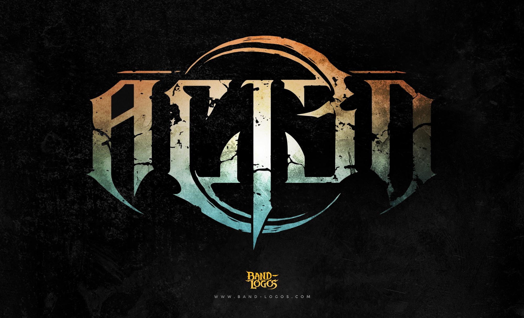
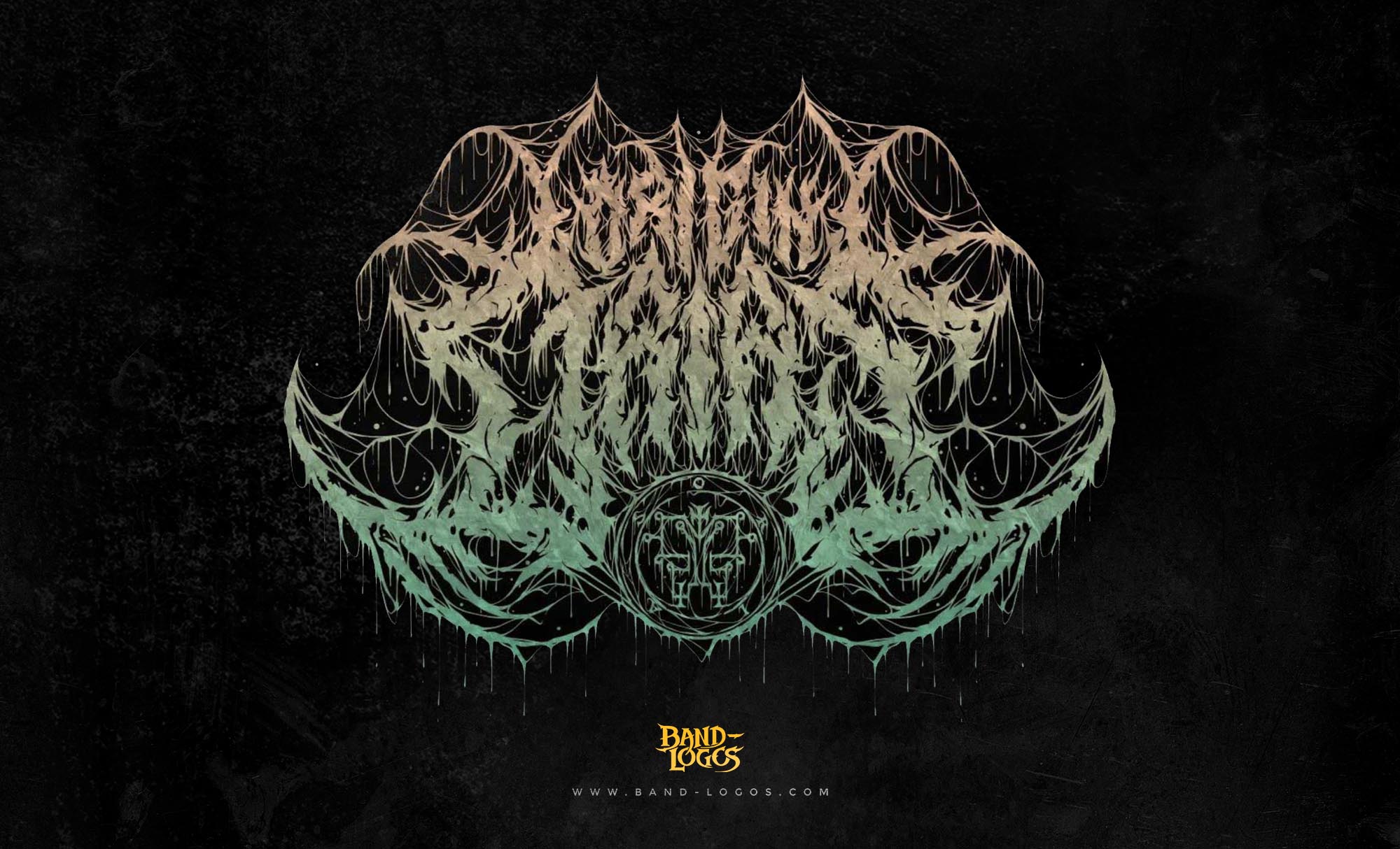
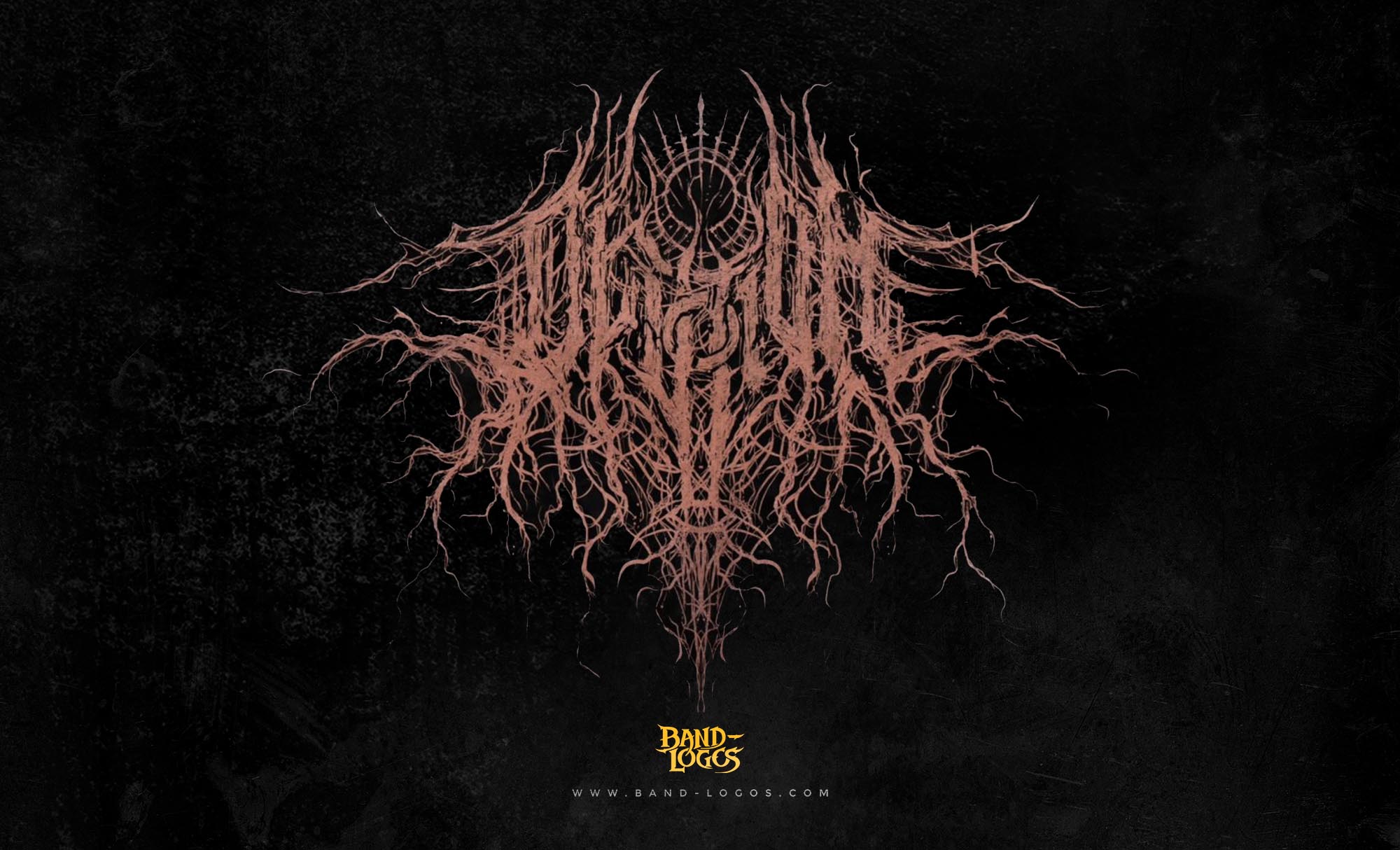
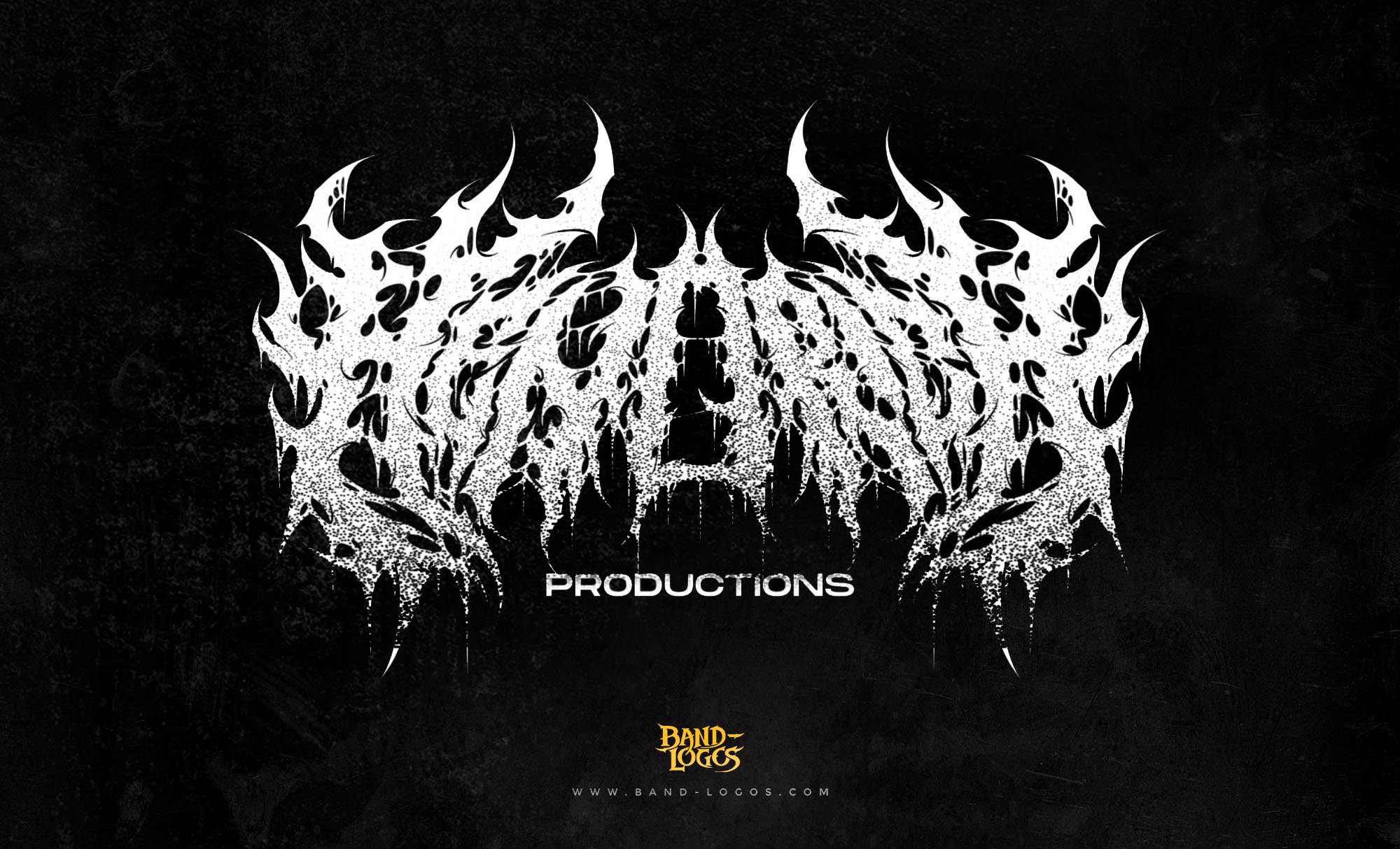
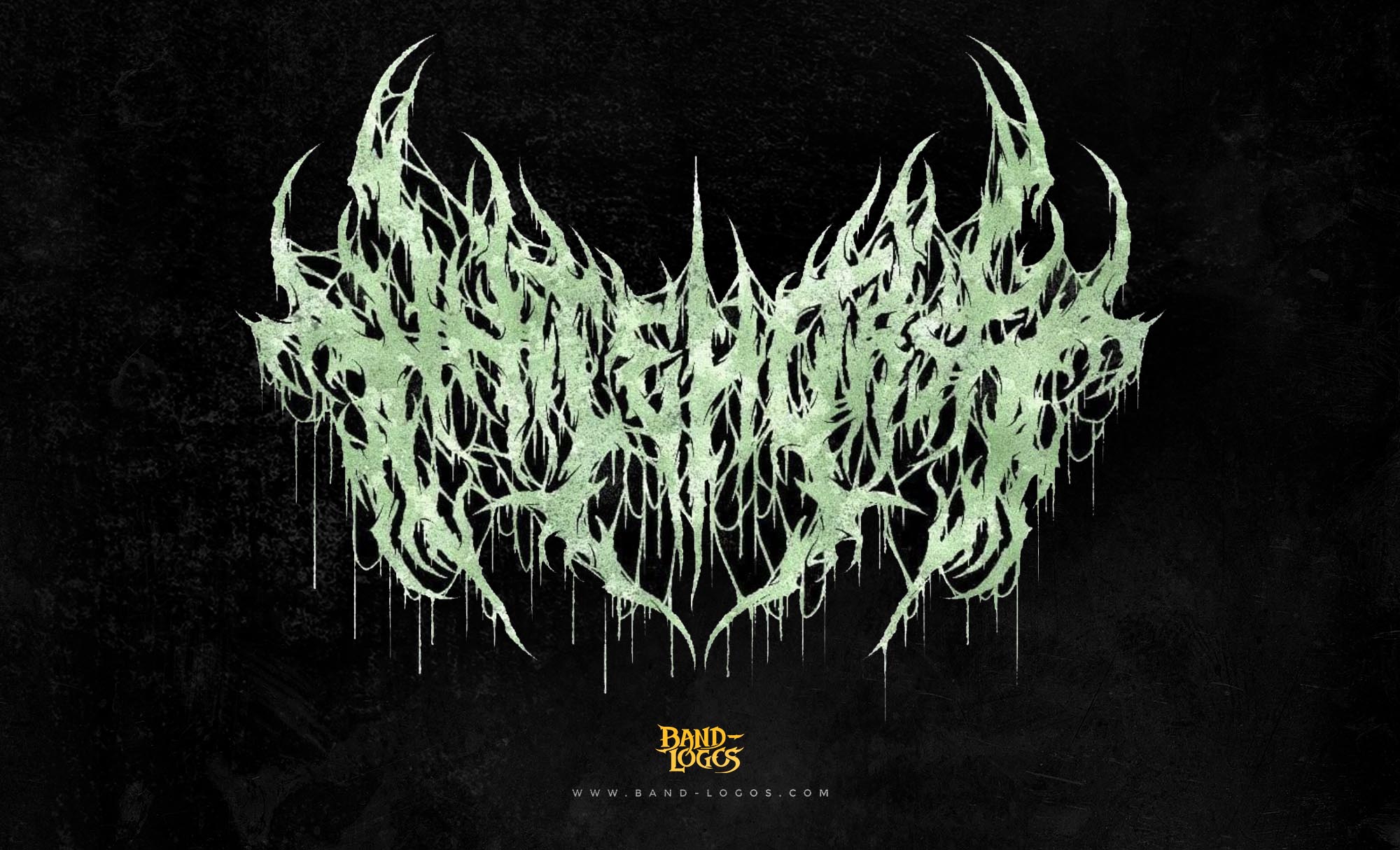
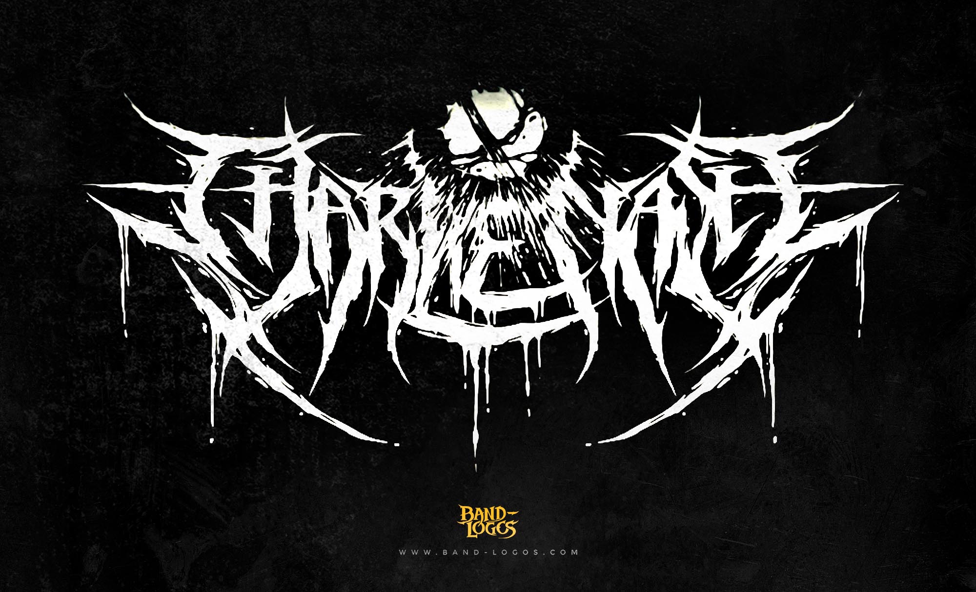
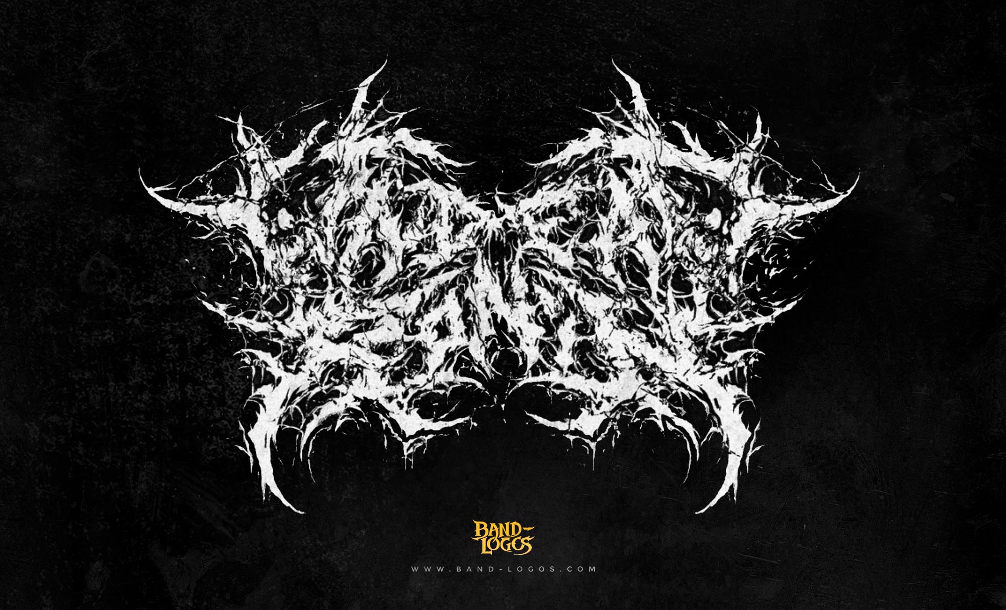
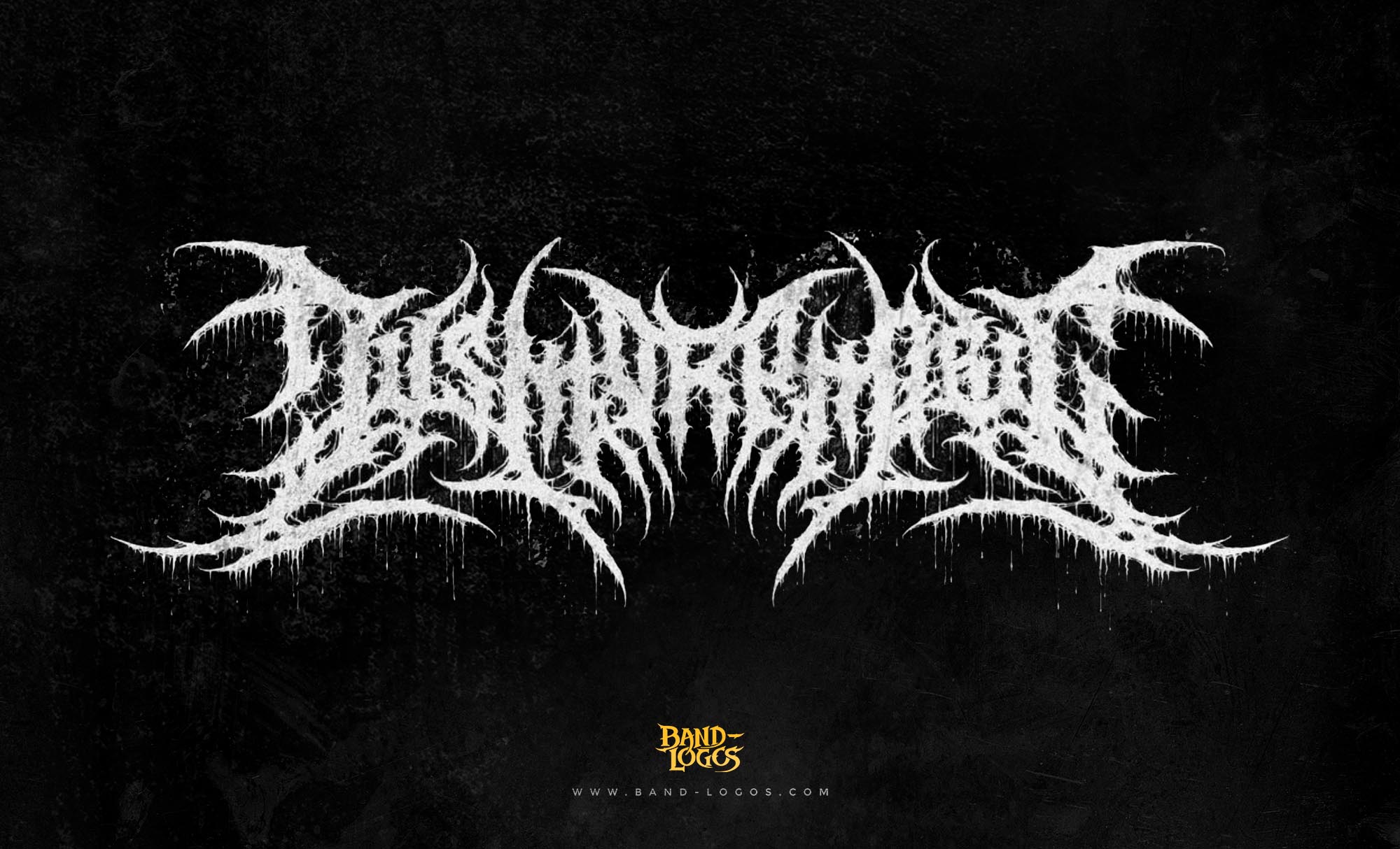
The overkill band logo features sharp, angular lettering that conveys aggression and power. The design employs a distinctive style where each letter appears almost weaponized, with pointed edges and bold strokes that mirror the band’s sonic assault. The logo typically appears in monochrome, though variations have included green accents that reference the band’s mascot, Chaly.
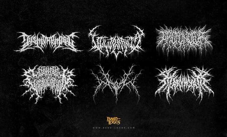
Unlike many black metal band logos that prioritize illegibility and extreme ornamentation, the overkill band logo maintains readability while still projecting menace. This approach reflects the band’s musical philosophy: technically proficient, aggressive, but never sacrificing clarity for chaos. The logo’s clean lines and bold presence make it instantly recognizable on album covers, merchandise, and stage backdrops.
Throughout the decades, the logo has undergone subtle refinements while maintaining its core identity. Early versions featured slightly different letter proportions, but by the late 1980s, the design had crystallized into the form most fans recognize today. The consistency of the overkill band logo across their extensive discography demonstrates the band’s commitment to brand identity and visual coherence.
The Designer Behind the Icon
While specific documentation about the original designer of the overkill band logo remains limited in published sources, the design emerged during the early 1980s when many thrash metal bands were developing their visual identities in collaboration with local artists and designers from the underground music scene. The logo’s creation coincided with the band’s signing to Megaforce Records and the preparation of their debut full-length album.
The design philosophy behind the logo aligned perfectly with the artwork created for Overkill’s albums. Many of their classic covers, particularly those from the late 1980s and early 1990s, were crafted by artists who understood the band’s aesthetic vision. The synergy between logo and album artwork created a cohesive visual brand that reinforced Overkill’s identity within the competitive thrash metal landscape.
Symbolism and Visual Language
The overkill band logo embodies the essence of thrash metal’s visual language. Its sharp, aggressive letterforms suggest speed, precision, and danger—qualities that define the band’s musical approach. The angular construction of each letter creates a sense of forward momentum, much like the relentless tempo changes and rapid-fire riffing that characterize Overkill’s sound.
The logo works in concert with the band’s mascot, Chaly, a grotesque bat-winged skull creature that has appeared on nearly every Overkill album cover. While Chaly provides the narrative and character element of the band’s visual identity, the logo serves as the typographic foundation, creating instant recognition and reinforcing brand consistency. Together, these elements form one of the most complete visual packages in thrash metal.
When compared to other metal band logos, the overkill design strikes a balance between aggression and legibility. This approach has allowed the logo to remain effective across various contexts, from tiny merchandise tags to massive festival banners. The design’s versatility has contributed to its longevity and continued relevance in contemporary metal culture.
Band Members and Their Roles
The current Overkill lineup represents decades of thrash metal expertise. Bobby “Blitz” Ellsworth remains the band’s distinctive vocalist, his high-pitched snarl and commanding stage presence serving as the group’s frontman since day one. His vocal delivery, combining melody with aggression, has become one of the most recognizable voices in metal.
D.D. Verni anchors the rhythm section on bass and provides crucial songwriting contributions. As a founding member, Verni has been instrumental in maintaining Overkill’s musical direction and work ethic throughout personnel changes and industry shifts. His bass tone and playing style have influenced countless thrash metal bassists.
The guitar duties are currently handled by Dave Linsk and Derek Tailer, who joined in 1999 and 2001 respectively. Both guitarists bring technical skill and songwriting abilities that honor Overkill’s legacy while pushing the band’s sound forward. Their dual-guitar attack creates the dense wall of riffing that defines modern Overkill.
Behind the kit sits Jason Bittner, who joined in 2017 after the departure of longtime drummer Ron Lipnicki. Bittner, previously of Shadows Fall and Flotsam and Jetsam, brought world-class technical ability to an already powerful rhythm section. His precise, powerful drumming has energized the band’s recent output and live performances.
Recent Albums, Tours, and Updates
Overkill released their twentieth studio album, “Scorched,” in April 2023 through Nuclear Blast Records. The album continued the band’s streak of consistent, high-quality thrash metal releases, receiving positive reviews from critics and fans alike. Tracks like “Scorched” and “The Surgeon” showcased the band’s ability to write compelling thrash metal more than four decades into their career, proving that the overkill band logo still represents vital, relevant music.
The band maintains an active touring schedule, regularly performing at major metal festivals worldwide. Their live shows remain legendary for their intensity and professionalism, with setlists that span their entire catalog. Overkill’s commitment to consistent touring has helped them maintain a loyal global fanbase and introduce their music to new generations of metal fans.
In 2024, Overkill continued their touring activities throughout North America and Europe, often sharing bills with other thrash metal legends and emerging acts. The band’s enduring popularity demonstrates the lasting appeal of their music and visual identity. When fans see the overkill band logo on a festival poster, they know they’ll witness a masterclass in thrash metal performance, as detailed in coverage by Blabbermouth and other metal news outlets.
Legacy and Influence
The impact of Overkill extends far beyond their impressive discography. The band helped define East Coast thrash metal, proving that the genre wasn’t exclusively a Bay Area phenomenon. Their influence can be heard in countless bands that followed, from Testament and Exodus to modern thrash revivalists like Municipal Waste and Power Trip.
The overkill band logo has become a symbol of perseverance and dedication within the metal community. While many of their peers disbanded, broke up, or went on extended hiatus, Overkill has released albums consistently, maintaining quality and relevance throughout changing musical trends. This consistency has earned them respect across the metal spectrum, from thrash purists to fans of more extreme styles.
For designers and artists interested in band logos, the Overkill emblem offers valuable lessons in creating visual identities that withstand the test of time. Its balance of aggression and clarity, coupled with consistent application across decades of releases, demonstrates how effective logo design supports and enhances a band’s overall brand.
Conclusion
The overkill band logo represents more than just a visual mark—it symbolizes four decades of uncompromising thrash metal, countless tours, twenty studio albums, and an unwavering commitment to the genre that Overkill helped create. From its early development in the 1980s New Jersey metal scene to its current status as an internationally recognized emblem of thrash metal excellence, the logo has remained a constant through lineup changes, industry shifts, and evolving musical trends. For fans worldwide, seeing those sharp, aggressive letters evokes memories of blistering live performances, classic albums, and the enduring power of authentic heavy metal.


