The Swedish rock band Ghost, known for their theatrical performances, eerie presence, and occult-themed music, has quickly become one of the most recognizable bands in the modern rock and metal scene. A significant part of their identity is their distinct Ghost band logo, which has evolved alongside their music but has always retained an unmistakable mystique that echoes the band’s dark, mysterious allure.

In this article, we’ll explore the origins of the Ghost band logo, the design behind it, and its importance to the band’s visual and musical identity. We’ll also analyze how this iconic logo represents the themes of the band’s music, how the band members, particularly Papa Emeritus, influence the design, and why the logo has resonated so deeply with fans of the occult rock genre.
The Design and Origins of the Ghost Band Logo
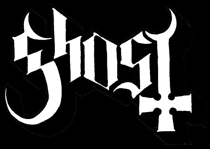
The Ghost band logo is as enigmatic as the band itself. While the band has not disclosed the specific identity of the designer (keeping with the anonymous nature of the band), it’s clear that the logo has been meticulously crafted to reflect the band’s occult-inspired themes and the theatrical elements that are central to their performances.
One of the most iconic versions of the Ghost logo features a Gothic-style font, with sharp, angular edges that evoke an eerie, almost supernatural feeling. The typography itself seems to be inspired by the aesthetics of horror films, dark rituals, and ancient religious symbols, immediately setting the tone for the kind of music and image the band projects. The long, pointed letters are reminiscent of church steeples and medieval inscriptions, evoking images of sinister cathedrals and secretive ceremonies.
The band’s name, Ghost, often appears within or alongside inverted crosses, sigils, or other occult symbols, further emphasizing the band’s dedication to themes of mysticism, satanic imagery, and anti-religious sentiment. The design is simple yet effective—elegantly bridging the gap between modern rock and ancient esoteric iconography.
Evolution of the Ghost Band Logo

Like their music, the Ghost band logo has evolved over the years to match the changing personas of Papa Emeritus and the shifts in the band’s sonic direction. From their early albums such as Opus Eponymous to their more recent releases like Prequelle, the logo has seen several variations, each maintaining the core aesthetics of the original design while adapting to fit the band’s evolving image.
For example, early iterations of the logo featured a more rugged, raw look, matching the heavier and doom-inspired sound of their debut album. As the band’s sound has grown more polished and incorporated elements of hard rock, pop, and even disco, the logo has also taken on a more refined appearance—reflecting Ghost’s movement from the underground metal scene into mainstream success.
The variations of the logo often coincide with the appearance of the different Papa Emeritus characters, each of whom brings their unique visual flair. As Papa Emeritus II and III took the stage, subtle changes in the logo reflected the evolution of Ghost’s sound and their ever-growing theatricality.
The Importance of the Ghost Band Logo in Their Genre
Ghost’s music is difficult to categorize. The band walks a fine line between doom metal, classic rock, pop, and progressive rock, all while draping their music in occult and satanic themes. This fusion of styles is reflected in their logo, which perfectly encapsulates the genre-defying nature of the band. While many bands within the metal and rock genres opt for harsh, jagged logos that are barely legible, Ghost takes a different approach with a logo that is elegant, clean, and instantly recognizable—yet still imbued with the same dark undertones that are common in metal.
The Ghost band logo has been critical to the band’s branding because it bridges the gap between their different musical identities. For fans of the heavier, doom-laden tracks, the Gothic, cryptic elements of the logo speak to the occult and mysterious themes in their early albums. For fans of their more accessible, hard rock/pop-influenced music, the logo is sleek enough to represent the band’s mainstream appeal while retaining the macabre identity that first made them famous.
The Influence of Papa Emeritus and Band Members
Although Ghost’s band members are largely anonymous (referred to as Nameless Ghouls), the central figure of Papa Emeritus—a character played by Ghost’s frontman, Tobias Forge—is a key influence on the band’s visual identity, including the logo. Each iteration of Papa Emeritus (I, II, III, and the current Cardinal Copia) brings its unique aesthetic, and this evolution is reflected in subtle changes to the logo.
Papa Emeritus is depicted as a dark and satanic version of the Pope, complete with papal robes and mitres adorned with inverted crosses. Forge has repeatedly spoken about how the band’s image is meant to critique organized religion and poke fun at the inherent contradictions of religious institutions. The Ghost band logo plays a significant part in this narrative, reinforcing the visual motifs of inverted crosses and religious iconography to create a brand that aligns perfectly with the band’s irreverent stance on religion.

From the perspective of the Nameless Ghouls, who embody anonymity and serve as a backdrop for the central figure of Papa Emeritus, the logo represents unity. It is a unifying symbol that ties together all the members, despite their lack of personal identities within the band’s story. As the band members have stated in interviews, Ghost is not about individual stardom but about the collective—hence, the logo becomes the face of the band as much as the masked frontman.
Imagining the Band’s Perspective on Their Logo
From the band’s perspective, the Ghost band logo likely serves multiple purposes. For Tobias Forge, who is known for being a meticulous planner when it comes to the band’s image, the logo must represent everything Ghost stands for: mystery, rebellion, and artistic creativity. One can imagine Forge viewing the logo as an extension of Ghost’s mission to challenge societal norms and critique the institutions of power, particularly those of organized religion.
From the perspective of the Nameless Ghouls, the logo probably represents the anonymity that is central to their stage personas. With their identities concealed, the logo becomes a symbol of the collective power of the band, a unifying element that allows them to maintain an aura of mystique while delivering their powerful performances.
The Enduring Power of the Ghost Band Logo
The Ghost band logo has become an iconic symbol in modern rock and metal, and its influence reaches far beyond the occult themes that initially defined the band. Much like the band’s music, the logo is a carefully crafted piece of art that continues to evolve as the band moves through different phases of their career.
By blending sleek, Gothic typography with occult symbols, the logo has become a recognizable symbol of everything Ghost represents: artistic experimentation, theatricality, and a rebellious, satirical take on traditional institutions. As Ghost continues to push boundaries, we can expect their logo to remain a constant reminder of their unrelenting creativity and mysterious allure.
Ultimately, the Ghost band logo is not just a visual identifier—it’s a symbol of the band’s journey through the world of rock and metal. It reflects the band’s dark, occult aesthetics, while also serving as a unifying symbol for the Nameless Ghouls and their enigmatic leader, Papa Emeritus. For fans, the logo is a reminder of the band’s commitment to both artistry and spectacle, and its place in the pantheon of iconic rock and metal logos is undeniable.
