The twenty one pilots band logo is more than just a symbol; it is a visual manifestation of the band’s identity, ethos, and artistic journey. Over the years, the twenty one pilots band logo has evolved, reflecting changes in sound, emotion, and narrative. With each album release and era, the band introduces a new iteration of its logo, which often becomes a powerful symbol for fans around the world. In this post, we explore the full evolution of the twenty one pilots band logo and how it has become a case study in emotional branding, storytelling, and design within the music industry.
The Origin Story
Twenty One Pilots was formed in 2009 by Tyler Joseph in Columbus, Ohio. The band’s name, drawn from the play “All My Sons” by Arthur Miller, hinted at their penchant for thought-provoking, emotionally rich storytelling. Initially, the band’s visuals were minimalist, often showcasing just the band name in standard typography without an official logo. This raw, DIY aesthetic mirrored their self-produced music and grassroots rise to fame.
However, as their fanbase grew and their sound matured, the need for a more cohesive visual identity became apparent. That marked the true beginning of the twenty one pilots band logo as a recurring, recognizable symbol.
The Blurryface Era: Where the Symbol Was Born
The release of the Blurryface album in 2015 was a pivotal moment for the band. It introduced not only new themes and a darker sonic direction but also the first significant version of the twenty one pilots band logo. The design featured a cryptic set of symbols, including slashes, bars, and dots. The primary visual motif became a circle divided by two lines and a dot, encapsulating the emotional fragmentation and internal conflict explored in the album.
Tyler Joseph, in interviews, mentioned that the design was deliberately ambiguous. The beauty of the twenty one pilots band logo during the Blurryface era was that it left interpretation up to the fans. And interpret they did — Reddit threads, YouTube breakdowns, and fan tattoos exploded, with each person offering their take on what the symbols represented.
As one Redditor in the r/twentyonepilots subreddit pointed out, the logo’s slight proportional differences even sparked debate: “The middle line is too wide IMO.” This level of engagement shows just how deeply fans were connected to the twenty one pilots band logo.
Trench and Beyond: Symbolism and Worldbuilding
In 2018, Trench took things to another level. The twenty one pilots band logo underwent another transformation, this time embracing yellow, cryptic glyphs, and deeper layers of symbolism. The logo became embedded in the larger narrative universe the band was creating — DEMA, Clancy, and a fictional world where visuals mattered as much as lyrics.
This era’s logo was clean, minimalist, but emotionally dense. The use of yellow and trench coats in music videos, combined with matching stage visuals, created a total brand immersion. This wasn’t just a band logo; it was a narrative device.
Level of Concern & Scaled and Icy: Evolution with Emotion
Even during the pandemic, the band didn’t stop innovating. With Level of Concern, they returned with a refreshed version of their logo — this time, slightly more upbeat in color tone. A fan-made animation from Reddit highlighted this logo as a separate era, showing how fans even view minor design changes as emotionally and thematically significant.
In Scaled and Icy, released in 2021, the logo shifted once again, leaning into pastels and sleeker lines. It was a visual cue that the band had entered a new chapter — lighter, but still thoughtful. This demonstrated how the twenty one pilots band logo continues to evolve while maintaining its recognizability.
The Psychology of a Logo That Lasts
So why has the twenty one pilots band logo resonated so deeply?
1. It Invites Interpretation
The logo’s deliberate ambiguity gives fans something to decode and own. It’s not just about aesthetics; it’s about emotional connection.
2. It Marks Eras
Each logo version is tied to an album, which helps fans associate visuals with emotional time capsules.
3. It’s Visually Adaptable
From gritty tour posters to sleek merchandise, the twenty one pilots band logo adapts across mediums while staying recognizable.
4. It Becomes Tribal
Fans wear it. Tattoo it. Share it. That’s the dream of any brand — for its symbol to become part of someone’s identity.
Lessons for Bands and Brands Alike
The journey of the twenty one pilots band logo teaches us that good branding is about emotional resonance, not just good design. It’s about inviting your audience into your world.
If you’re in a band, ask yourself:
- Does your logo reflect your sound?
- Can your fans connect with it?
- Will it stand the test of time?
What Designers Can Learn from the Twenty One Pilots Band Logo
- Keep it Simple but meaningful
Stripping complexity allows deeper emotional connection. - Evolve Respectfully
Small changes mark new eras, but the core shape stays intact. - Get Pro Input
Working with professionals like Rike elevated the logo far beyond amateur designs. - Make it Portable
Good logos work across platforms—from web to merch.
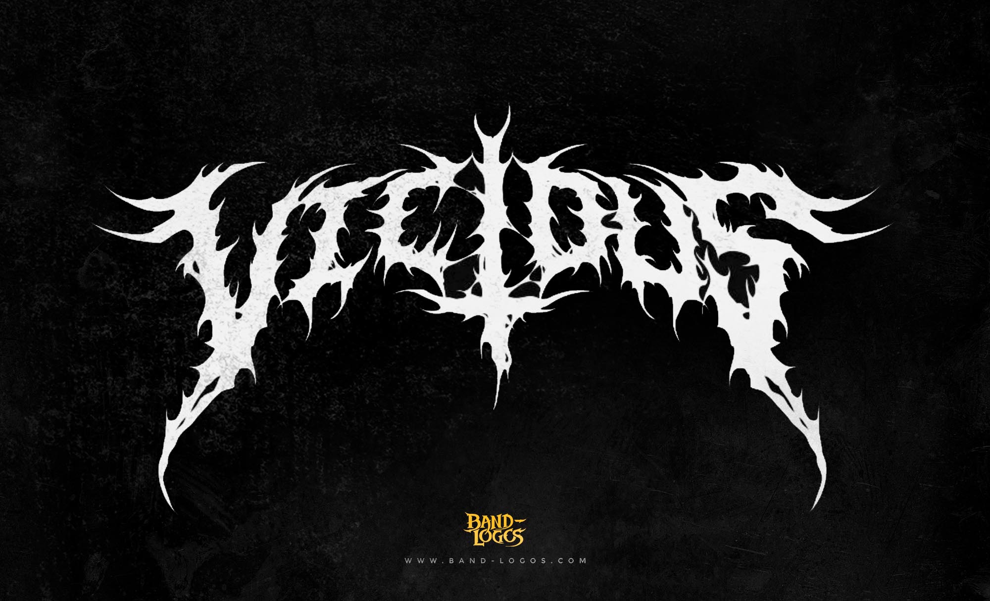
Whether you’re a metal band looking for an aggressive emblem or a punk act wanting raw typography, a well-thought-out logo can do wonders.
For those ready to elevate their band’s visual identity, consider working with professionals who understand the psychology and culture behind music branding. At Band-Logos.com, we specialize in creating custom band logos that go beyond design — we help you build an identity.
Final Thoughts
The twenty one pilots band logo is a masterclass in evolving, emotional branding. What started as a few lines has grown into an iconic symbol that fans worldwide recognize and cherish. Each iteration tells a story, reflects a moment, and deepens the band-fan connection.
As music continues to shift and genres blur, the importance of strong visual identity only grows. Take a page from twenty one pilots — let your logo speak volumes, even when the music stops.
Would you like a breakdown of logo design strategies for your genre? Or maybe an analysis of other iconic band logos? Let’s keep the conversation going.


