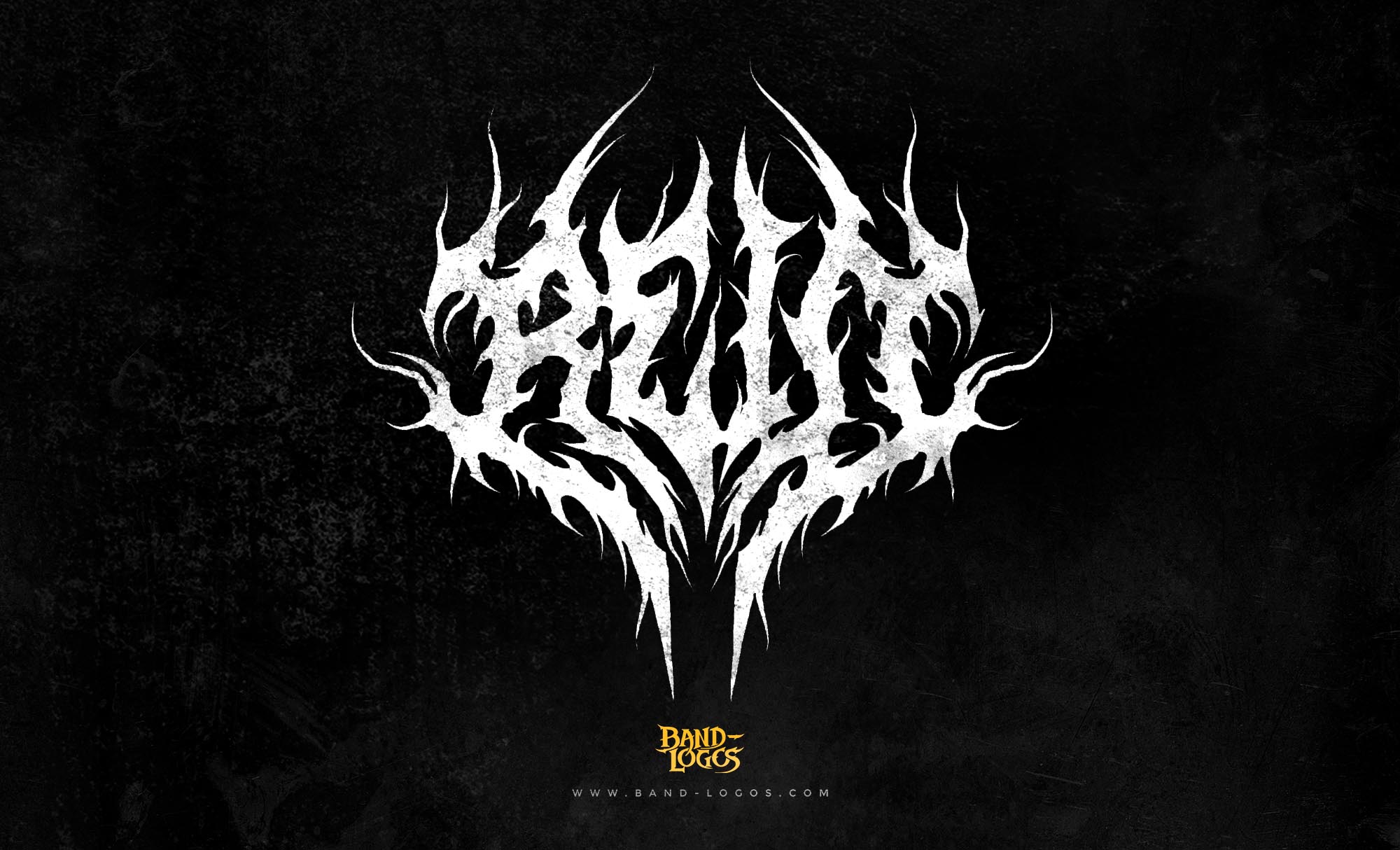
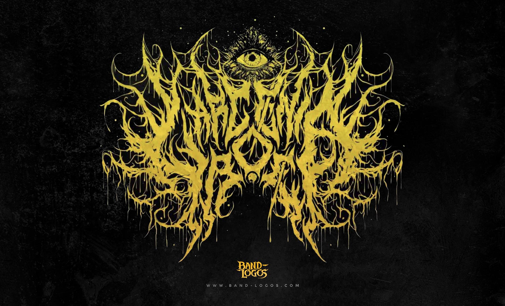
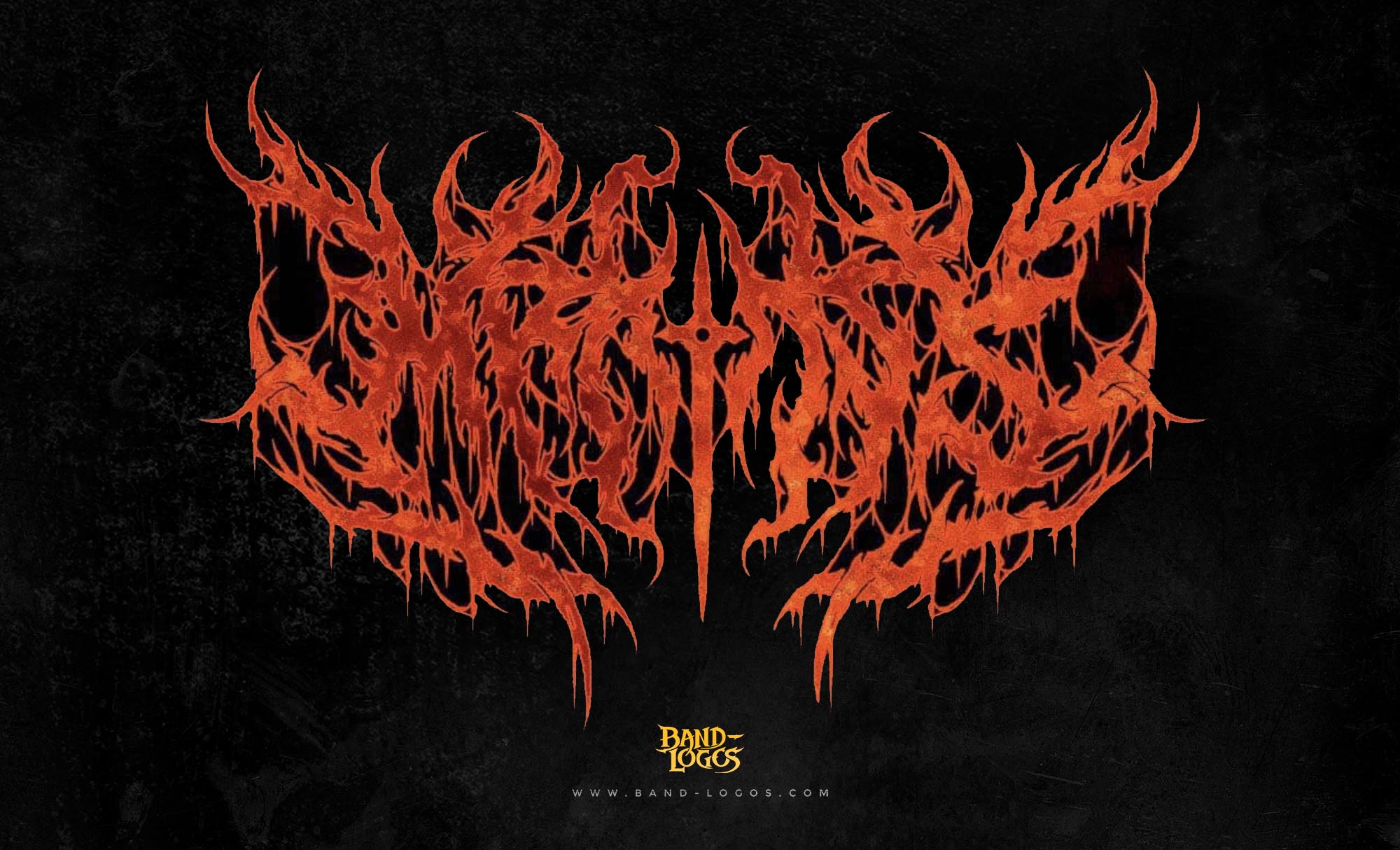
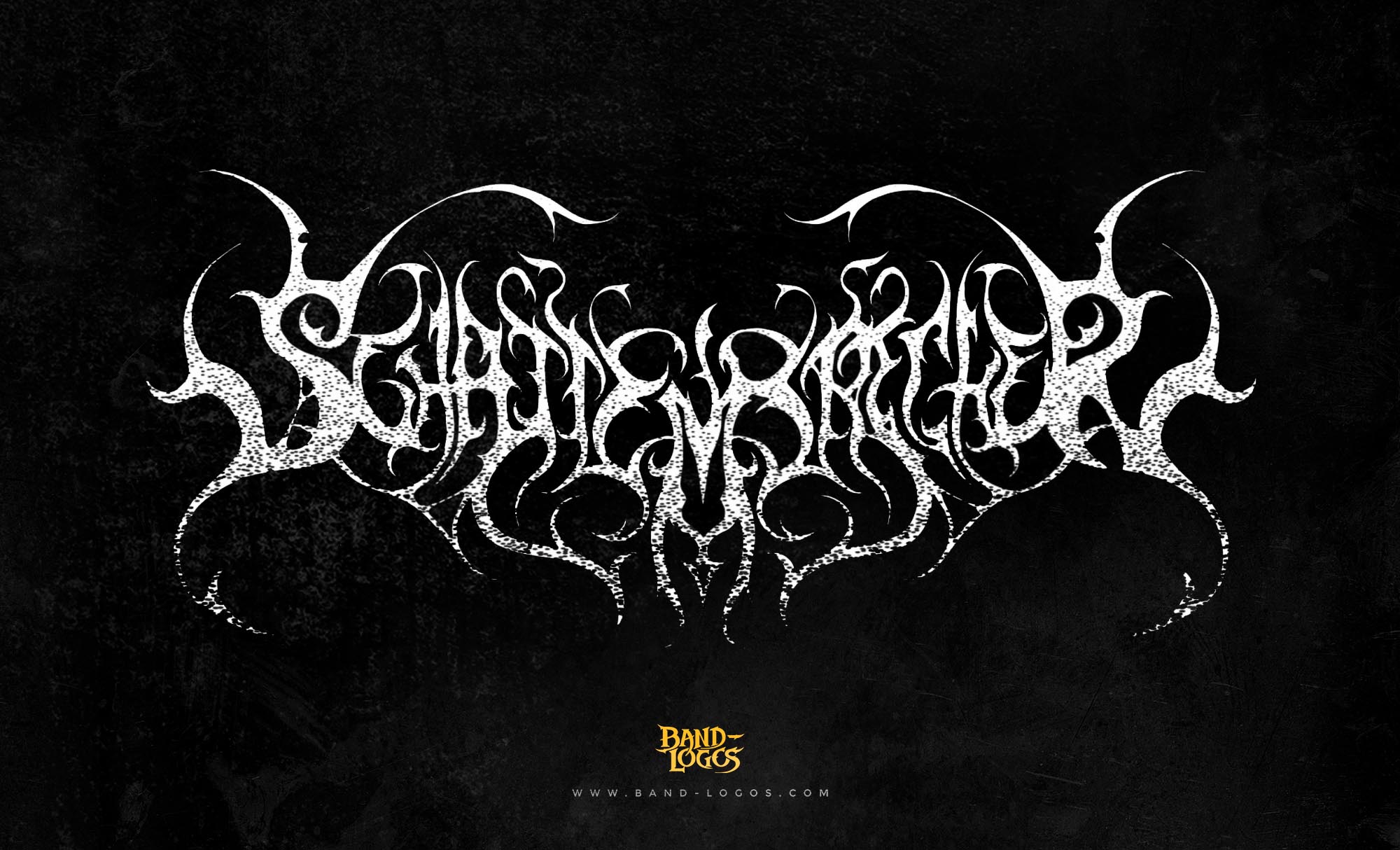
The whitechapel band logo represents one of deathcore’s most recognizable visual identities, a stark emblem that captures the raw brutality and conceptual darkness of the Tennessee-based band. Since their formation in 2006, Whitechapel has built a legacy on crushing breakdowns, guttural vocals, and thematic depth rooted in horror and violence. Their logo, with its bold lettering and menacing aesthetic, has become synonymous with modern deathcore culture and stands as a visual representation of the band’s uncompromising approach to extreme metal.
The Origins of Whitechapel
Whitechapel emerged from Knoxville, Tennessee in February 2006, founded by vocalist Phil Bozeman, guitarist Brandon Cagle, and guitarist Ben Savage. The band chose their name from the infamous Whitechapel district in East London, where Jack the Ripper committed a series of brutal murders in the late 1880s. This dark historical reference established the thematic foundation for the band’s music and visual identity from the very beginning.
Shortly after formation, the group expanded to include guitarist Alex Wade, bassist Gabe Crisp, and drummer Derek Martin. By March 2006, they had recorded their first demos, laying the groundwork for what would become one of deathcore’s most enduring acts. The band’s early sound combined the breakdown-heavy structure of deathcore with death metal technicality and an emphasis on atmospheric darkness that set them apart from their peers.
In 2007, Whitechapel signed with Siege of Amida Records in the United Kingdom and Candlelight Records in North America. That same year brought significant lineup changes when Brandon Cagle left the band following a motorcycle accident that impaired his ability to play guitar. Zach Householder stepped in as his replacement, solidifying a core lineup that has remained remarkably stable ever since. The band released their debut full-length album, The Somatic Defilement, in June 2007, introducing their particular brand of visceral deathcore to a rapidly growing audience.
The Whitechapel Band Logo Design and Evolution
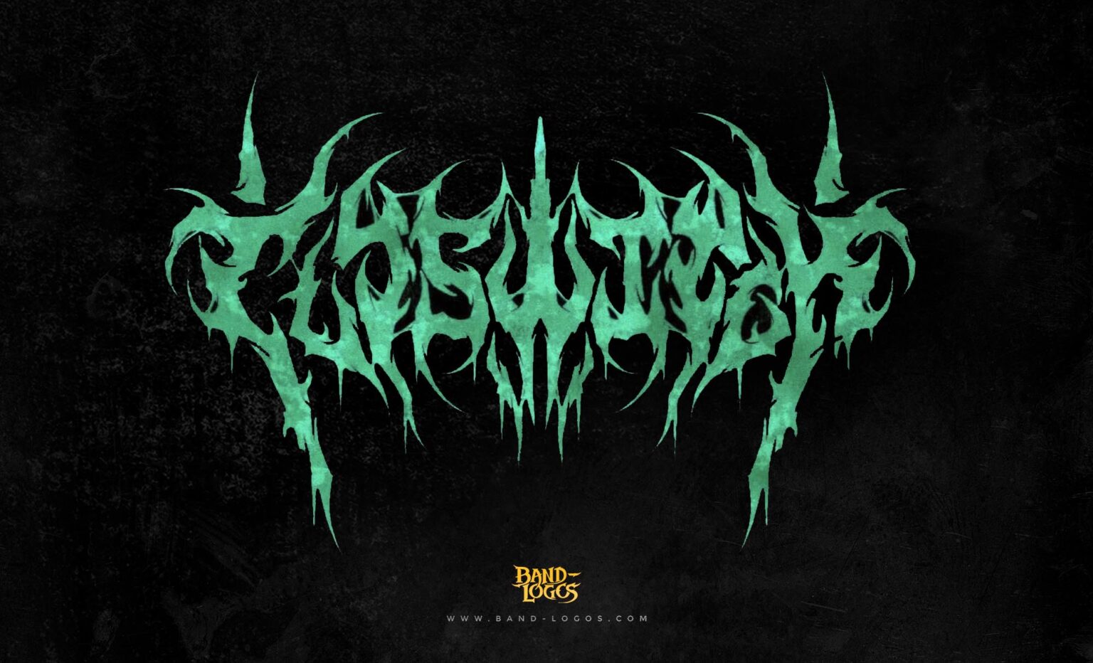
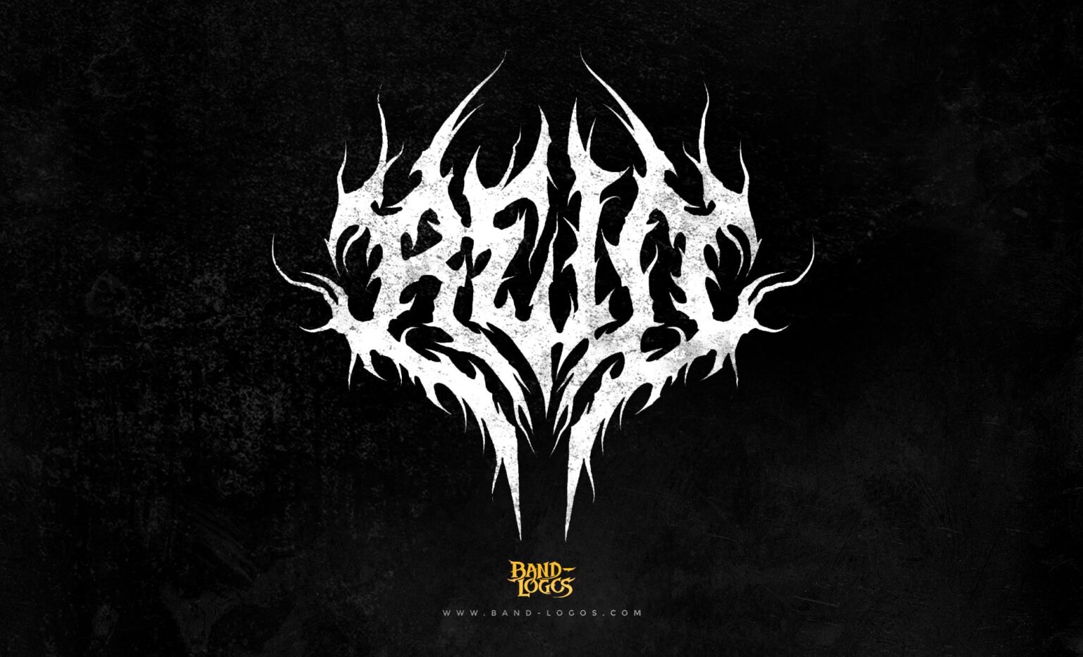
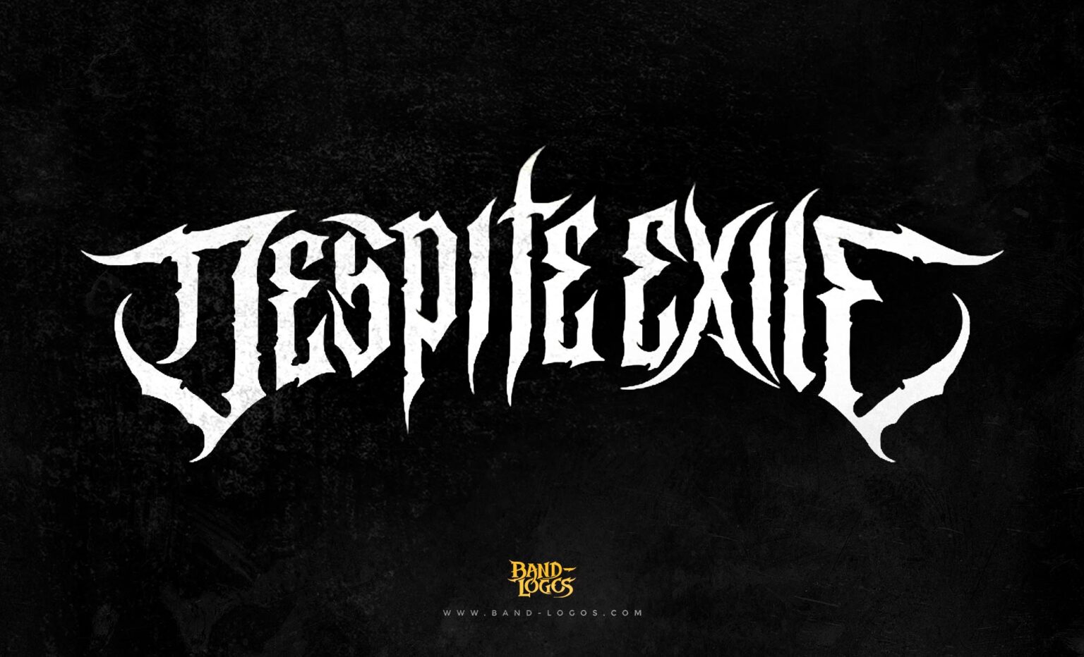
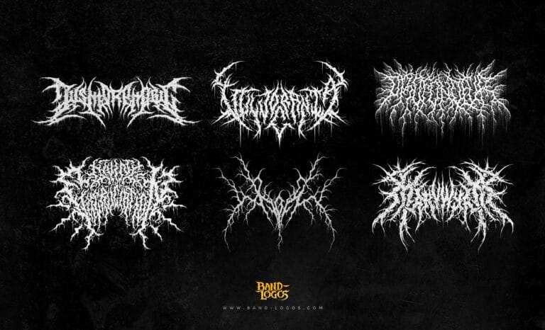
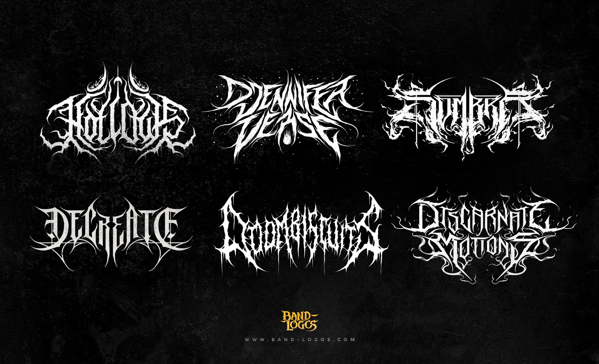
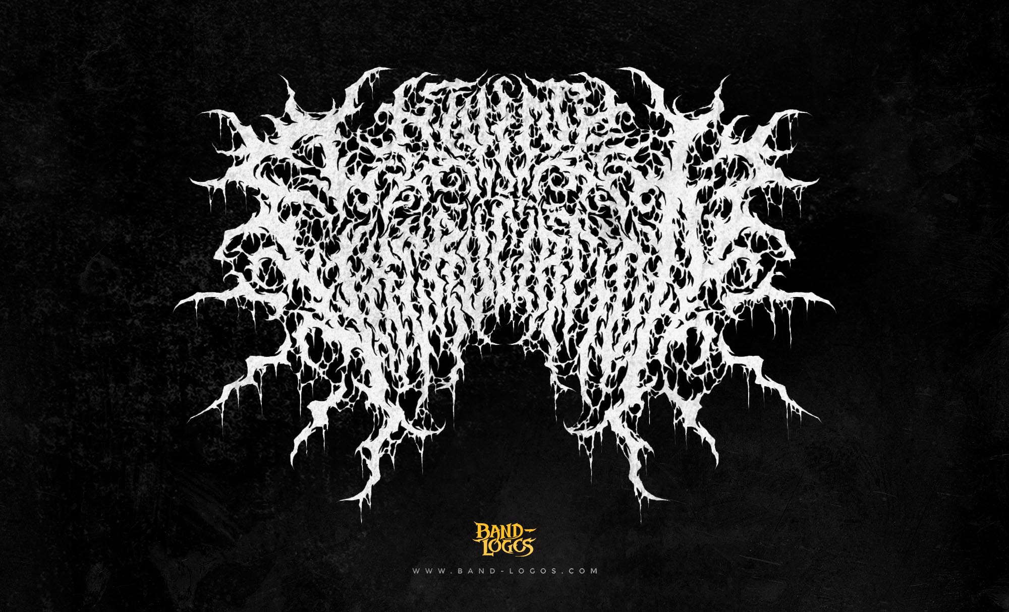
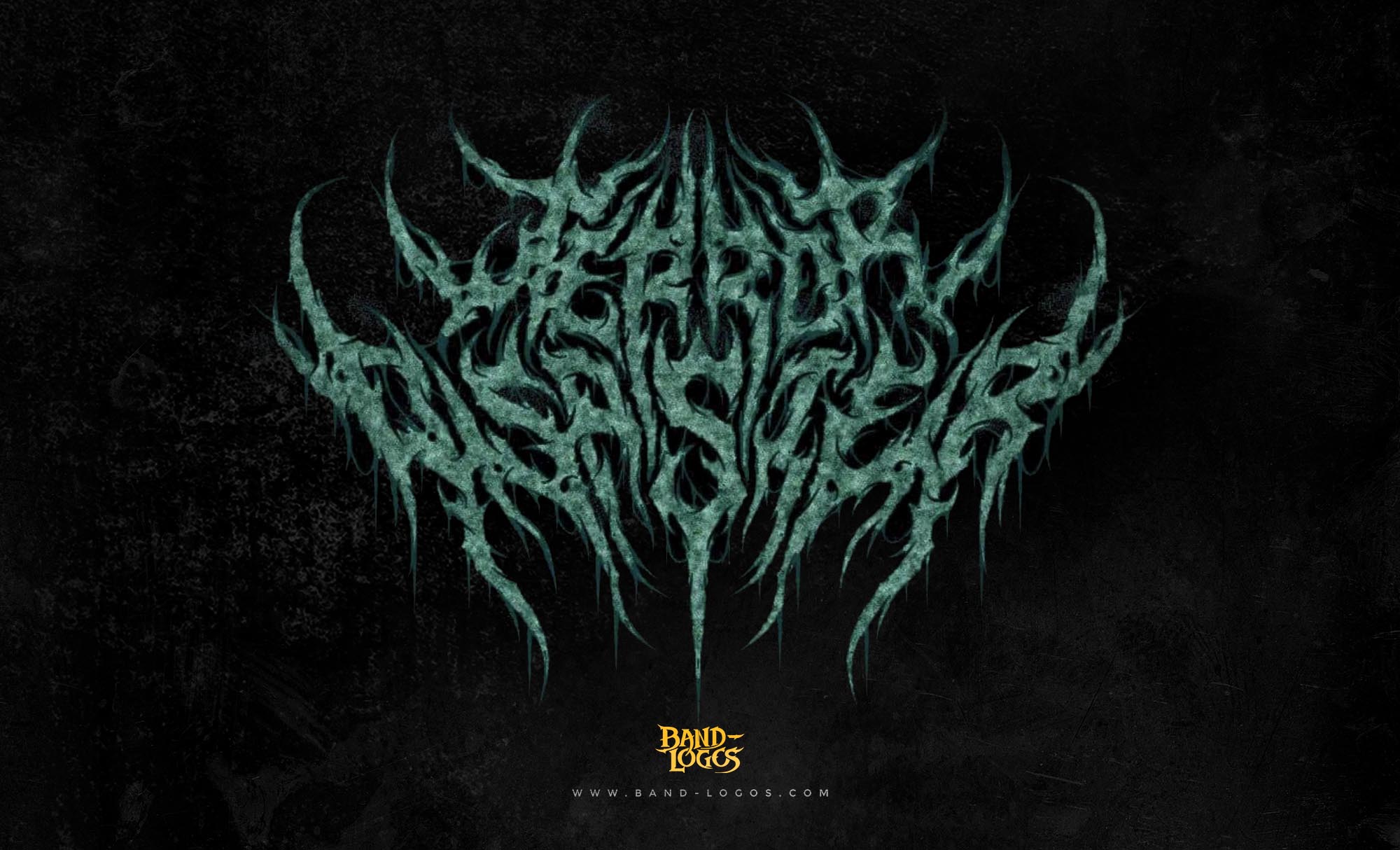
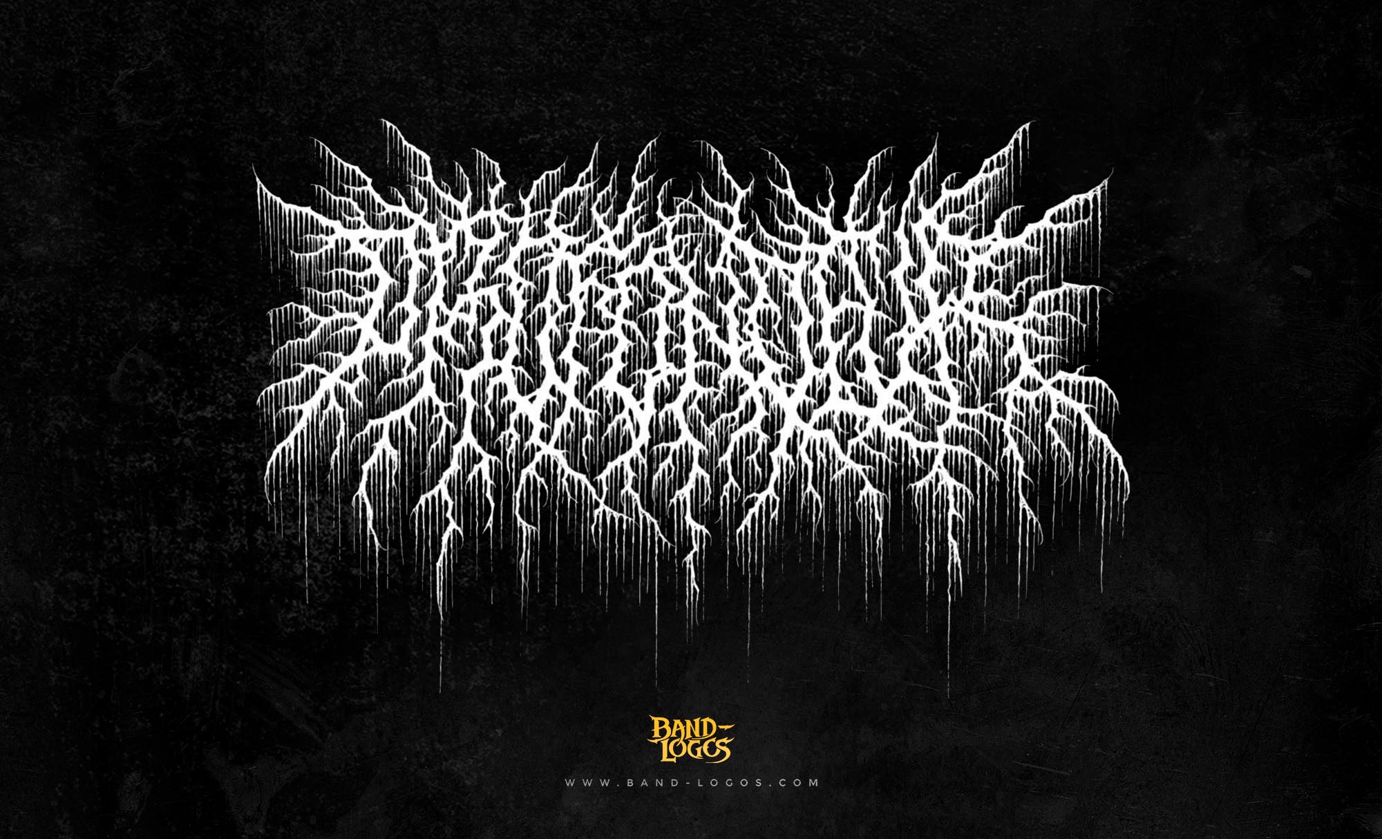
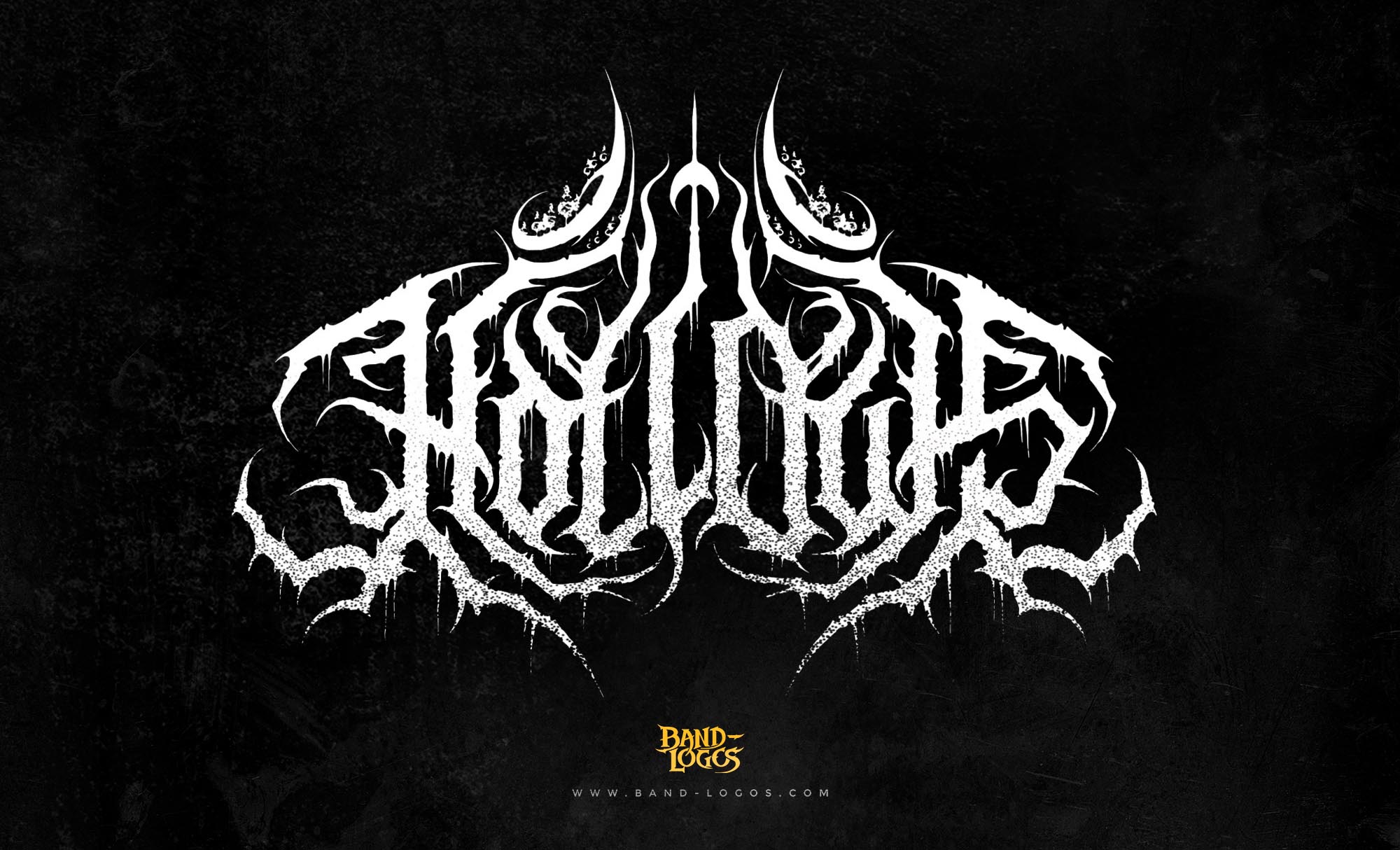
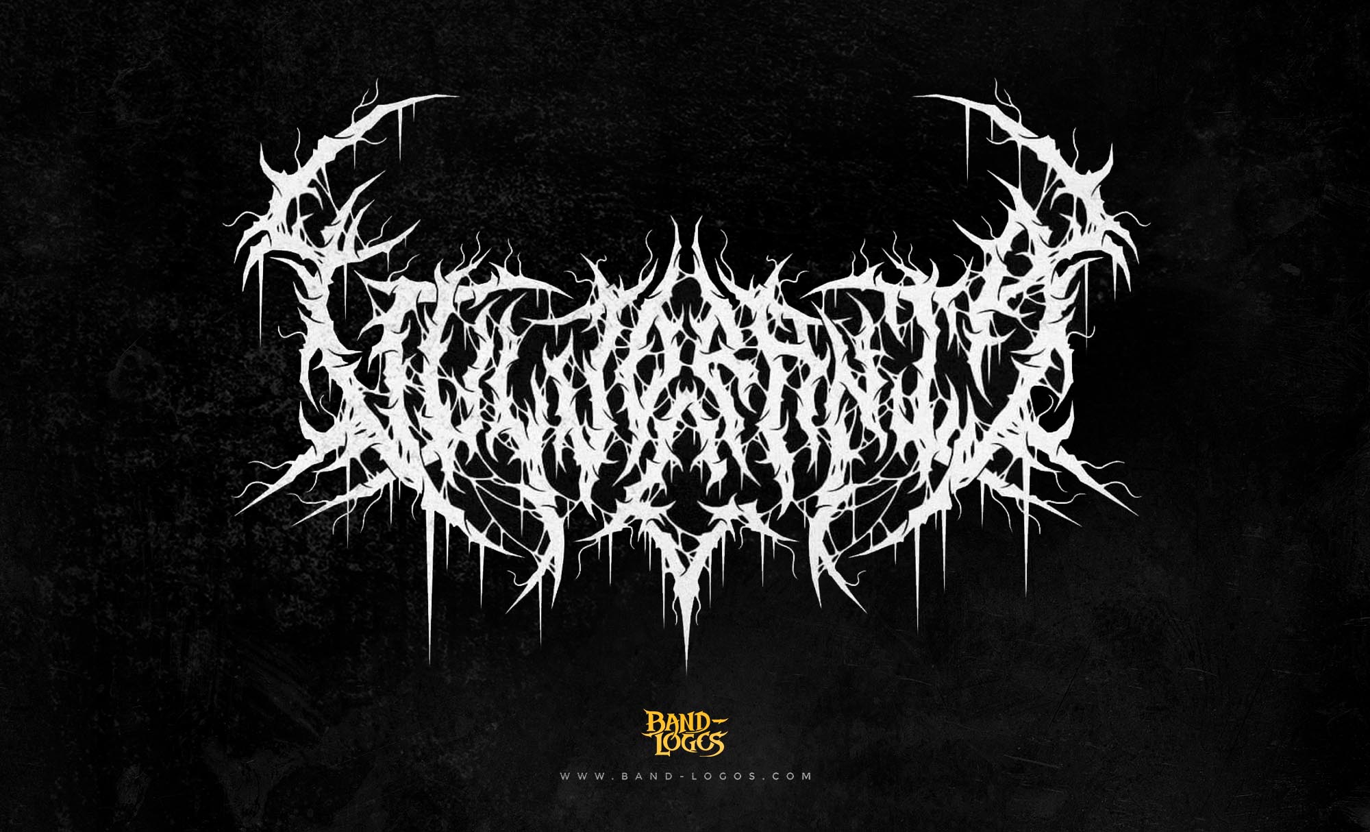
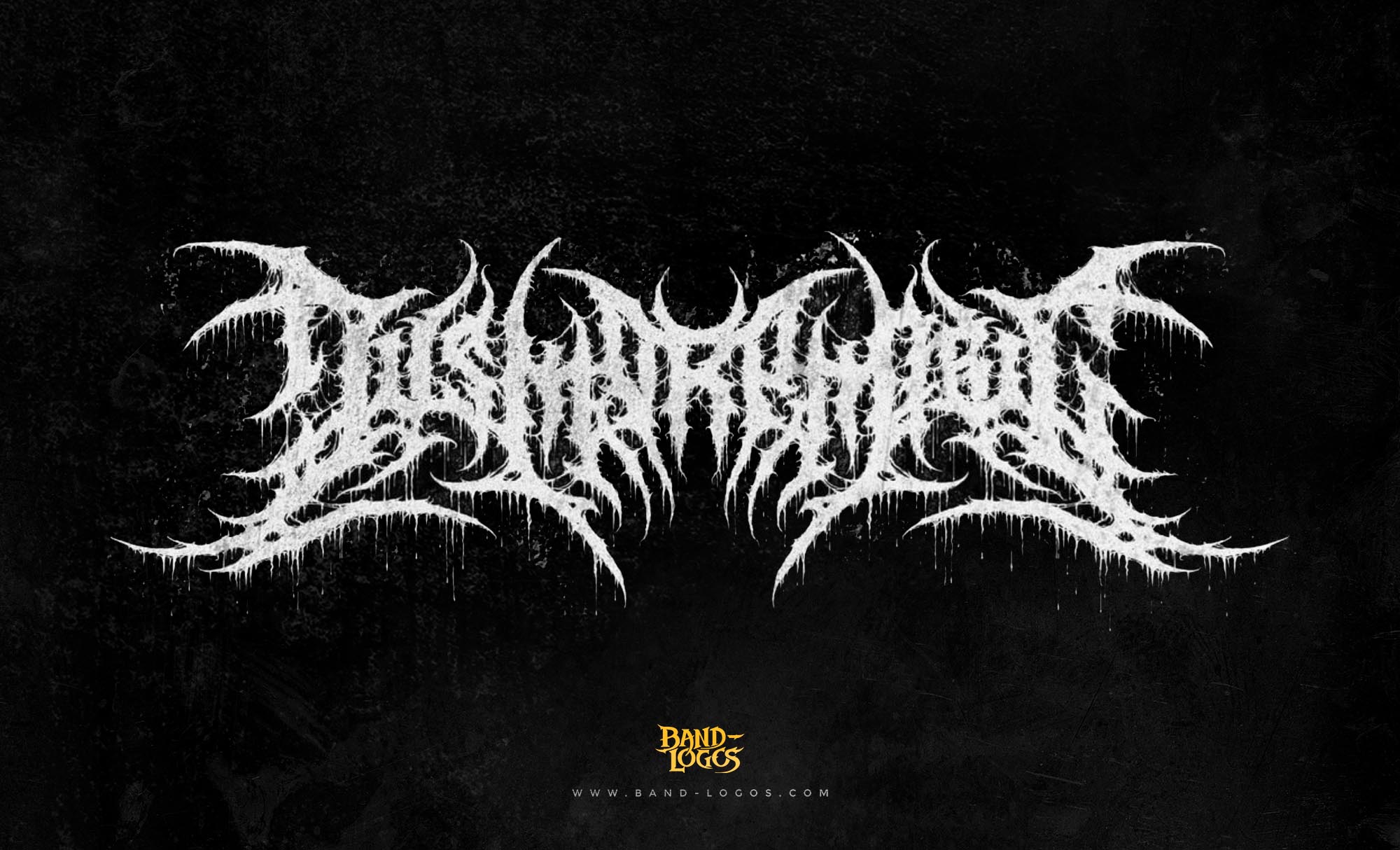
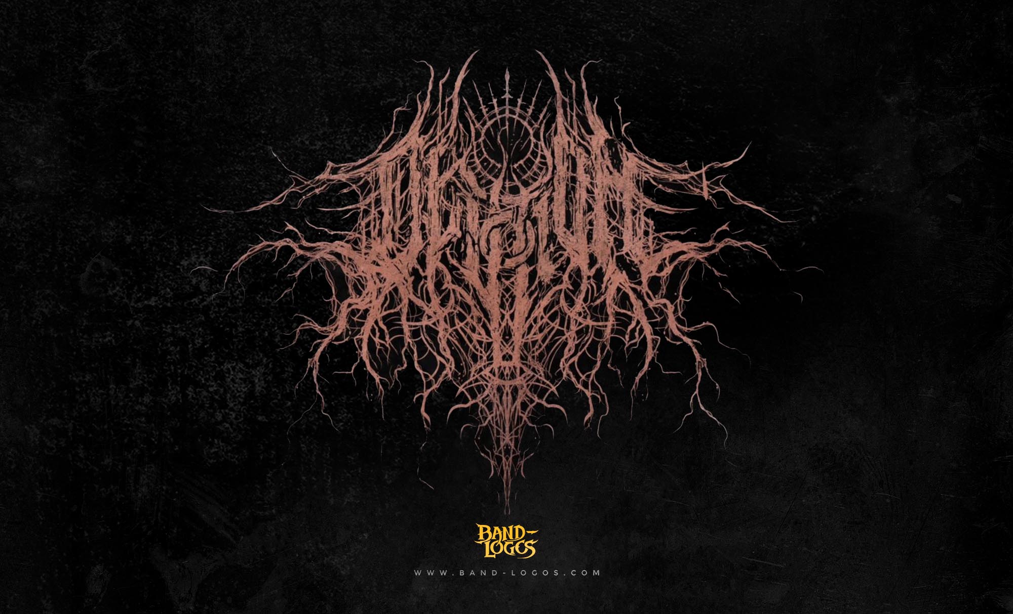
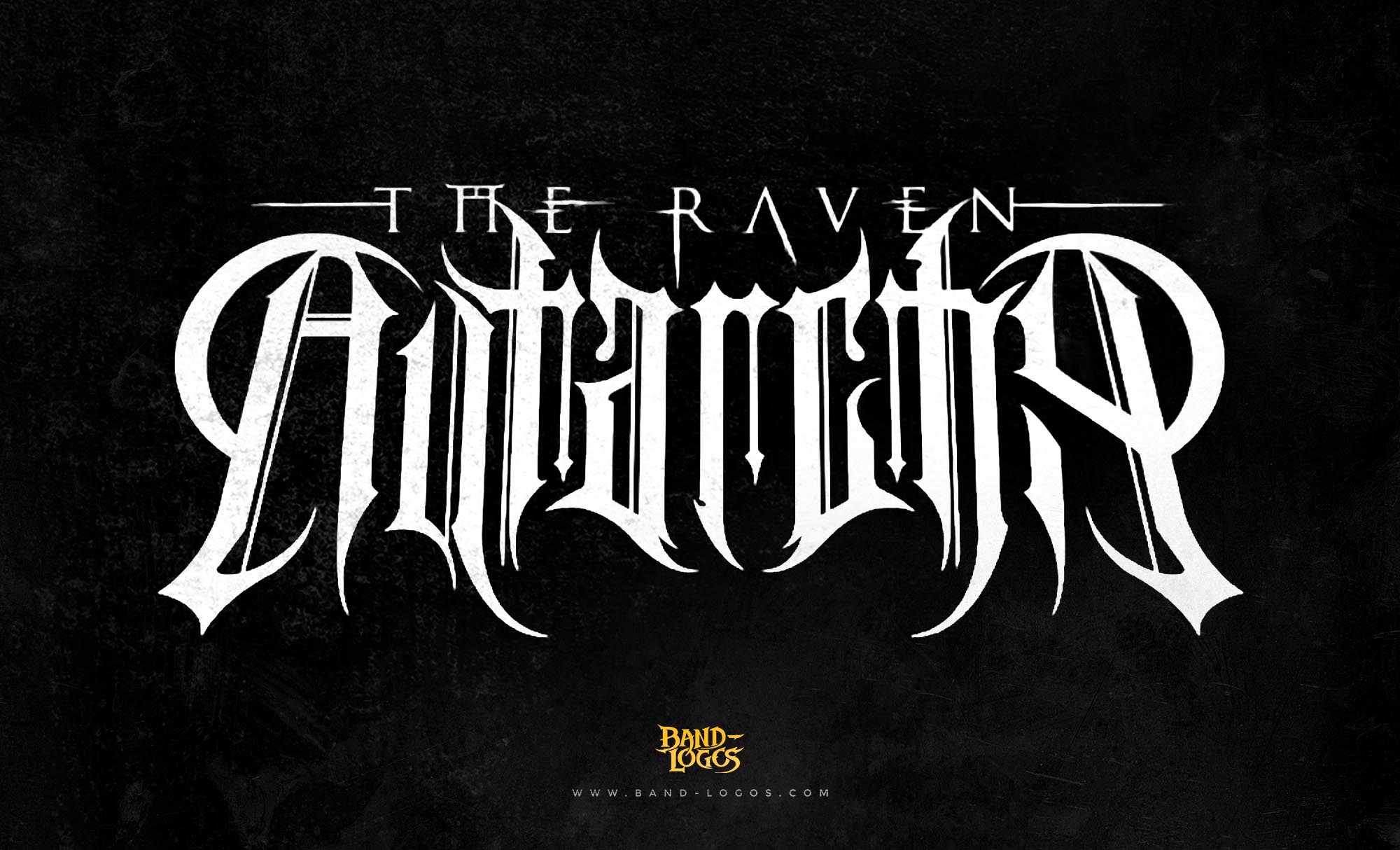
The whitechapel band logo features angular, aggressive typography that reflects the band’s sonic brutality. The design incorporates sharp edges and bold letterforms that create an imposing visual presence, immediately communicating the intensity of the music. While the exact designer of the logo has not been widely publicized, the visual identity was developed in conjunction with the band’s early branding efforts as they established themselves in the deathcore scene.
Unlike many extreme metal bands that opt for illegible, ornate lettering, the whitechapel band logo maintains a degree of readability while still conveying menace and aggression. The letters are constructed with strong horizontal and vertical elements that give the logo stability and weight. This design choice positions the logo within the broader tradition of band logos that prioritize impact and memorability over decorative complexity.
Logo Variations Across Album Cycles
The whitechapel band logo has evolved subtly throughout the band’s career, with different iterations appearing across their nine studio albums. The logo that first appeared on their 2012 self-titled album introduced a refined version of their visual identity, featuring cleaner lines and more defined letterforms. By the time Our Endless War was released in 2014, the logo had been further refined while maintaining its core aggressive aesthetic.
These variations have allowed the logo to adapt to different artistic contexts while preserving brand recognition. The logo has been rendered in various colors and textures to match each album’s specific visual theme, from the raw black and white presentations of their earlier work to more elaborate treatments in recent releases. This flexibility demonstrates sophisticated design thinking that serves both artistic and commercial purposes.
Symbolic Language and Connection to the Music
The whitechapel band logo carries significant symbolic weight within the deathcore community. The angular, blade-like quality of the letterforms evokes the violence referenced in the band’s name and explored throughout their lyrics. This visual brutality mirrors the sonic assault of their music, creating a cohesive artistic statement that spans both auditory and visual dimensions.
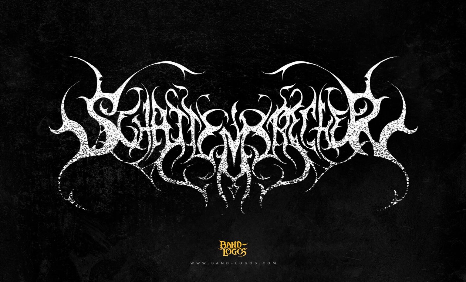
Within the landscape of metal band logos, Whitechapel’s design occupies a distinct position. While some bands in the extreme metal spectrum, particularly those within black metal band logos, embrace illegibility as a badge of underground authenticity, Whitechapel strikes a balance between accessibility and aggression. This approach reflects their position as a band that helped bring deathcore to mainstream metal audiences while maintaining underground credibility.
The logo’s connection to the Jack the Ripper murders referenced in the band’s name creates a layered narrative. The visual identity serves as a gateway to the thematic content explored in albums like The Somatic Defilement and This Is Exile, where violence, horror, and psychological darkness form the lyrical foundation. The logo becomes a visual shorthand for these themes, instantly recognizable to fans who understand the band’s conceptual approach.
Band Members and Their Contributions
The current lineup of Whitechapel consists of vocalist Phil Bozeman, guitarists Ben Savage, Alex Wade, and Zach Householder, bassist Gabe Crisp, and drummer Brandon Zackey. This core group has maintained remarkable consistency since 2007, with the drummer position being the only role to see regular changes over the years.
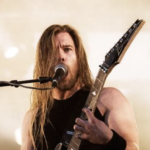
Phil Bozeman serves as the band’s vocal powerhouse and primary lyricist. His ability to deliver guttural lows, piercing highs, and emotionally charged clean vocals has made him one of deathcore’s most respected vocalists. Bozeman’s personal experiences, particularly the loss of both parents during his youth, have informed the deeply emotional content of albums like The Valley and Kin, where he confronted childhood trauma through his lyrics.
Ben Savage and Alex Wade form the band’s guitar foundation, crafting the intricate riffs and devastating breakdowns that define Whitechapel’s sound. Zach Householder, who joined in 2007, has become increasingly important to the band’s creative process. For their 2025 album Hymns in Dissonance, Householder took on production duties, marking the first time the band self-produced a record. This development demonstrated the band’s artistic maturity and technical capability after years of working with respected producers like Jason Suecof and Mark Lewis.
Gabe Crisp provides the low-end foundation that anchors the band’s sound, while Brandon Zackey, who became a full-time member in 2024 after touring with them since 2022, brings technical precision and power to the drum throne. According to Revolver Magazine, the band’s collaborative approach and stable lineup have been crucial to their longevity and continued creative evolution.
Recent Work and Hymns in Dissonance
Whitechapel released their ninth studio album, Hymns in Dissonance, on March 7, 2025, through Metal Blade Records. The album represents a deliberate return to the band’s brutal deathcore roots after the more progressive and melodic explorations of The Valley and Kin. Guitarist Alex Wade described the album as an attempt to write their heaviest material to date, with no holds barred in terms of aggression and darkness.
Hymns in Dissonance is a concept album that follows the story of a demonic cult leader gathering followers to open a portal to another dimension. Phil Bozeman explained that the title itself is a mockery of traditional hymns, with dissonance representing evil in contrast to the harmony typically associated with religious music. Each track from the third song onward represents one of the seven deadly sins, creating a cohesive narrative throughout the album.
The album was produced entirely by Zach Householder at his studio, beginning in June 2023. This self-production approach allowed the band complete creative control and marked a significant milestone in their career. The album artwork was created by Rob Borbas, a European tattoo artist known professionally as Grind Design, who specializes in dark and cryptic imagery. The cover features a mysterious masked figure that connects to the album’s cult narrative.
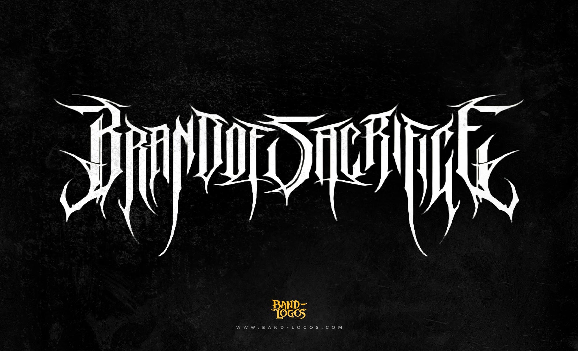
Whitechapel supported the album release with an extensive tour running from March through April 2025, with support from Brand of Sacrifice, 200 Stab Wounds, and Alluvial. The band later announced a fall 2025 tour where they would perform Hymns in Dissonance in its entirety, culminating with their tenth annual Christmas benefit show in their hometown of Knoxville, Tennessee.
The Logo’s Cultural Impact
The whitechapel band logo has transcended its original function to become a cultural symbol within the deathcore and extreme metal communities. The logo appears on countless pieces of merchandise, from t-shirts and hoodies to posters and patches. Fans often incorporate the logo into tattoos, demonstrating the deep personal connection many feel to the band’s music and visual identity.
The logo’s design has influenced a generation of deathcore and death metal bands seeking to establish their own visual identities. Its balance of readability and aggression has proven to be a successful formula that many emerging bands have attempted to emulate. This influence extends beyond music into broader alternative culture, where the logo serves as a marker of belonging within extreme music communities.
The consistent application of the whitechapel band logo across nearly two decades has created strong brand recognition that serves the band well in an increasingly crowded metal landscape. Whether on album covers, concert posters, or digital platforms, the logo instantly identifies the band and communicates their artistic approach before a single note is heard.
Need a Professional Band Logo?
The success of the whitechapel band logo demonstrates the critical importance of strong visual identity in the music industry. A well-designed logo serves as the foundation for all band branding, creating instant recognition and communicating artistic vision to potential fans. If your band needs a professional logo that captures your unique sound and style, consider working with experienced designers who understand the specific requirements of music branding. Band-Logos.Com specializes in creating custom band logos for metal, rock, and alternative artists, delivering professional designs that help bands establish their visual identity and stand out in competitive music markets.
Conclusion
The whitechapel band logo stands as a testament to the power of thoughtful visual design in extreme metal. Through its aggressive typography, symbolic connection to the band’s thematic content, and consistent application across multiple album cycles, the logo has become one of deathcore’s most recognizable emblems. As Whitechapel continues to evolve musically, from their brutal early work through their more progressive middle period and back to the crushing heaviness of Hymns in Dissonance, their logo remains a constant visual anchor that unites their entire discography and connects them to a devoted global fanbase.


